Challenge
The skincare market is saturated; many brands lean heavily on visuals but lack authenticity or a strong narrative. Lumisel is a concept brand that would feel fresh, natural, and premium, yet approachable and sustainable. It was important to differentiate this brand from competitors, expressing “marine-powered” and “organic forms” without overdoing cliché visuals was essential. It was challenging to balance natural forms with refined, elegant typography.
Solution
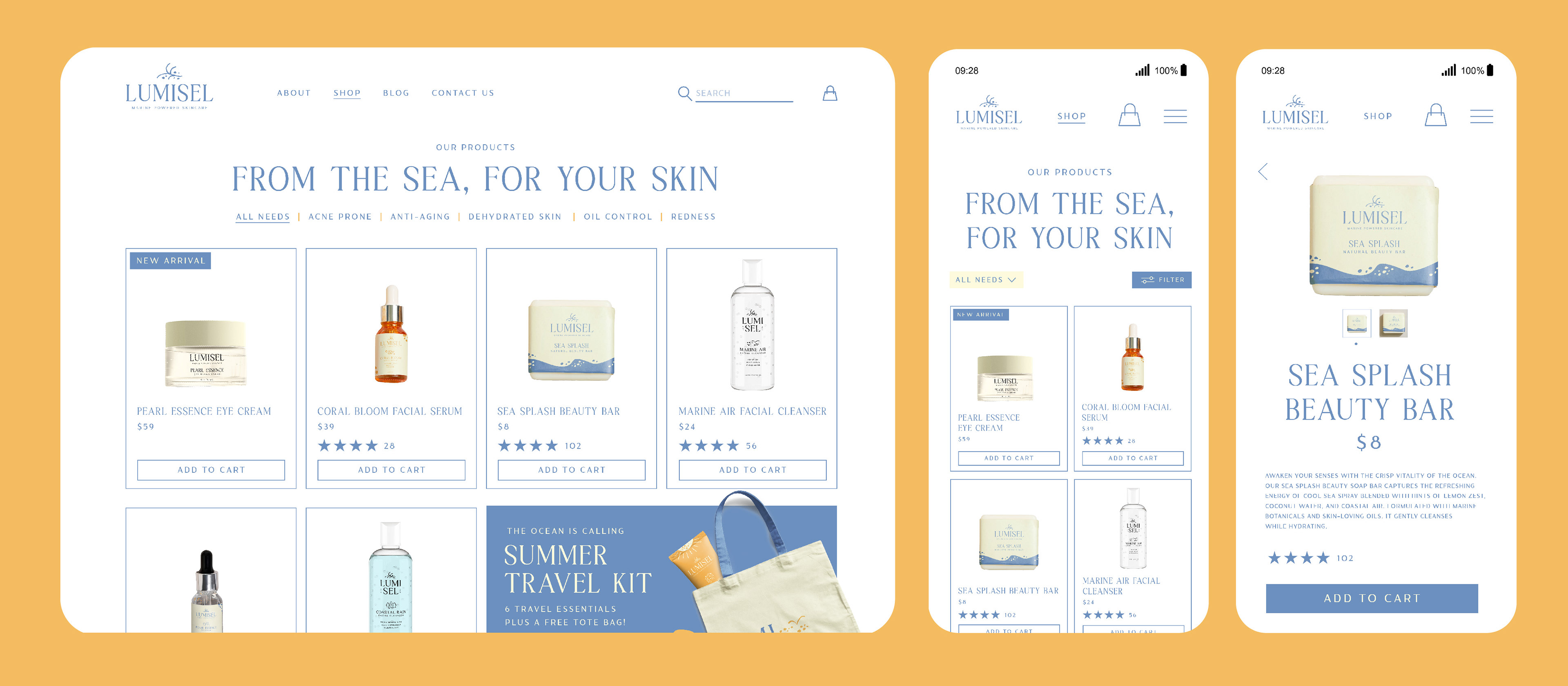
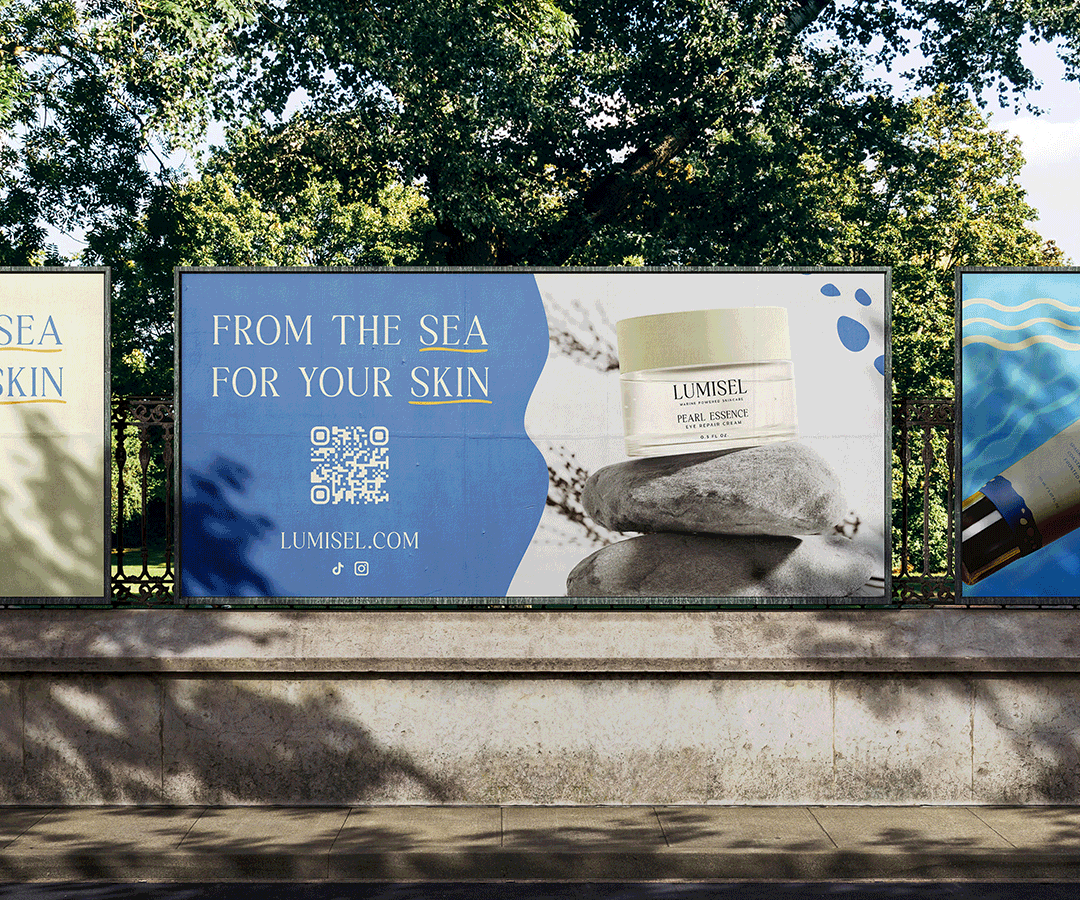
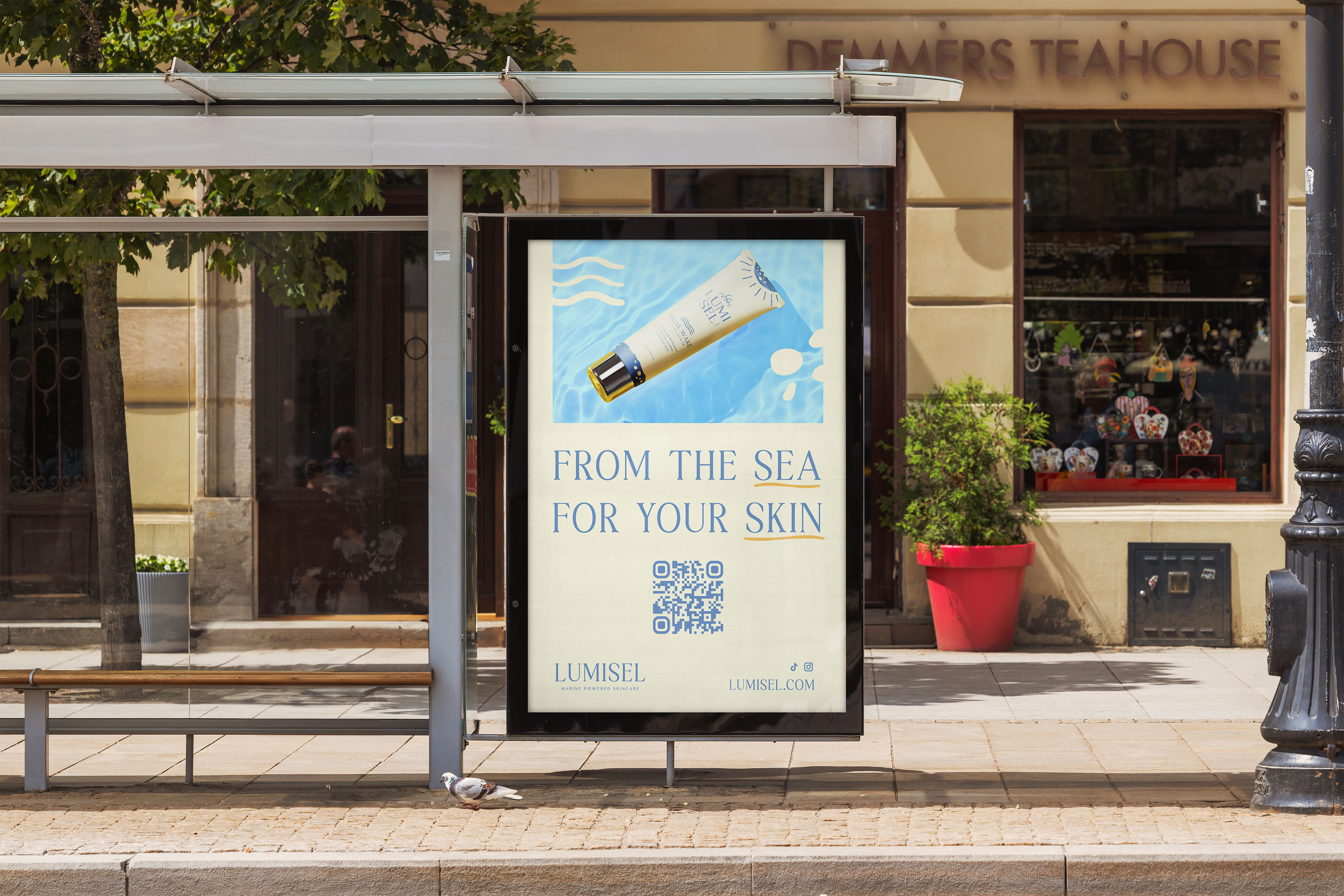
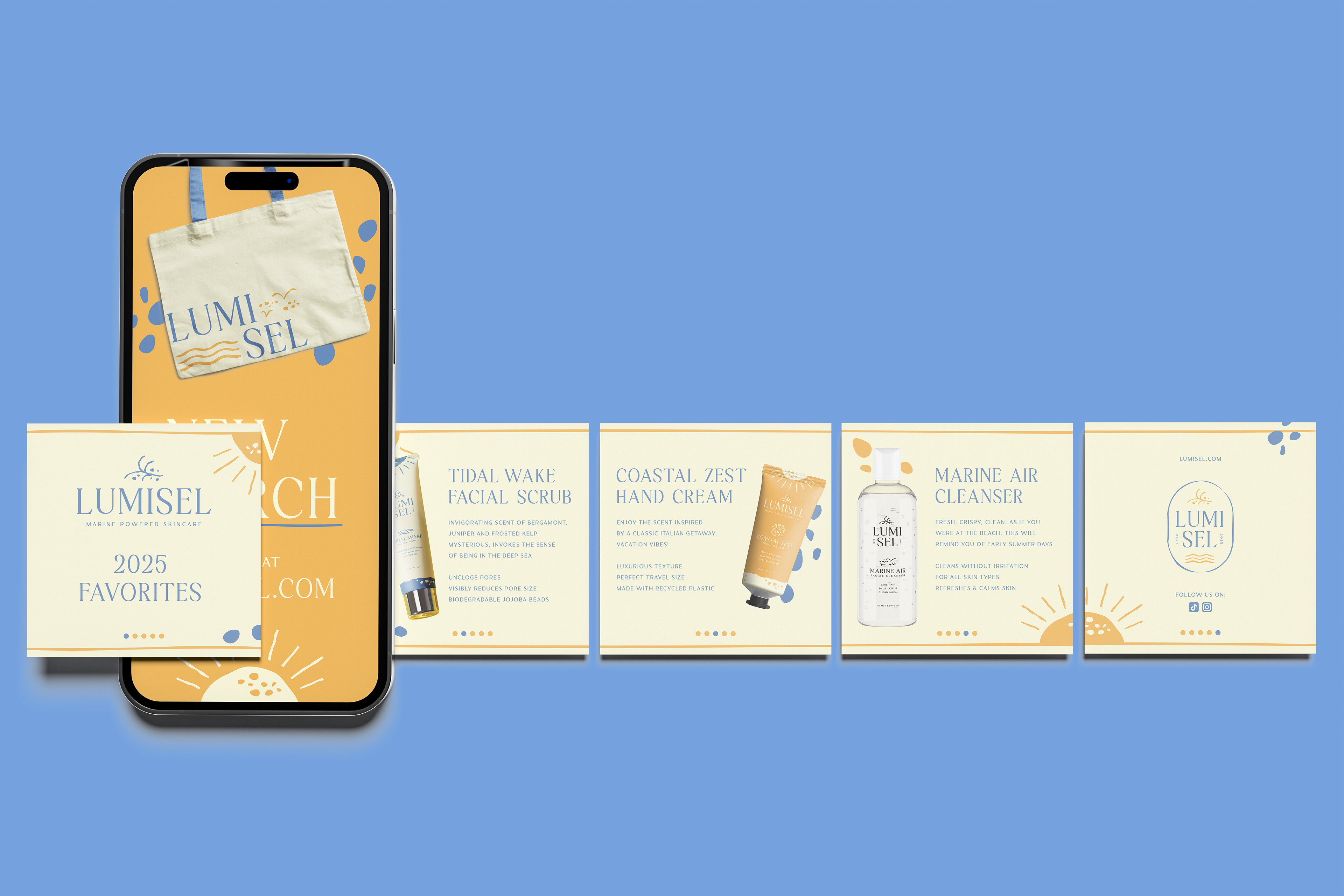
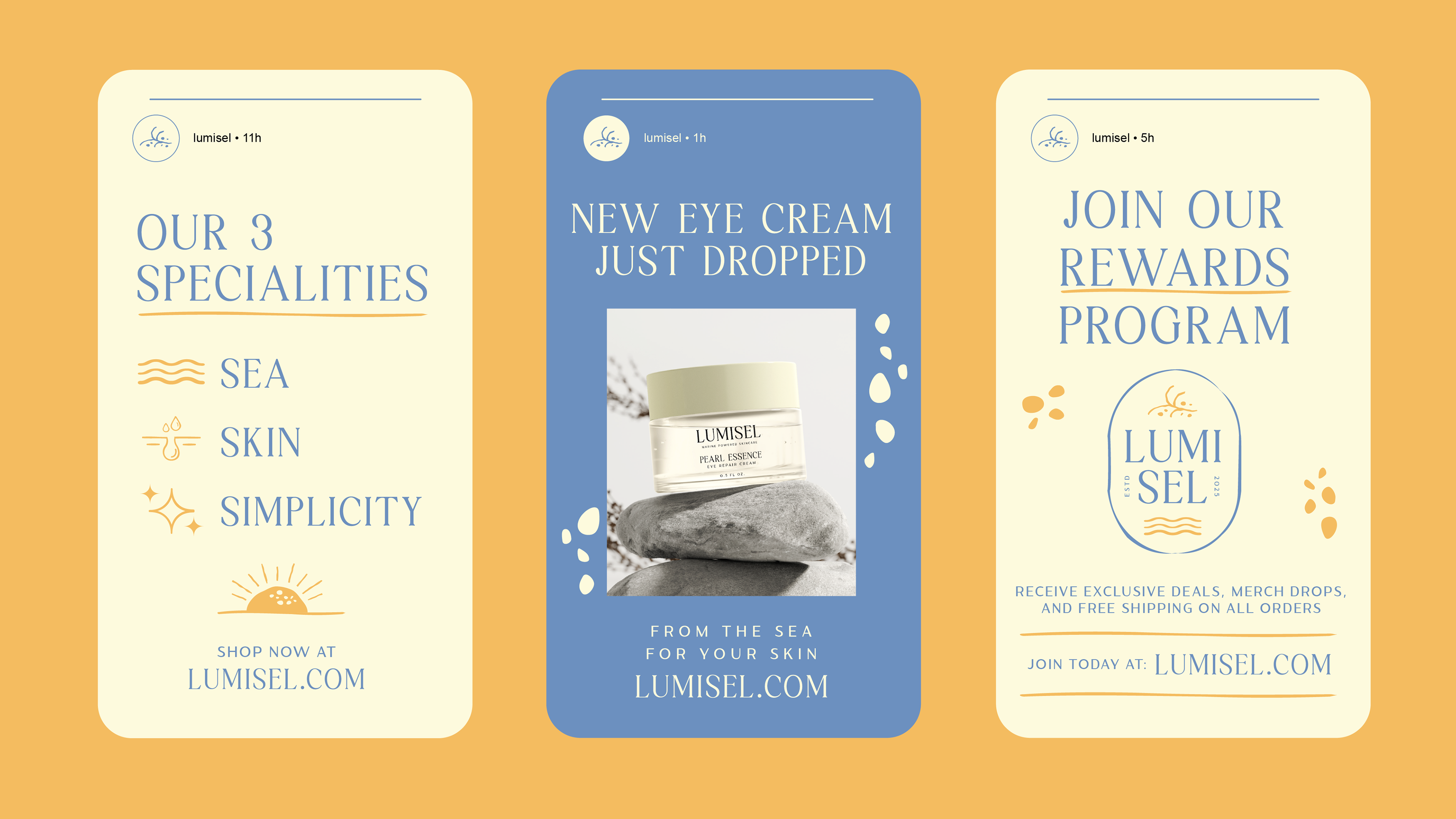
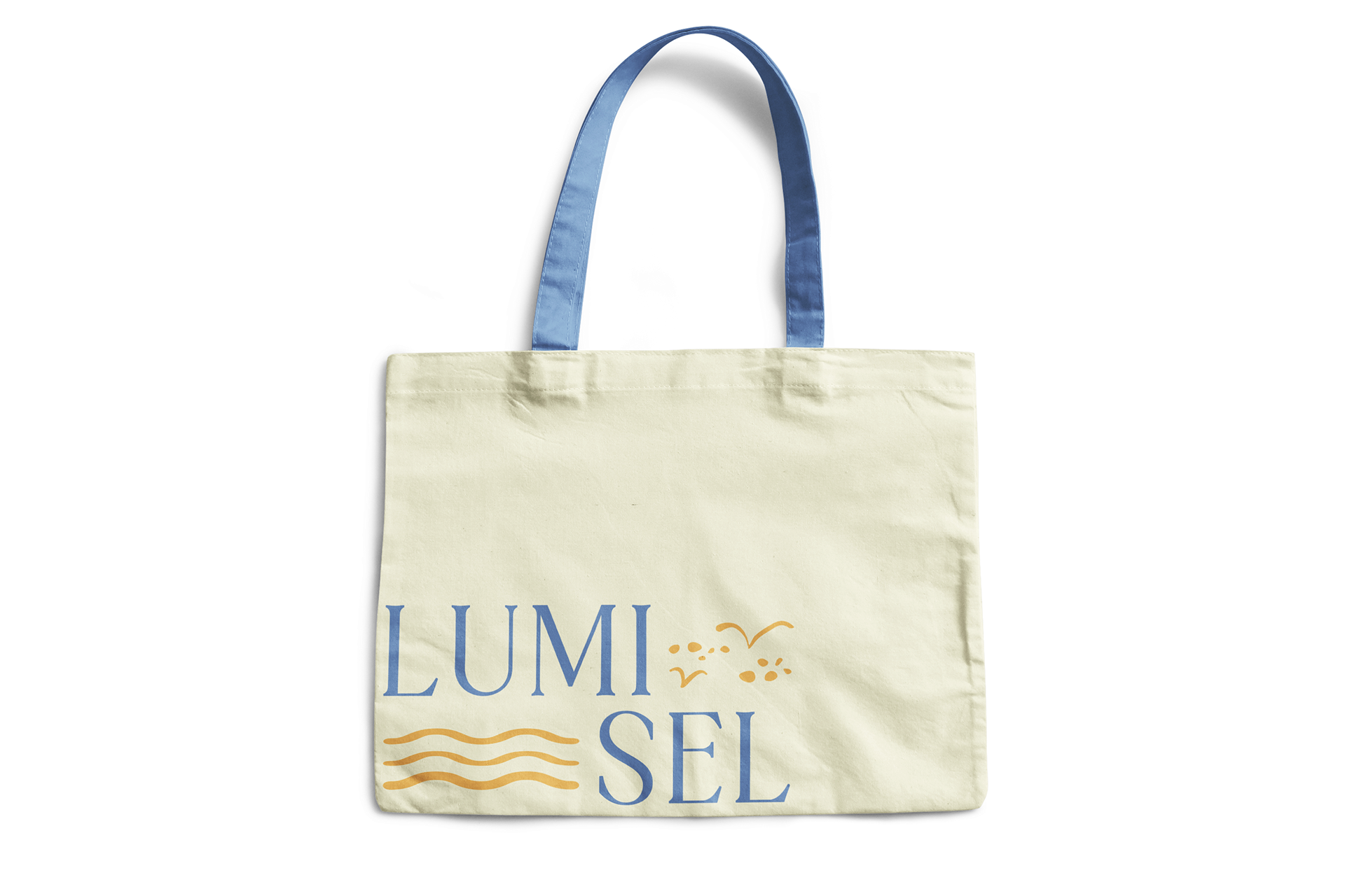
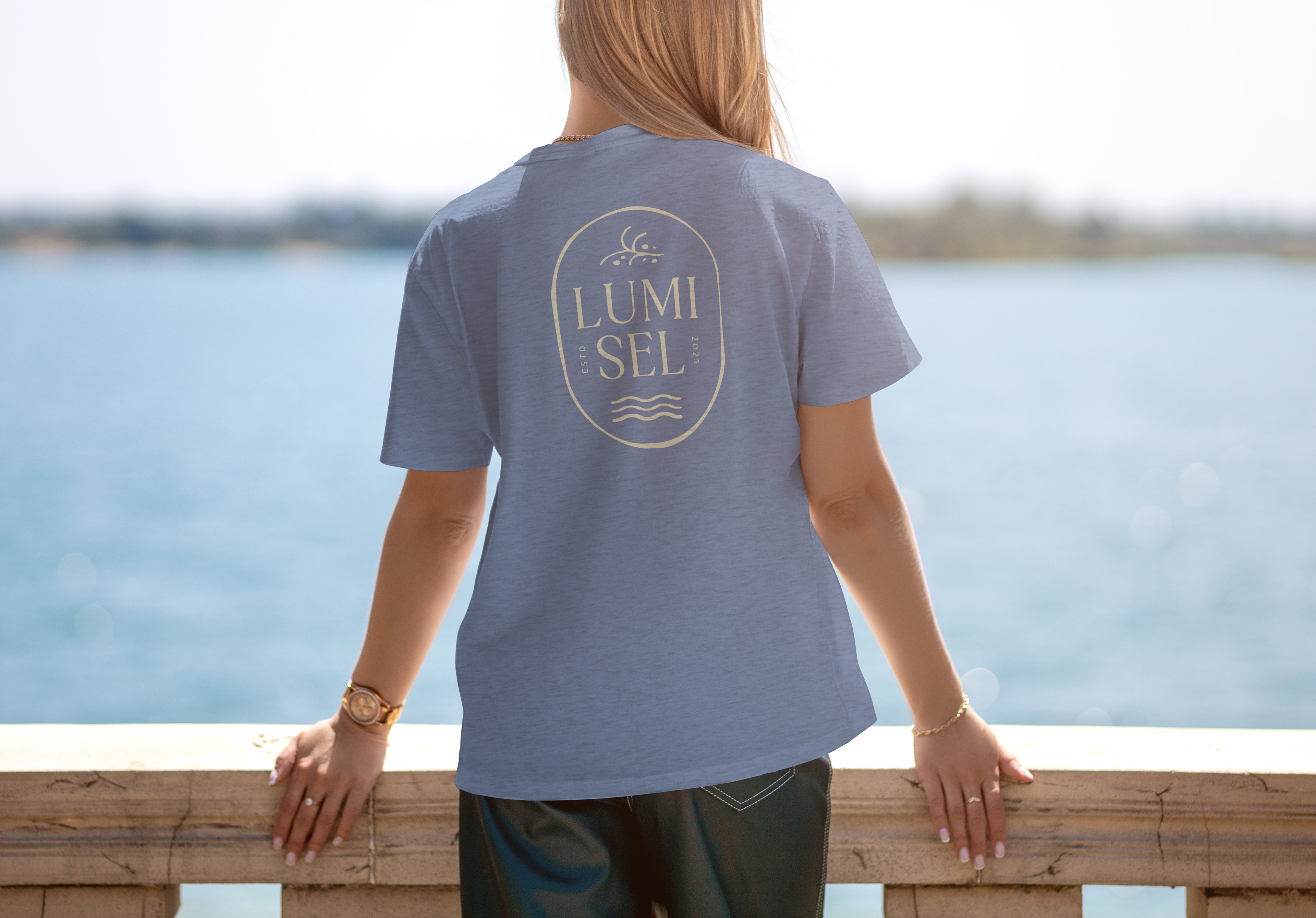
Before envisioning the solution, I did visual research of competitors with similar values or visual aesthetics. This helped create the groundwork of a brand identity. The end result was a cohesive visual system that translates through all touchpoints reliably: product labels, advertising, social assets, web UI, and motion graphics, establishing Lumisel as a cohesive, premium marine-inspired skincare brand.
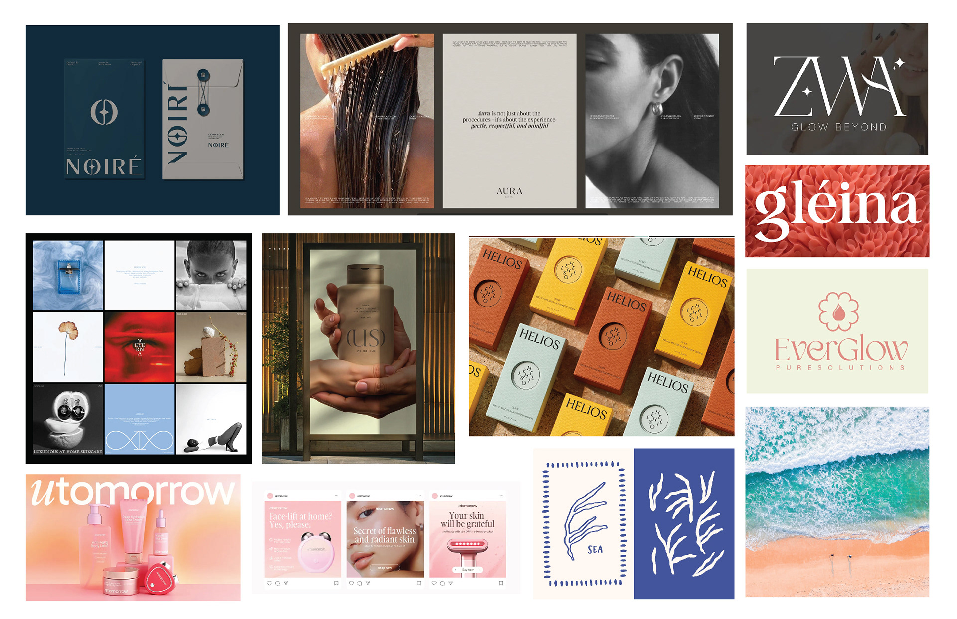

Moodboard
Before creating the logo, I collected visual inspiration of other skincare brands, as well as typography, this helps me effectively ideate my design process. Different typefaces were researched and tested to determine usefulness and readability.

Logo + Branding
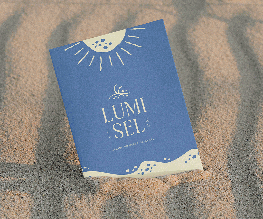
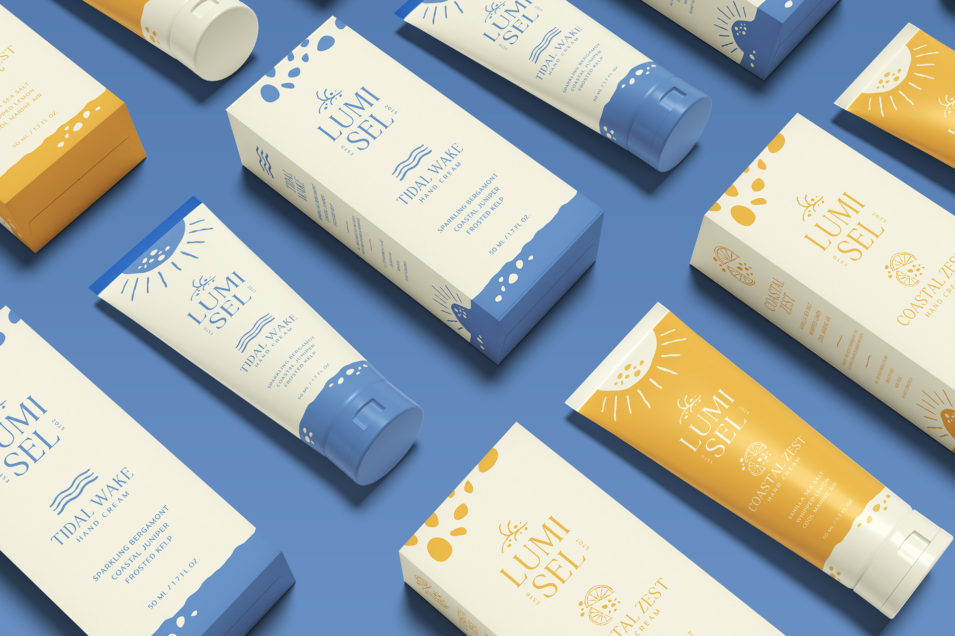
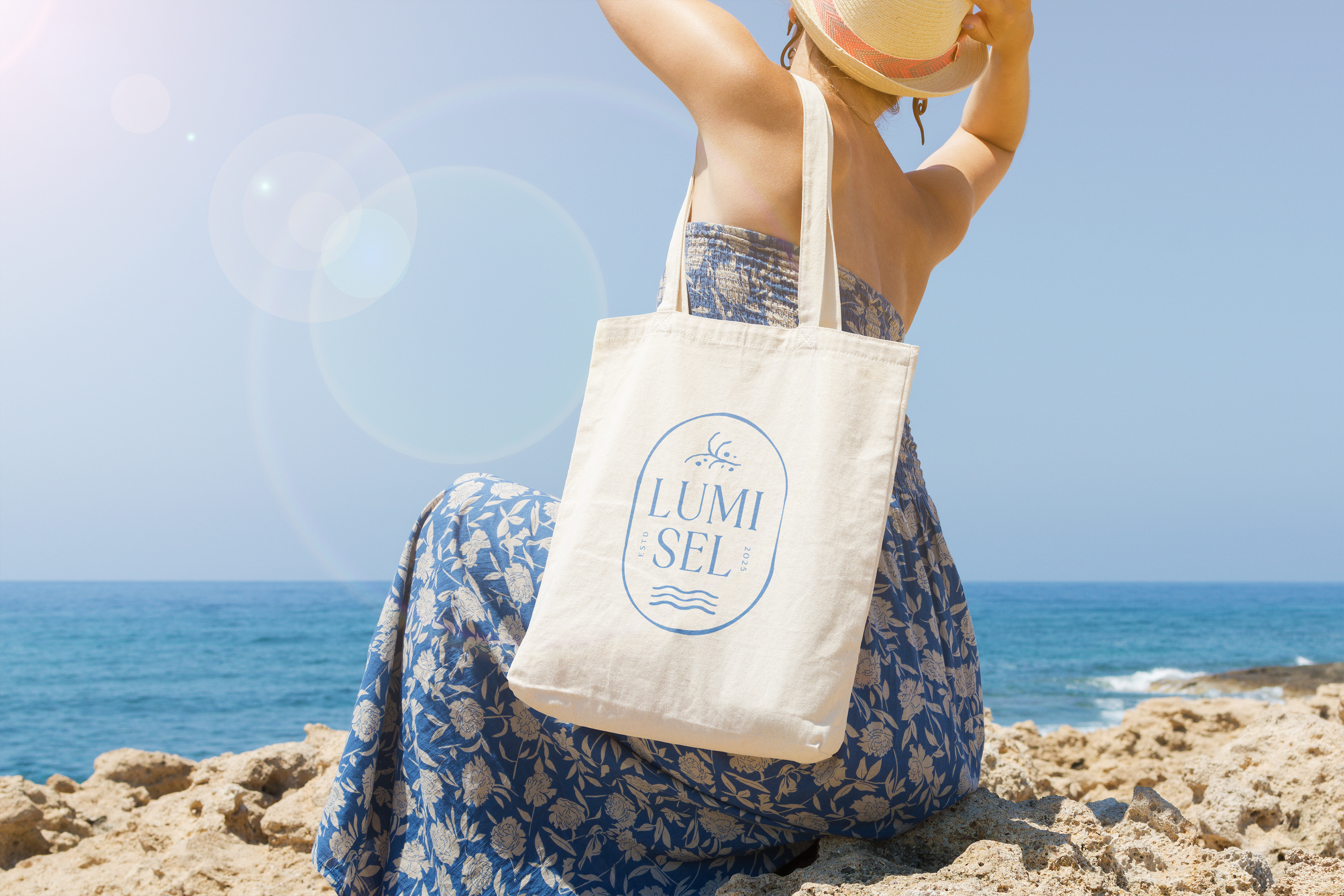
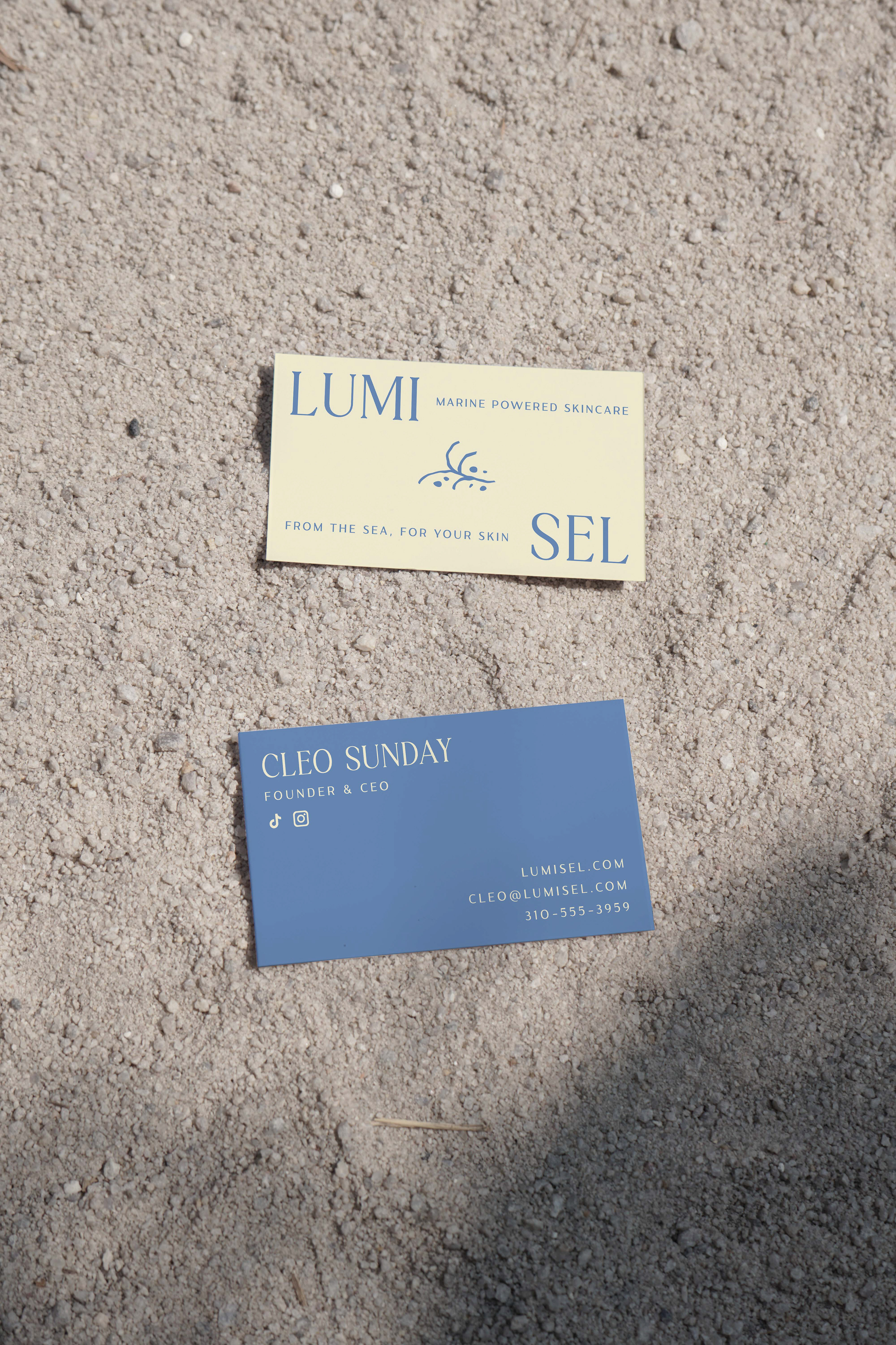
The visual branding of Lumisel evokes organic shapes inspired by the sea, while maintaining a soft and refined look. The logomark is a stripped-down image of sea kelp and pebbles/minerals found on the beach.
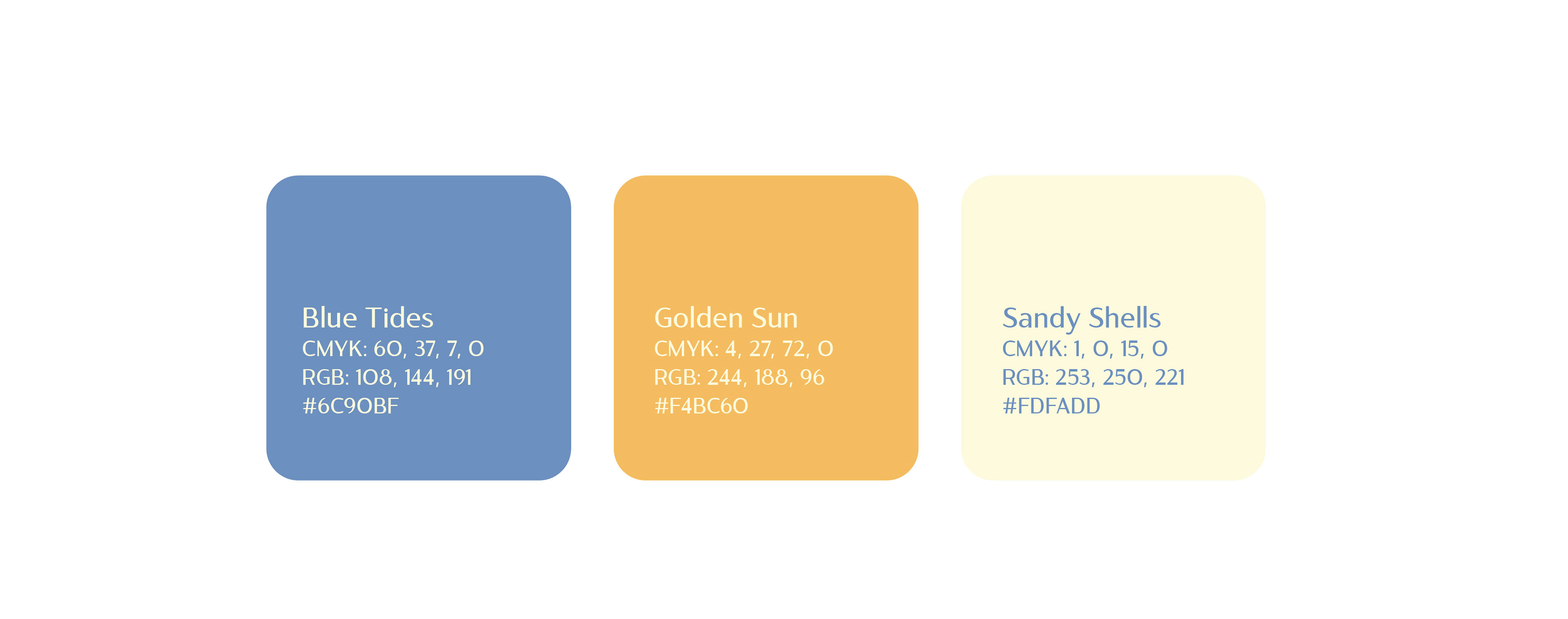
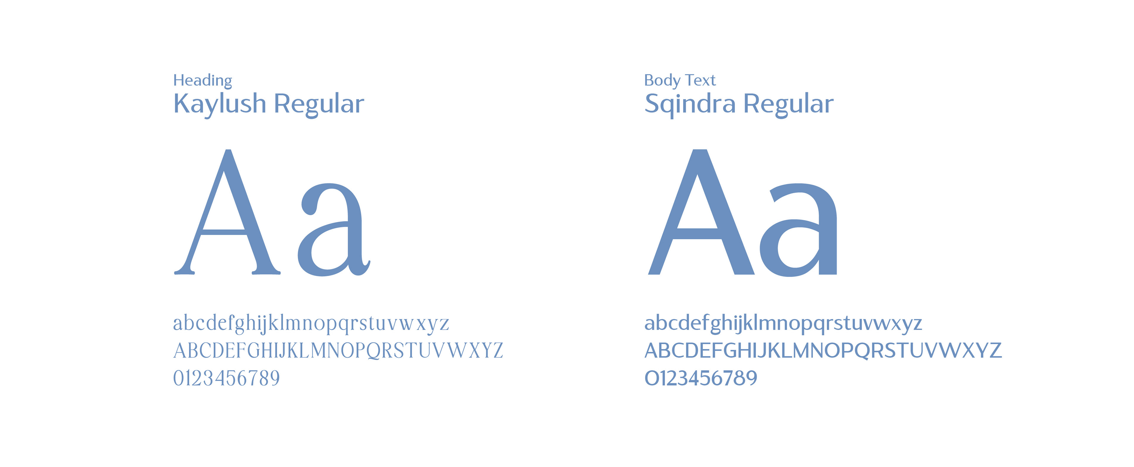
The color palette consists of the core three essentials that represent the brand: blue waves, sunset yellow, and sandy neutral. The refined look of the brand is upheld by the typography, a contrasting serif and sans-serif. The illustrations used throughout the branding include thick and thin strokes and convey the motions and organic forms of the ocean waves.

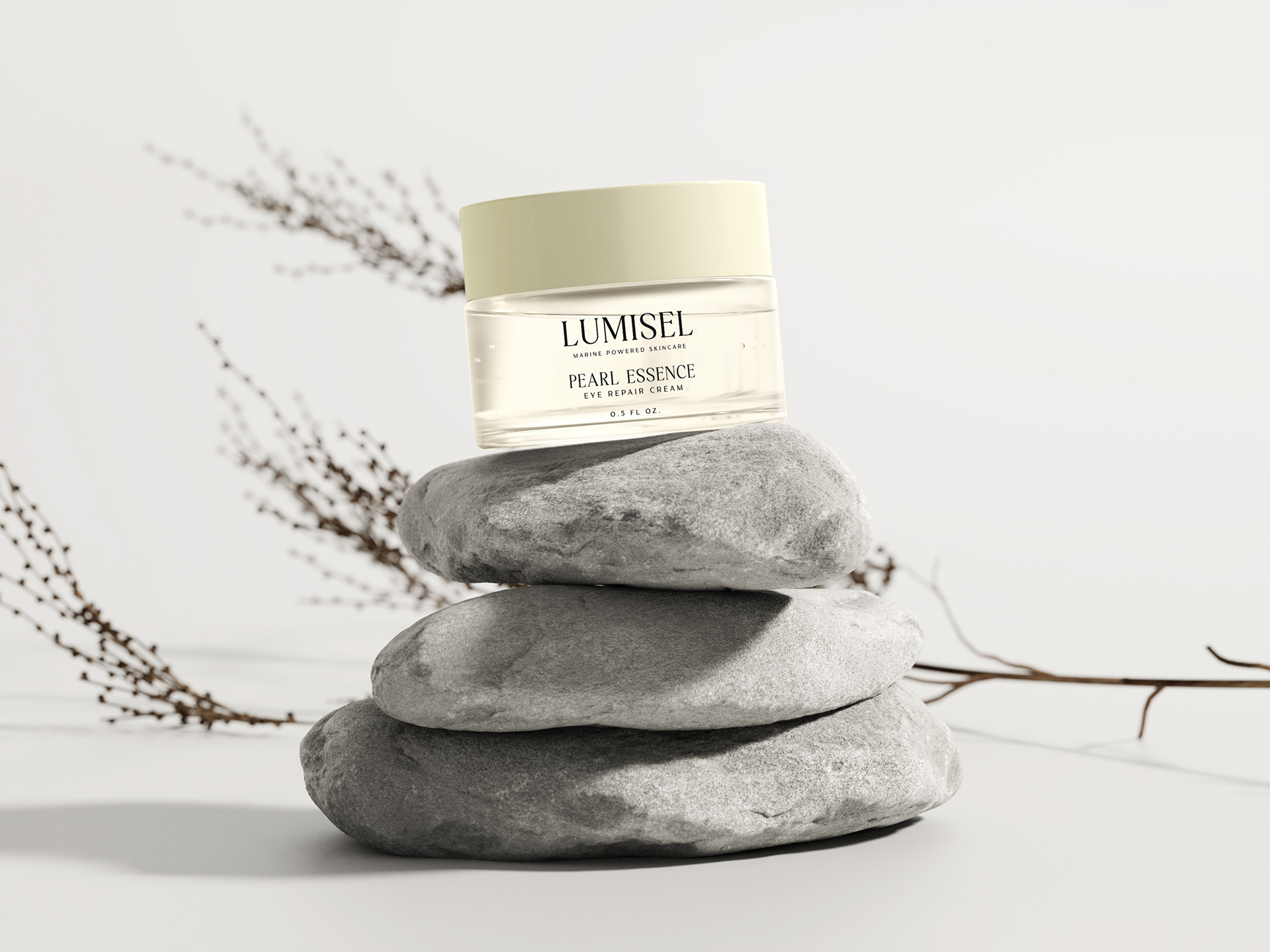
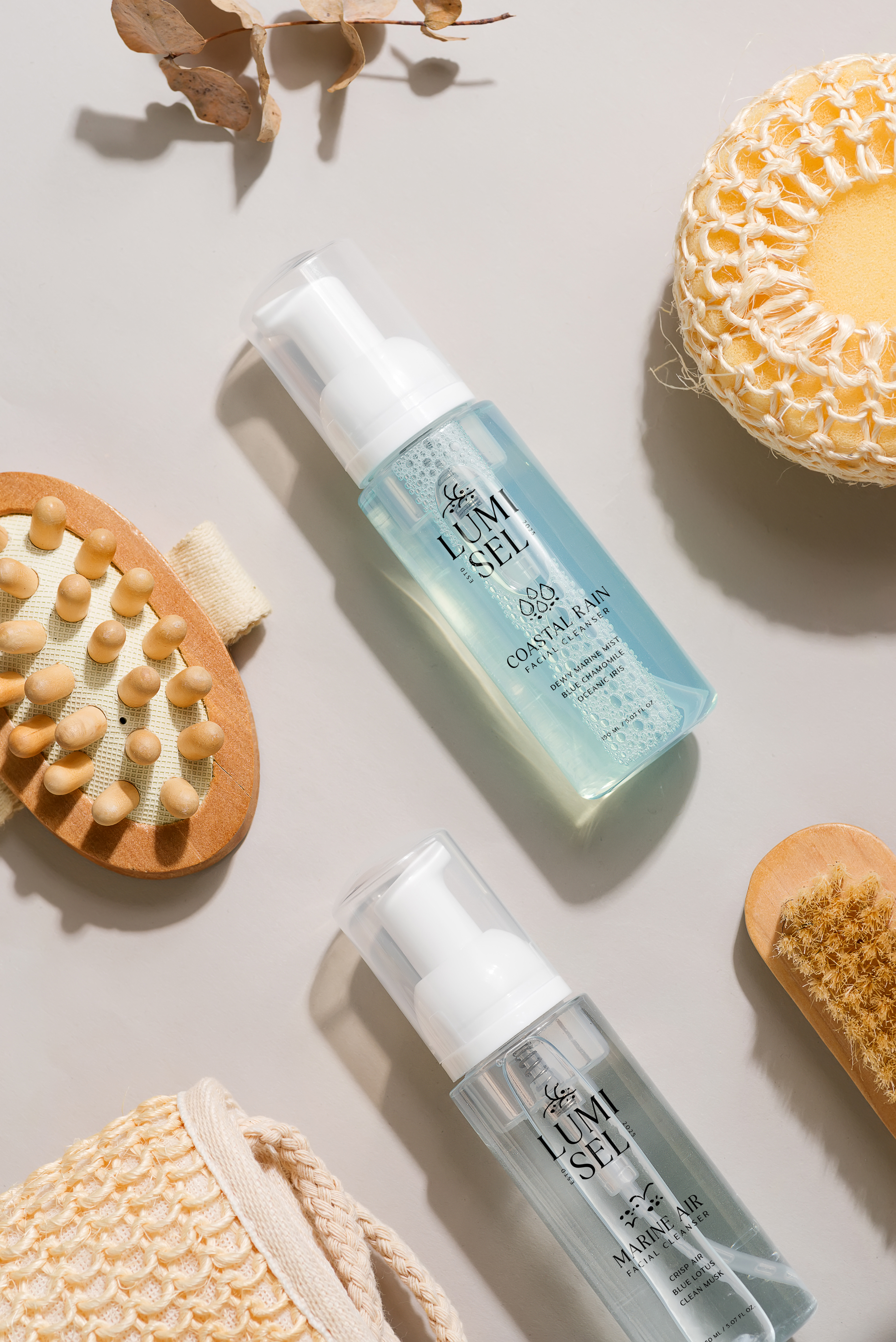

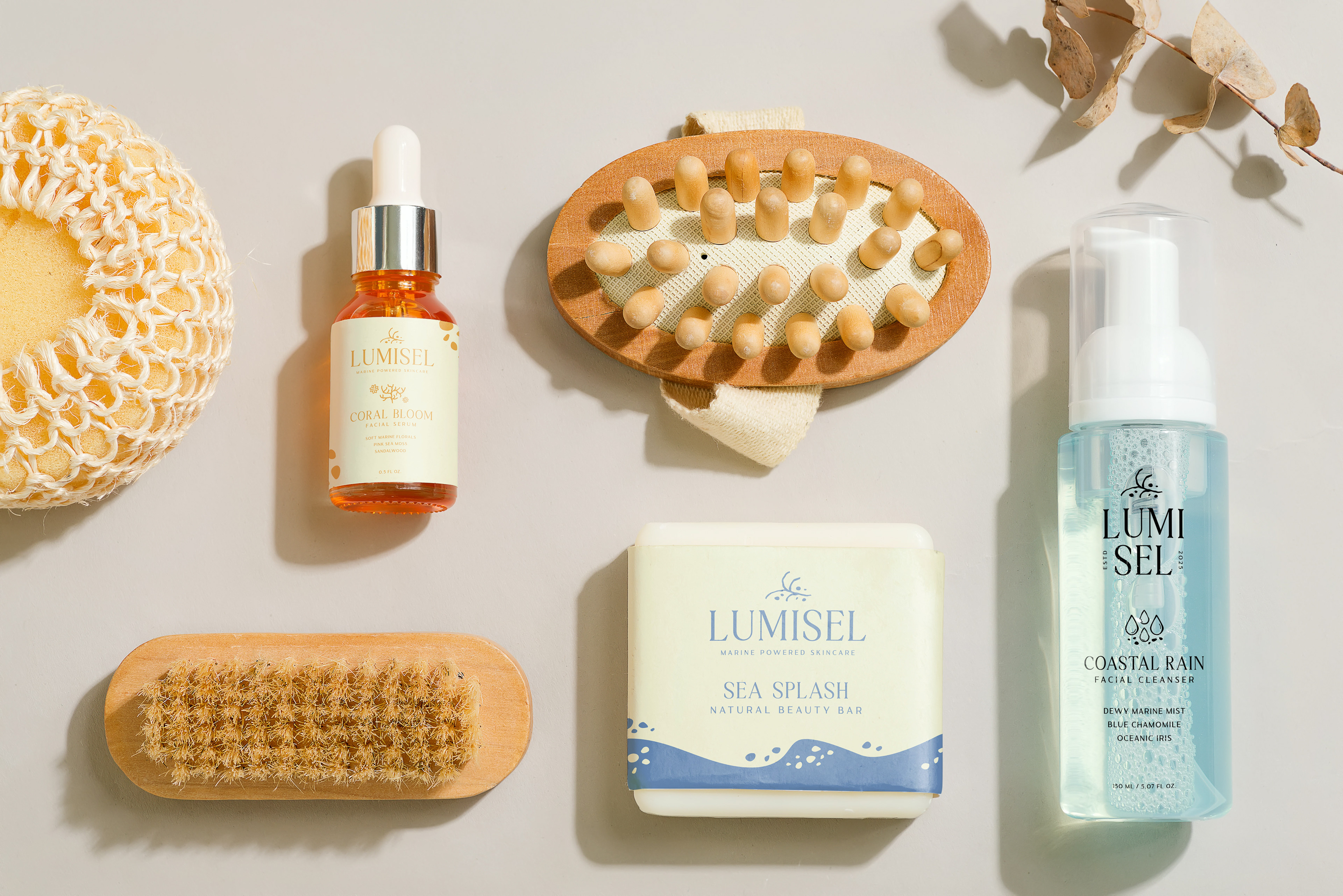
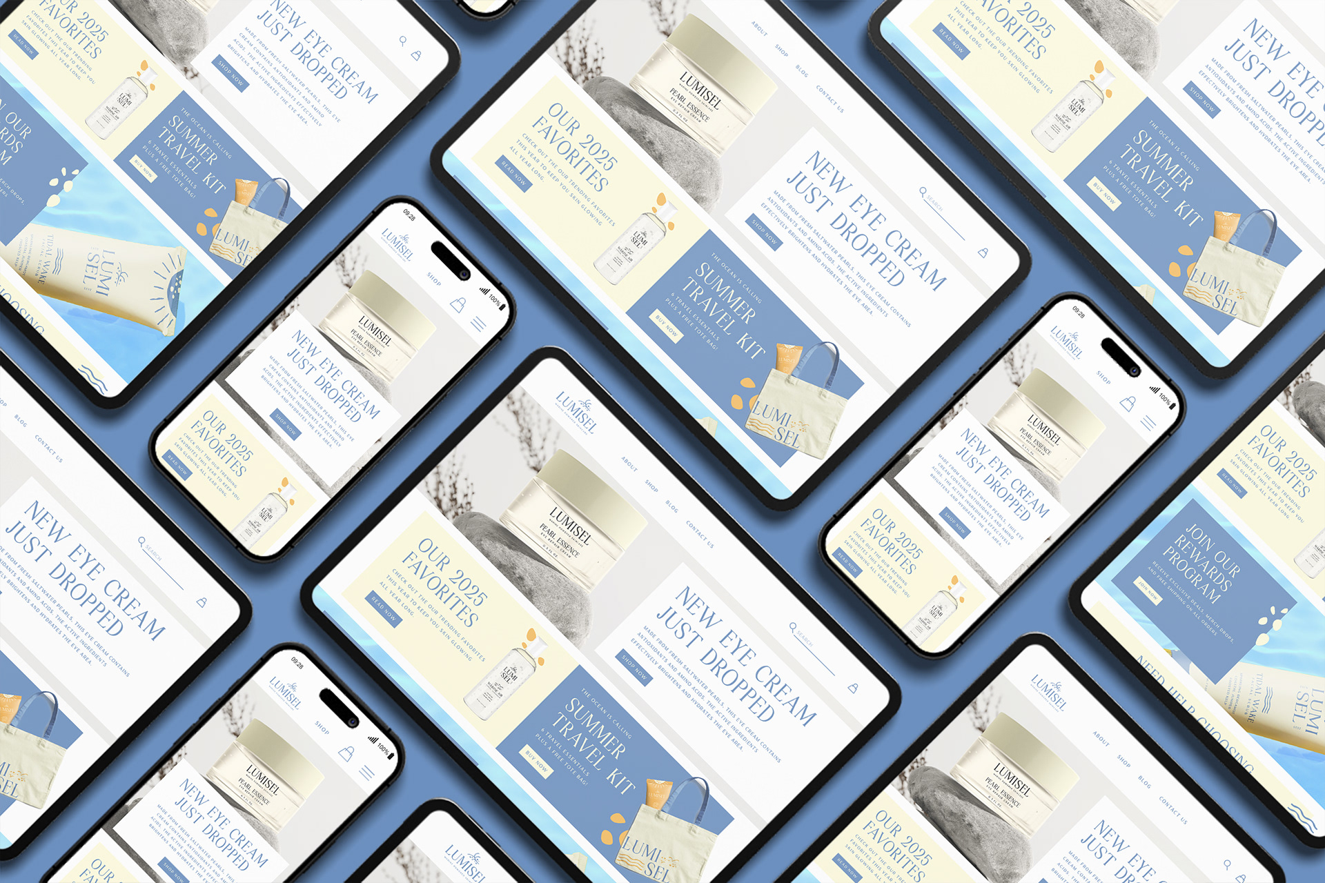


Visual assets showcased include stock mockups and photography to enhance the visual presentation of artwork made by me. All rights to those images remain with their respective creators.