Challenge
The veterinary market is crowded and visually saturated; many clinics use similar imagery. Barkside needed branding that felt fun and distinct without losing professionalism. I needed to create an identity that works both in-clinic and online. I wanted to evoke care, friendliness & warmth while maintaining credibility and clarity for services, ensuring readability and professionalism but making sure the identity didn’t lean too cartoonish.
Solution
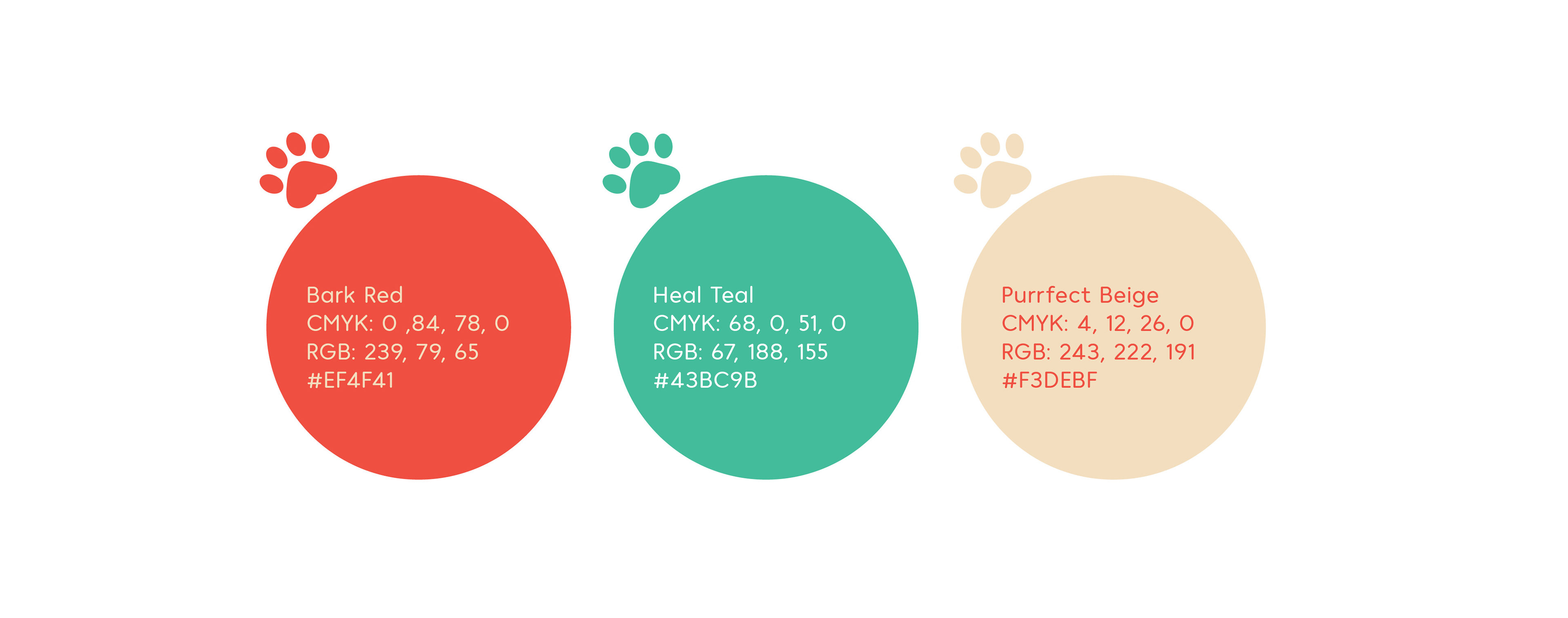
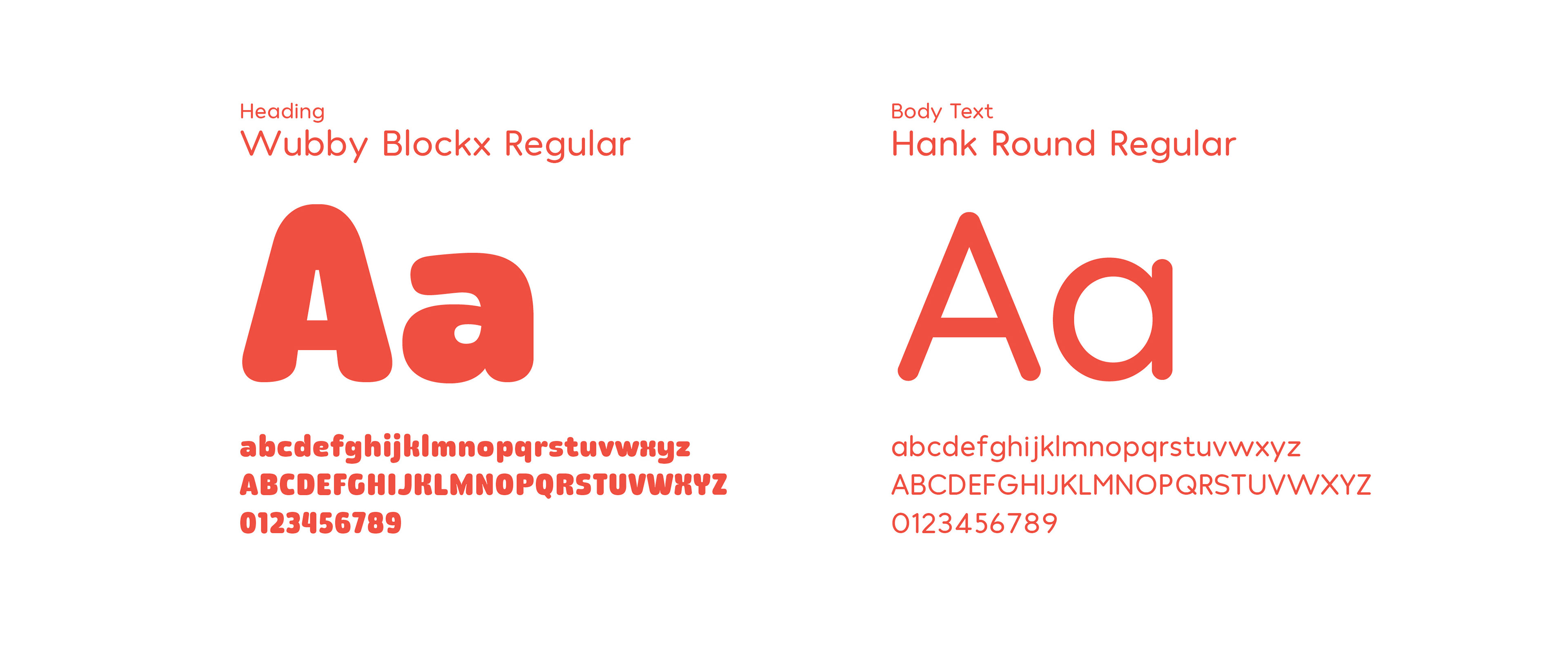
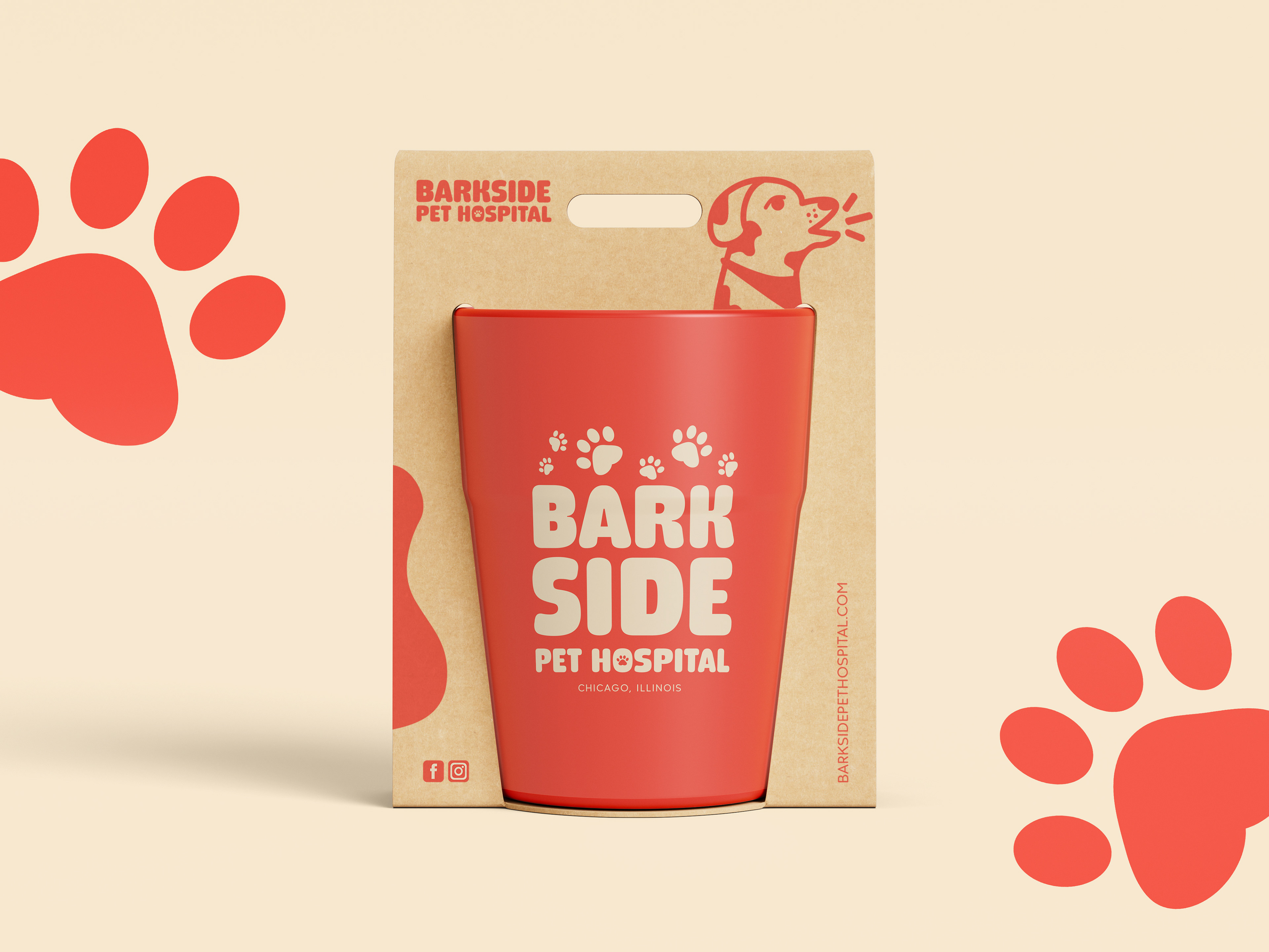
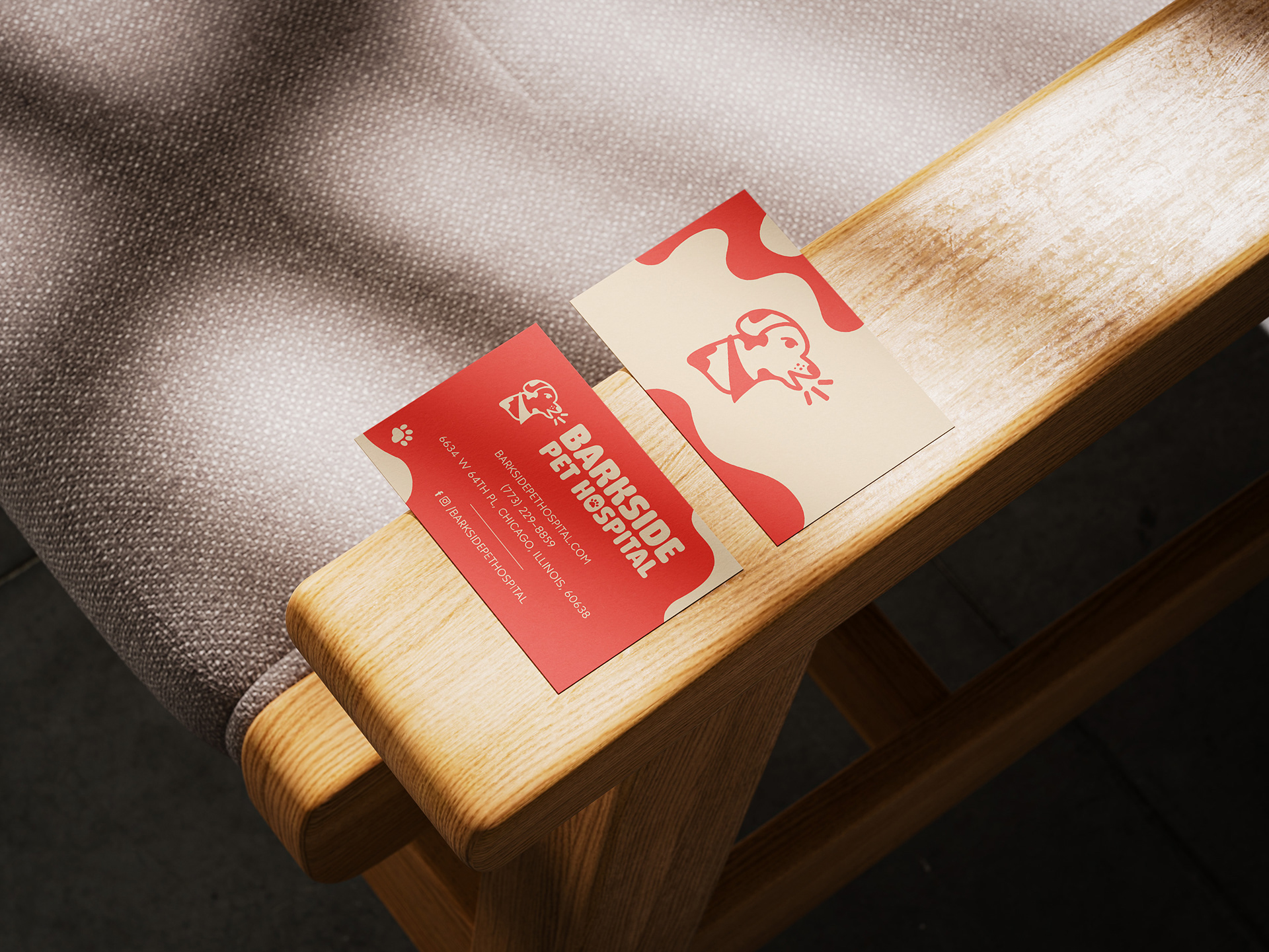
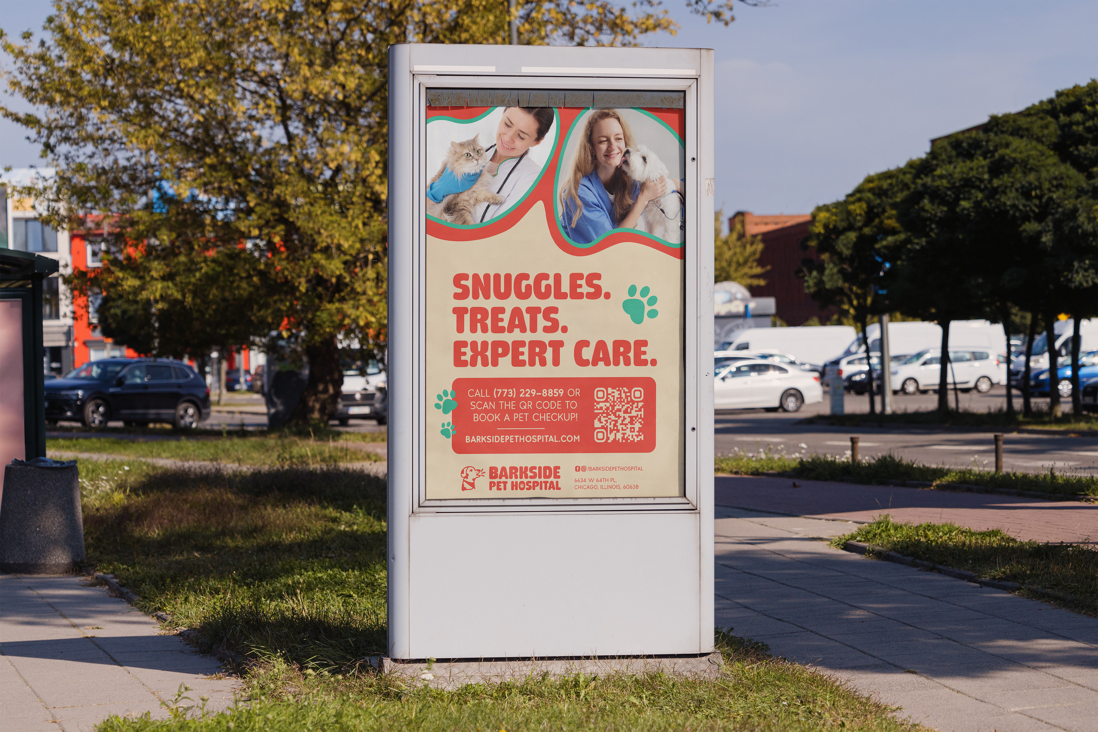
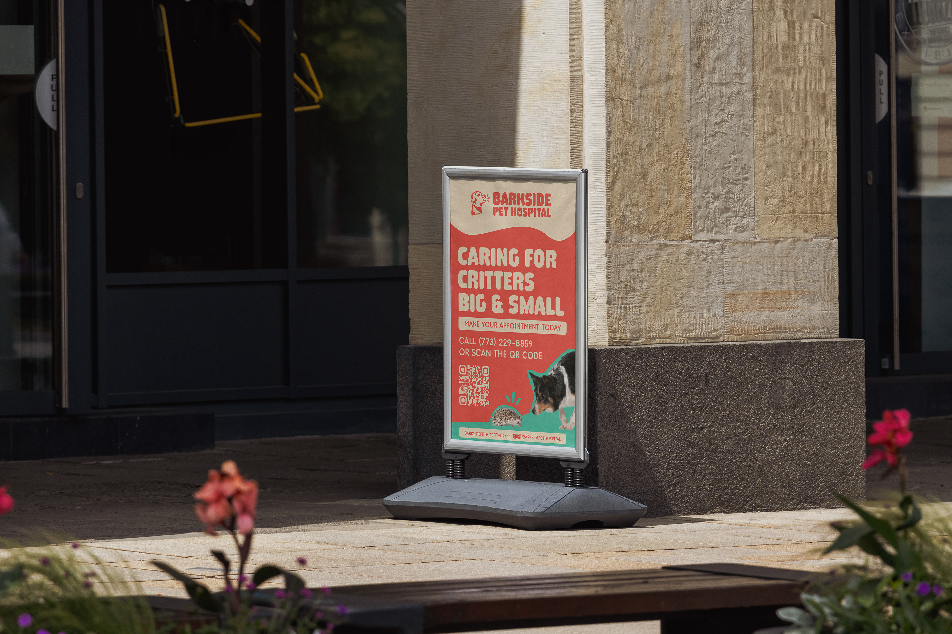
I designed a brand identity for Barkside that feels both playful & trustworthy, making sure it stands out in the local veterinary space. Brand assets were created that are scalable: whether in print, online, or in real life (merch, signage, etc.), the brand remains consistent and charming. The brand demonstrates visual uniqueness that aids memorability among competitors.

Logomark Progress
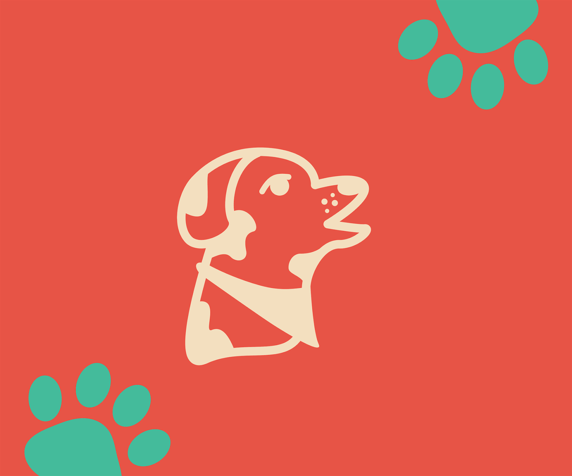
The logomark was illustrated from the sketch and continuously altered in Adobe Illustrator.

Logo Design
The logo design for Barkside Pet Hospital has a playful logomark and bold, vibrant typography. The counter of the "o" in "Hospital" is in the shape of a pawprint. I wanted the visual branding to stand out for competitors. Although Barkside has a fun visual identity, it does not compromise on their services and specialties they serve to their community of pet owners and their companions.


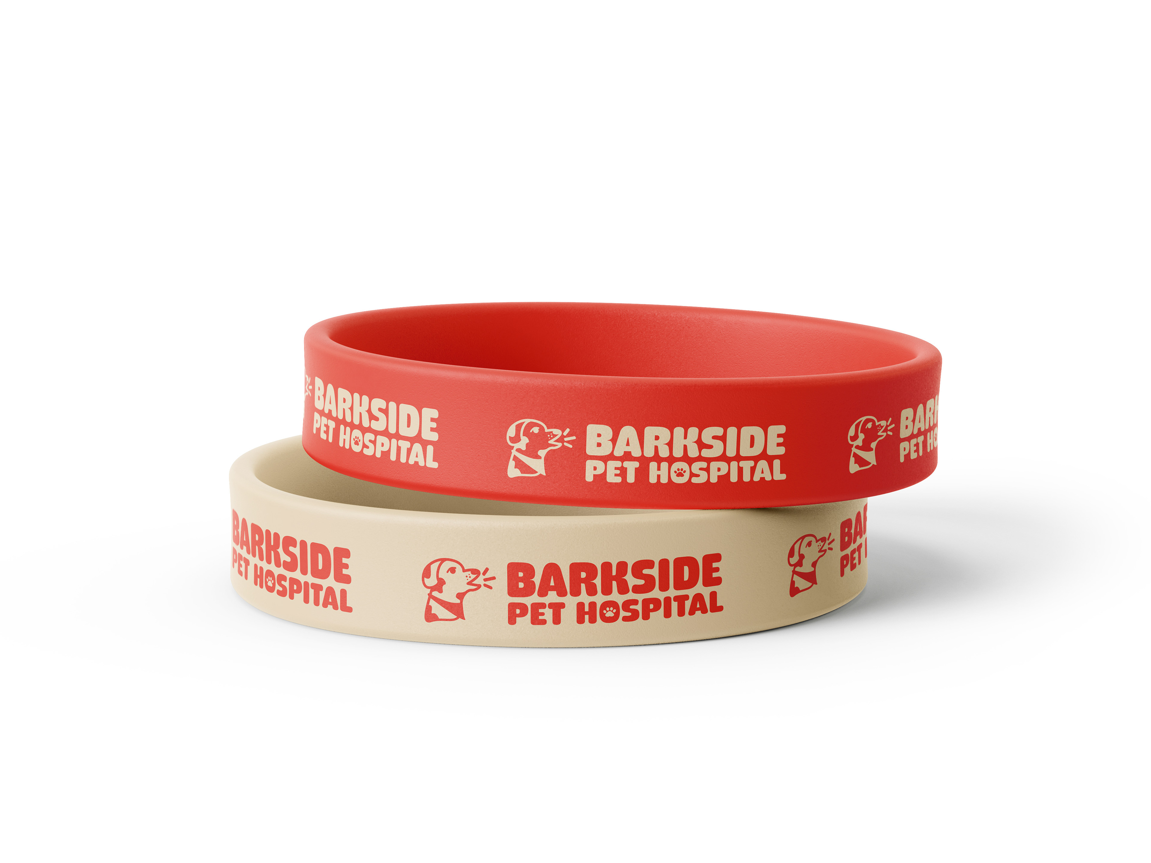


Visual assets showcased include stock mockups and photography to enhance the visual presentation of artwork made by me. All rights to those images remain with their respective creators.