Challenge
A fictional nonprofit, ActiveEd Kids, needed a cohesive brand campaign to raise awareness about children’s health and movement in schools. The visuals needed to strike a balance: professional enough to appeal to educators and supporters, but lively and approachable for families and kids.
Solution
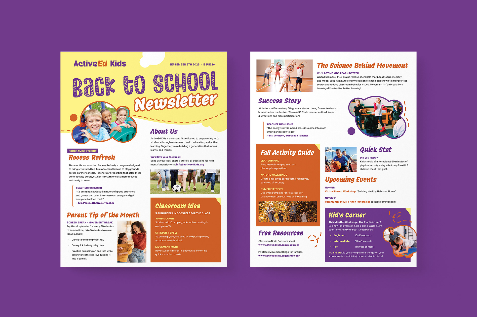
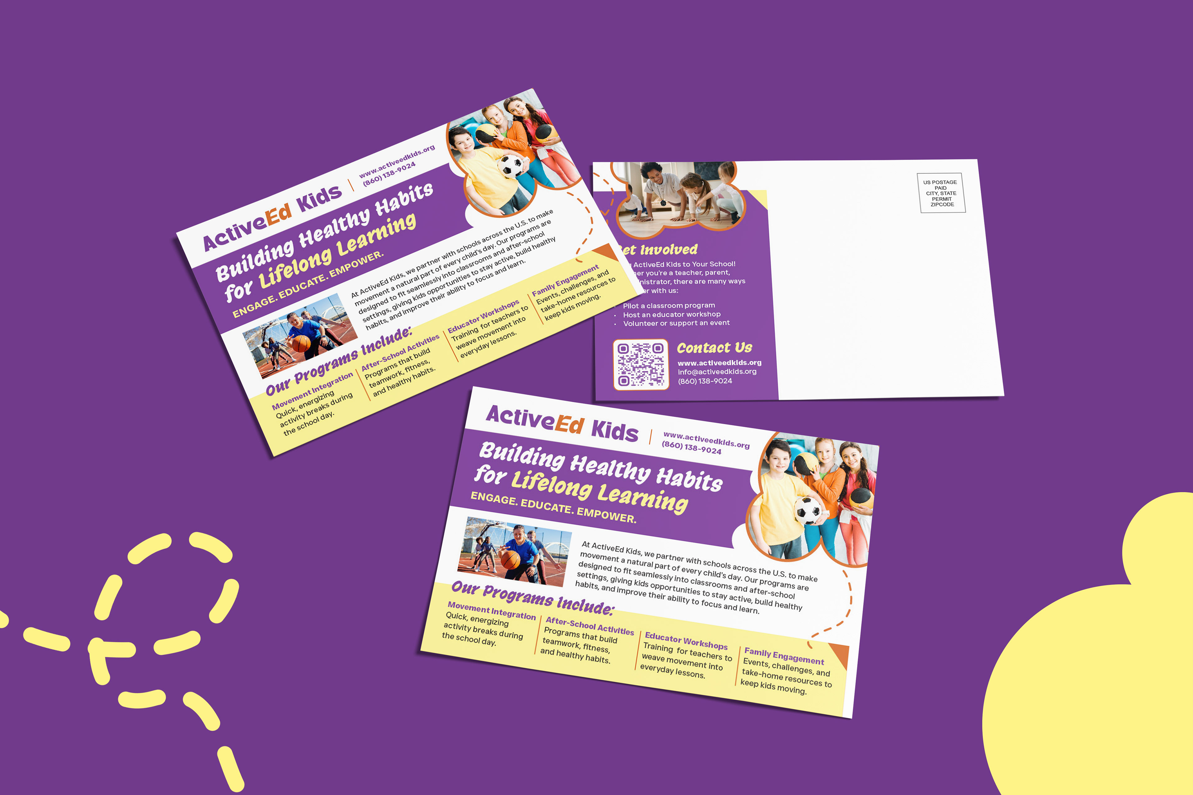
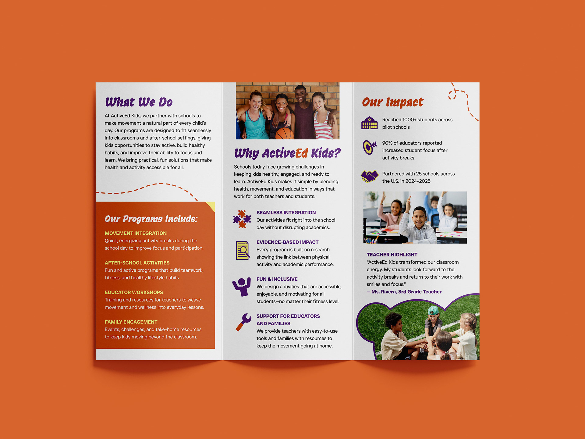
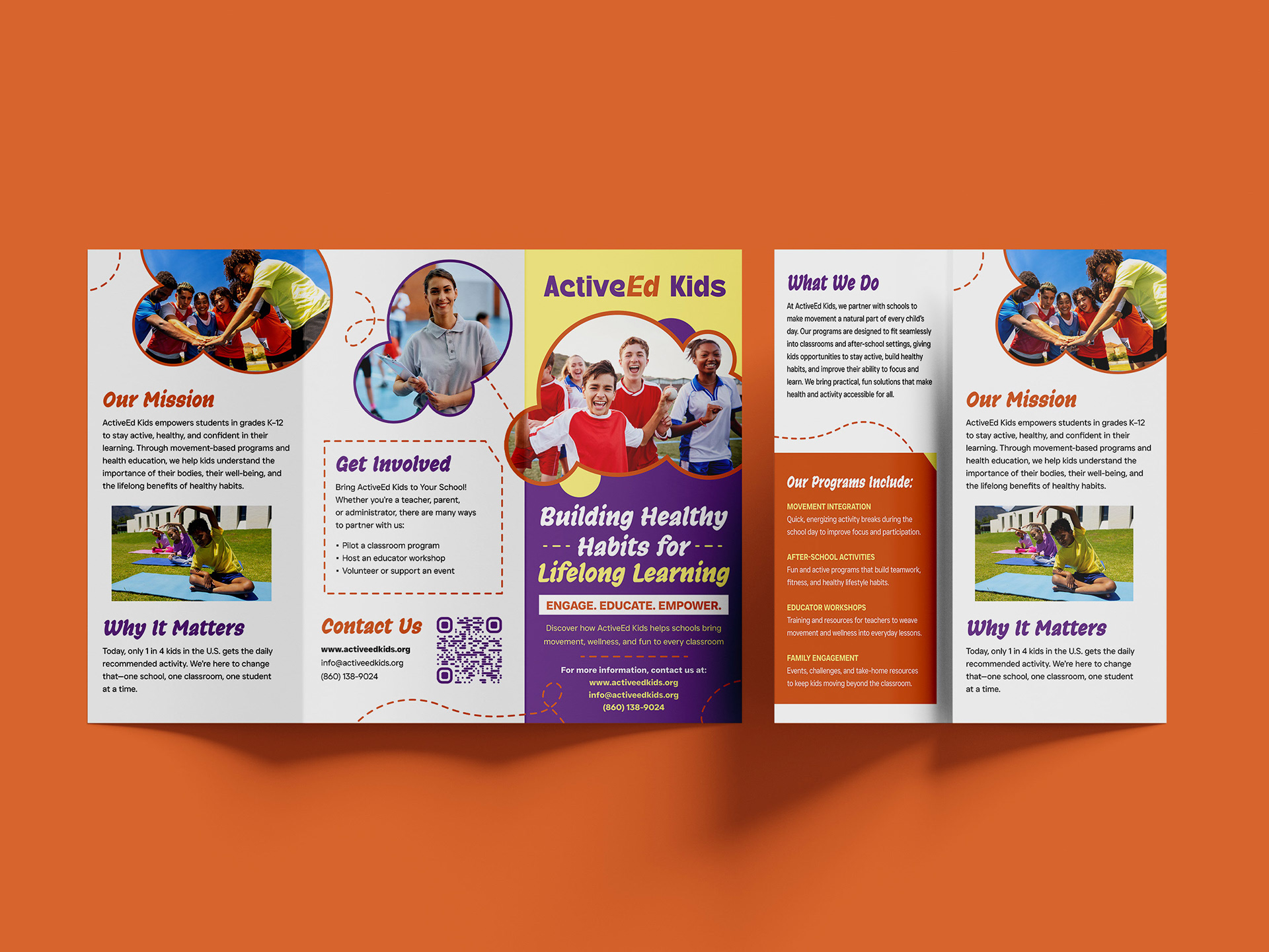
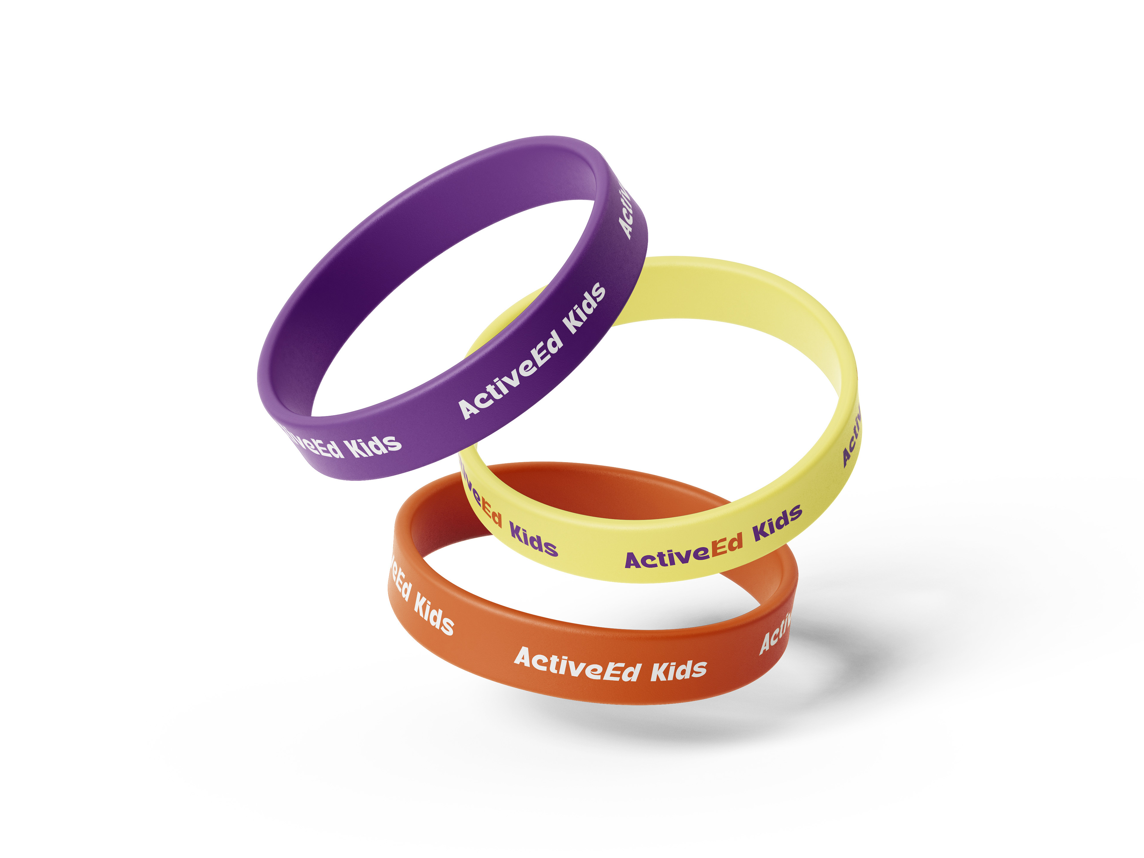
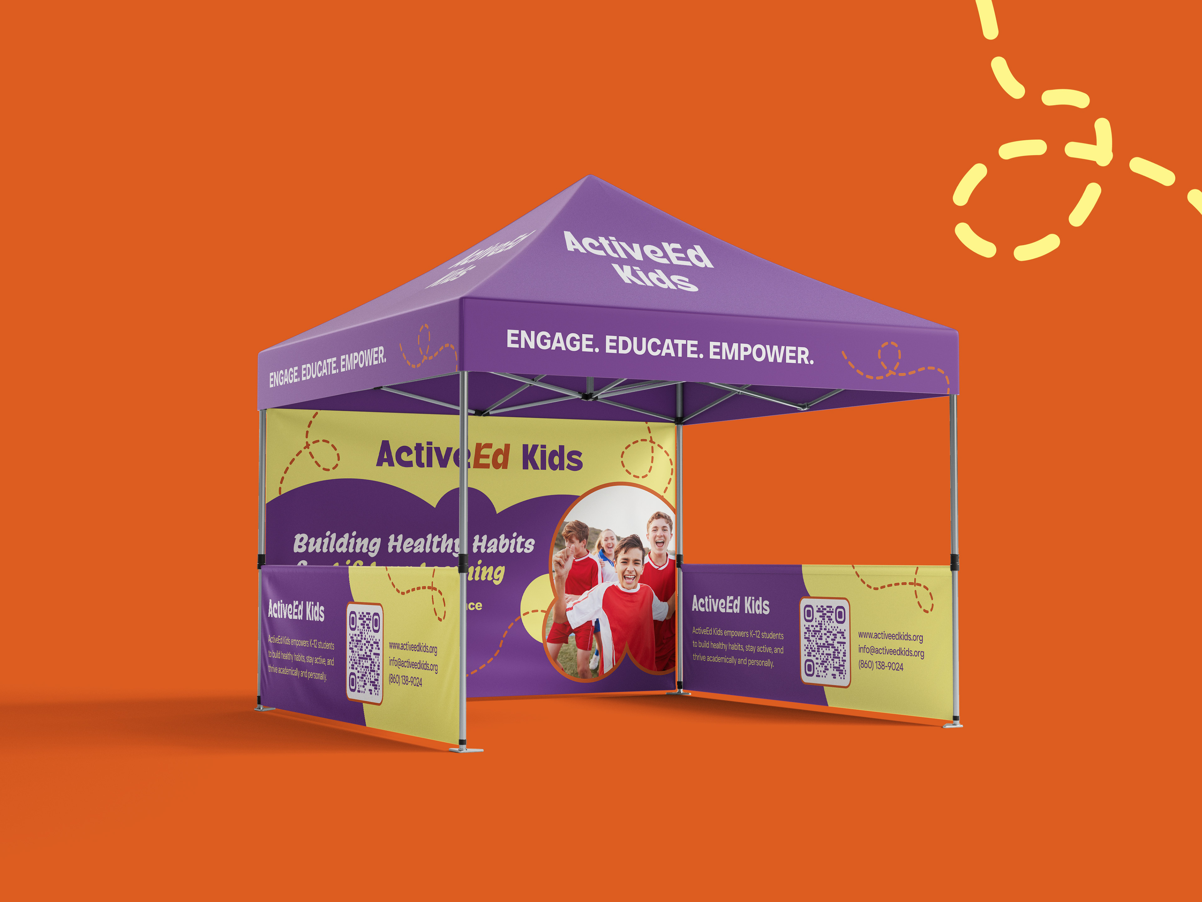
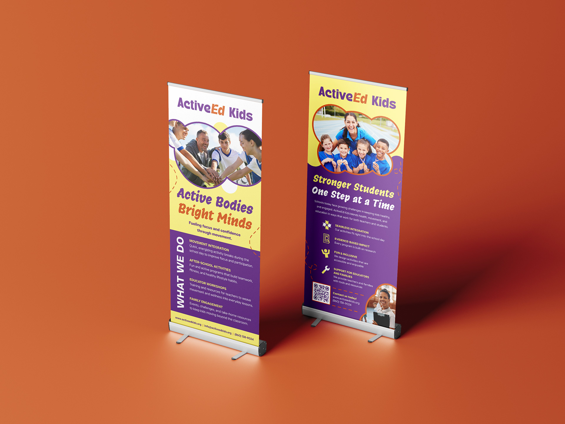
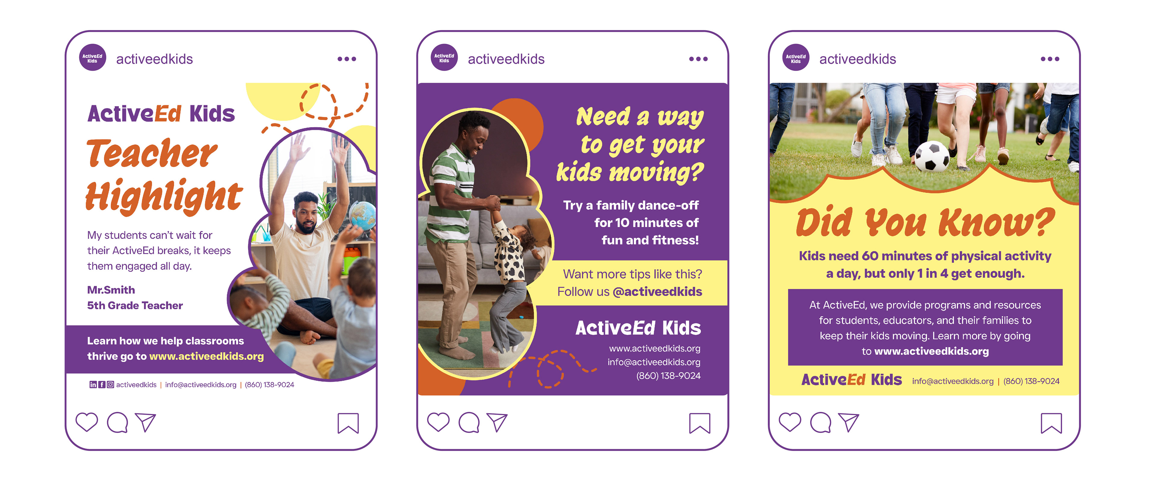
I created a unified design system with vibrant colors, playful yet professional typography, and engaging imagery of active kids. Using this style guide, I developed print collateral with clear layouts and approachable visuals, informational presentation slides geared towards educators and parents, and digital assets for online engagement.
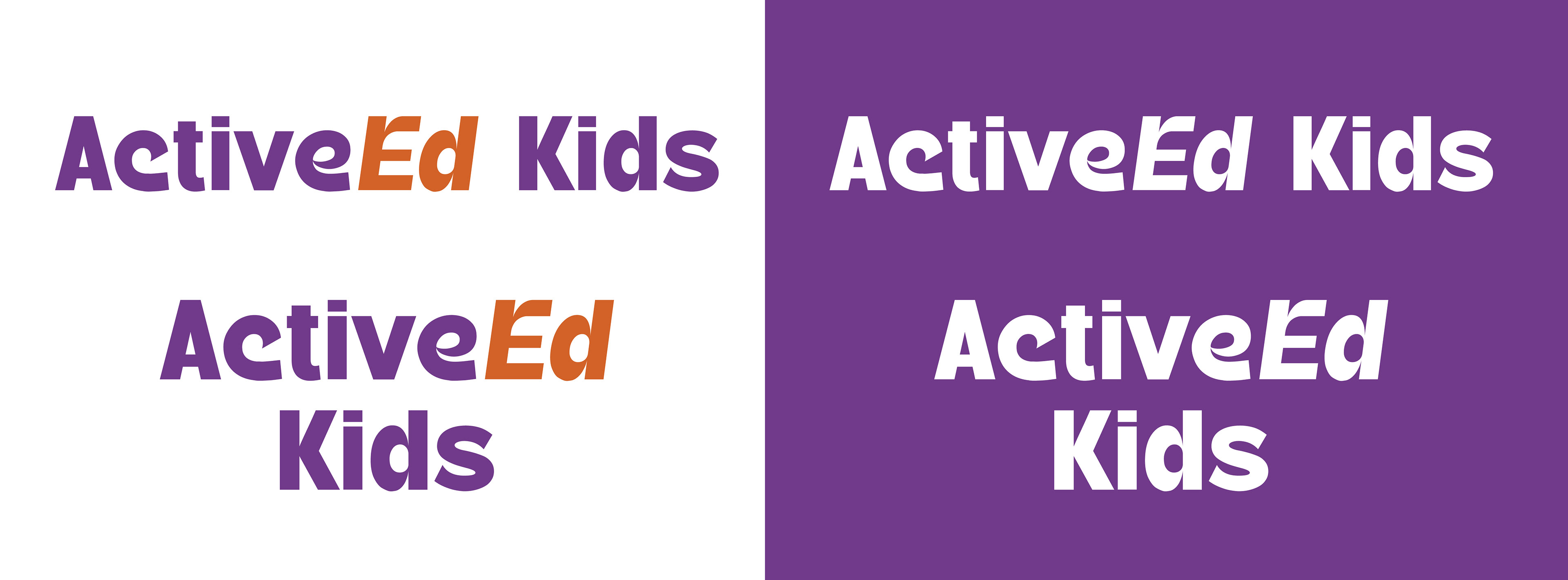
Logo Design & Branding
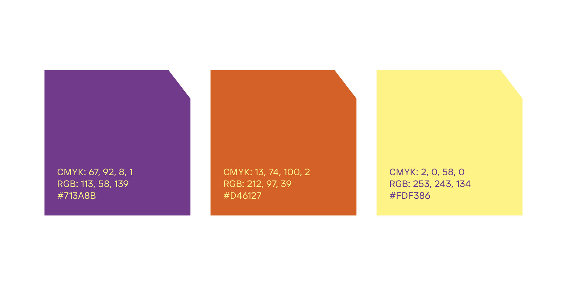
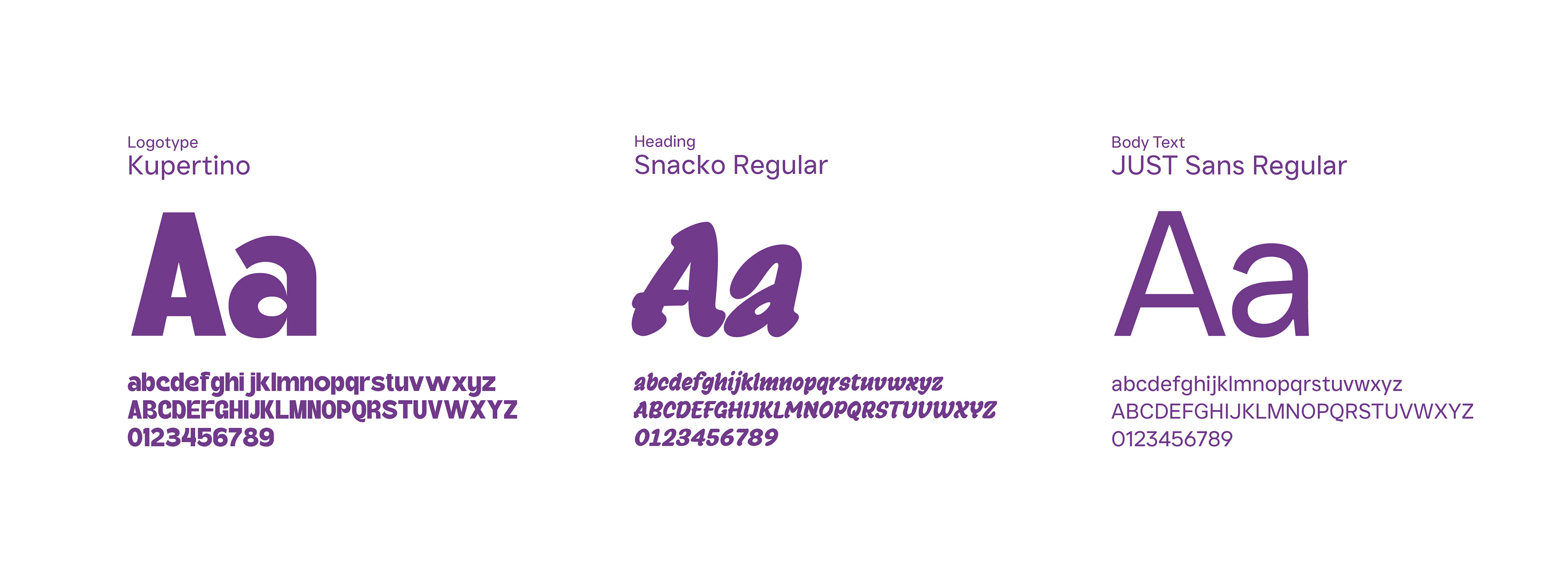
For the logotype, I wanted to use a font that was bold, yet readable and recognizable from a long distance. To add emphasis, I skewed the "Ed" and made it a different color. For the branding colors, I wanted to use purple which signifies creativity and orange for energy. An accent light yellow was added for contrast. The typography was chosen to compliment the logotype on any branded material, so a thick handwritten font was used for the headings, and a readable sans-serif was chosen for the body copy.

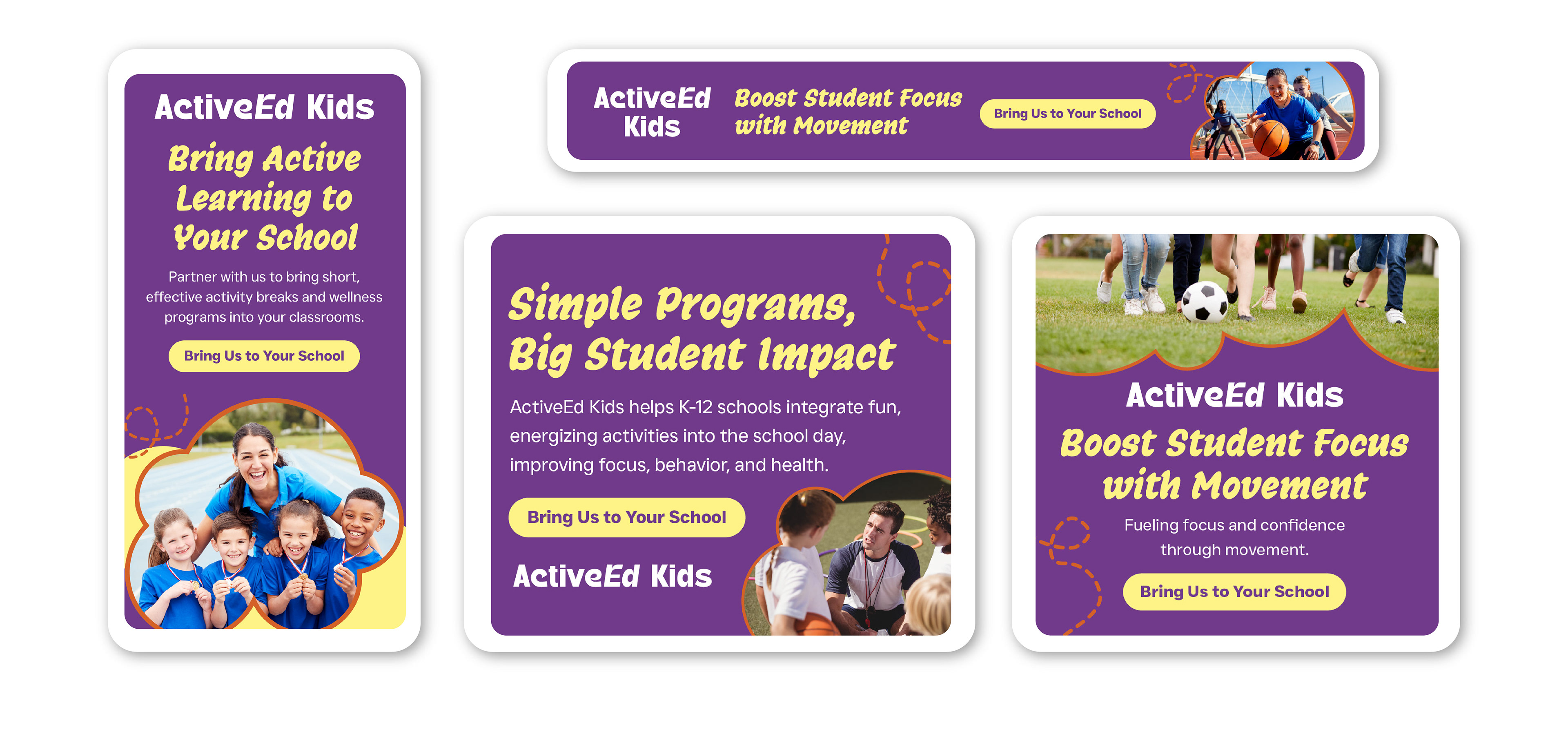
Google Display Ads
Ads in different sizes geared towards educators.
Presentation Deck Design
12 slides designed to educate teachers and parents about the importance of the programs ActiveEd Kids offers.

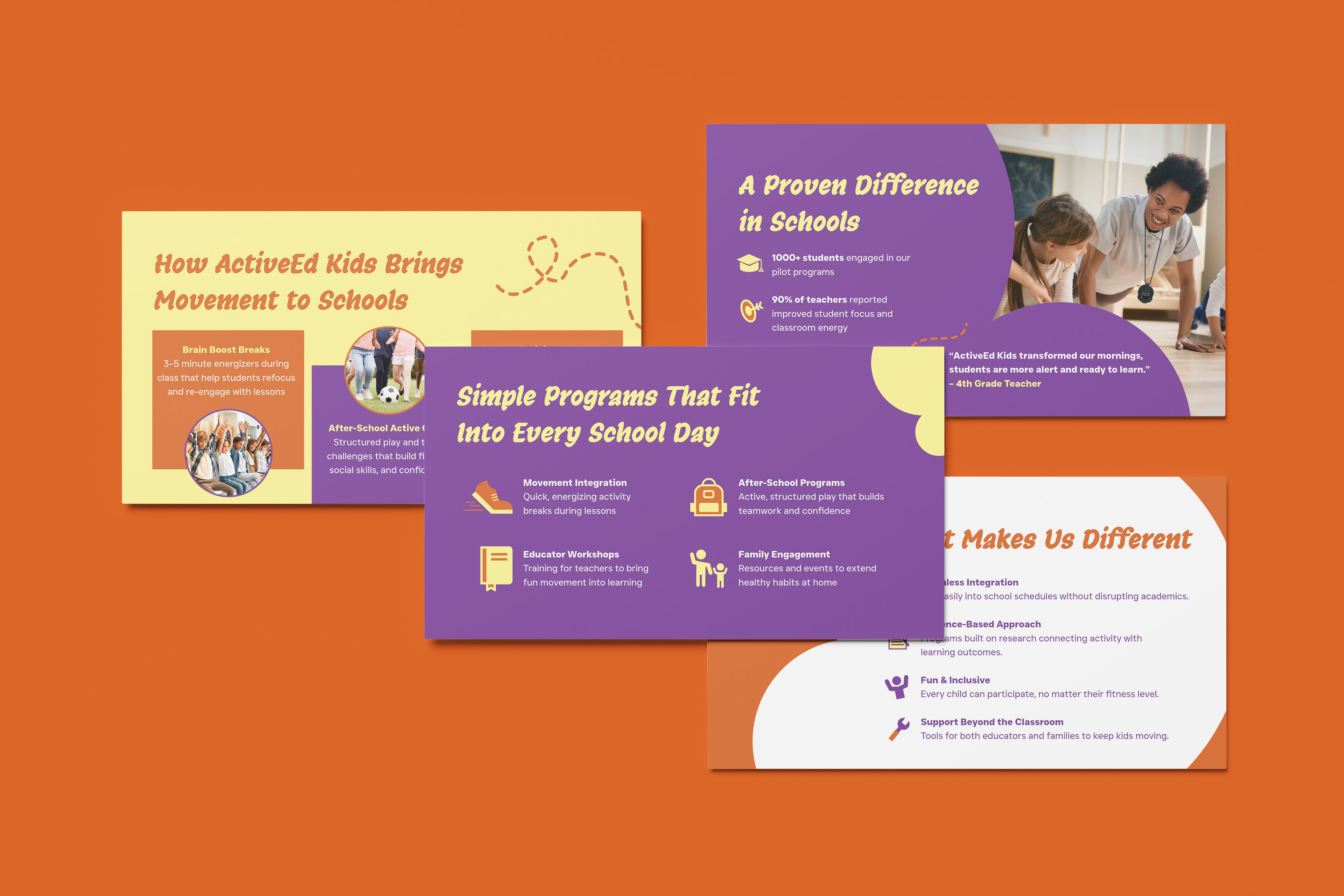

Visual assets showcased include stock mockups and photography to enhance the visual presentation of artwork made by me. All rights to those images remain with their respective creators.