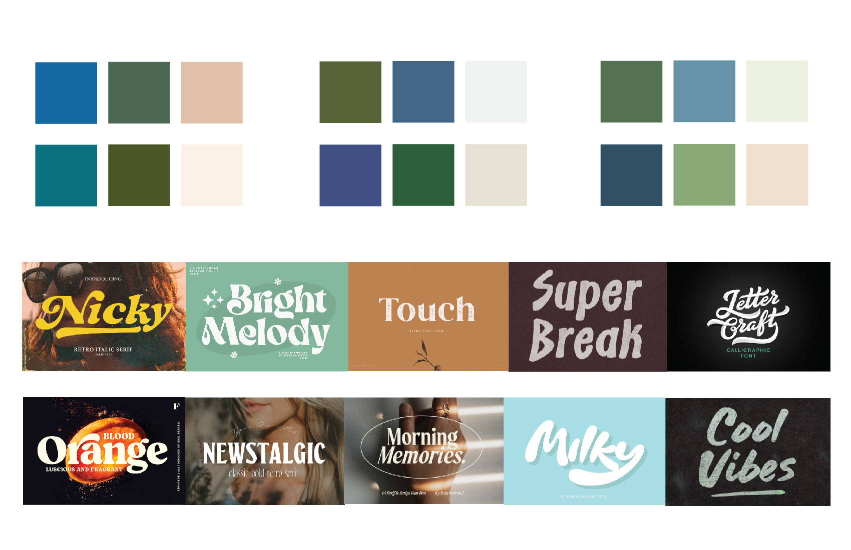
Moodboard
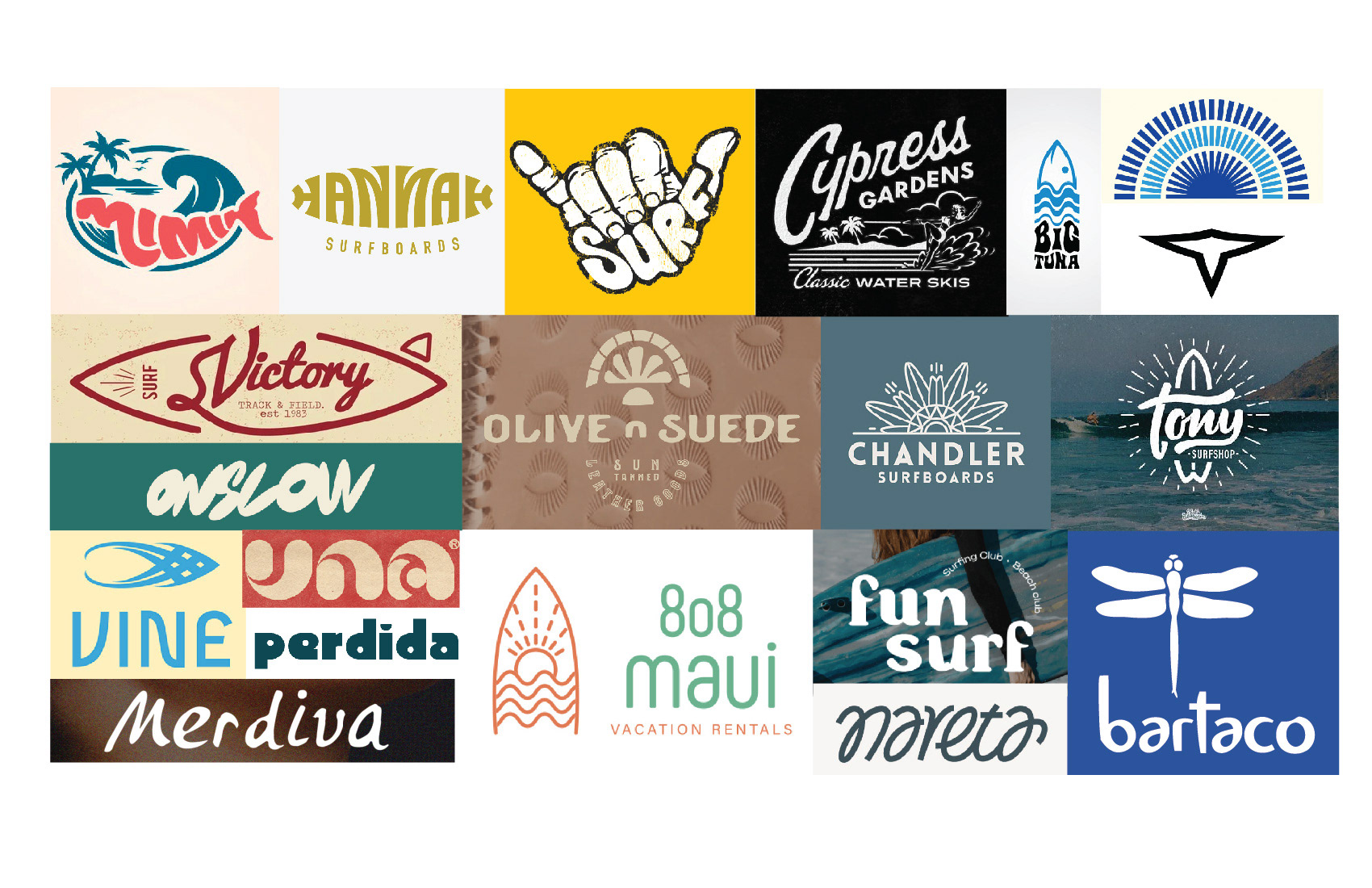
Before redesigning the logotype, I initially underwent a full logo process for them. For inspiration, I looked at retro and brush typography and creative ways to incorporate surf elements. These moodboards were shown to the client to gain more insight to what they wanted before designing the logos.
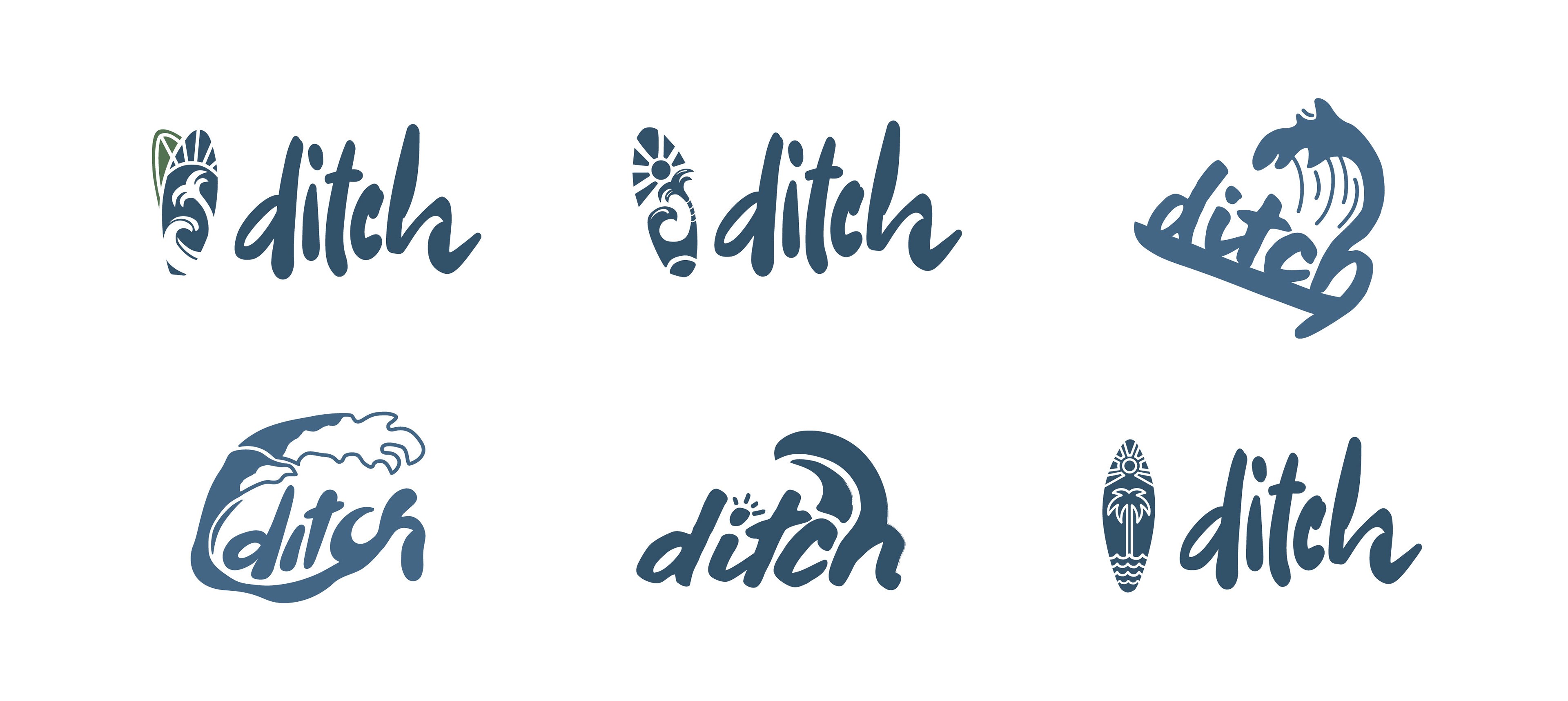
Unused Logo Concepts
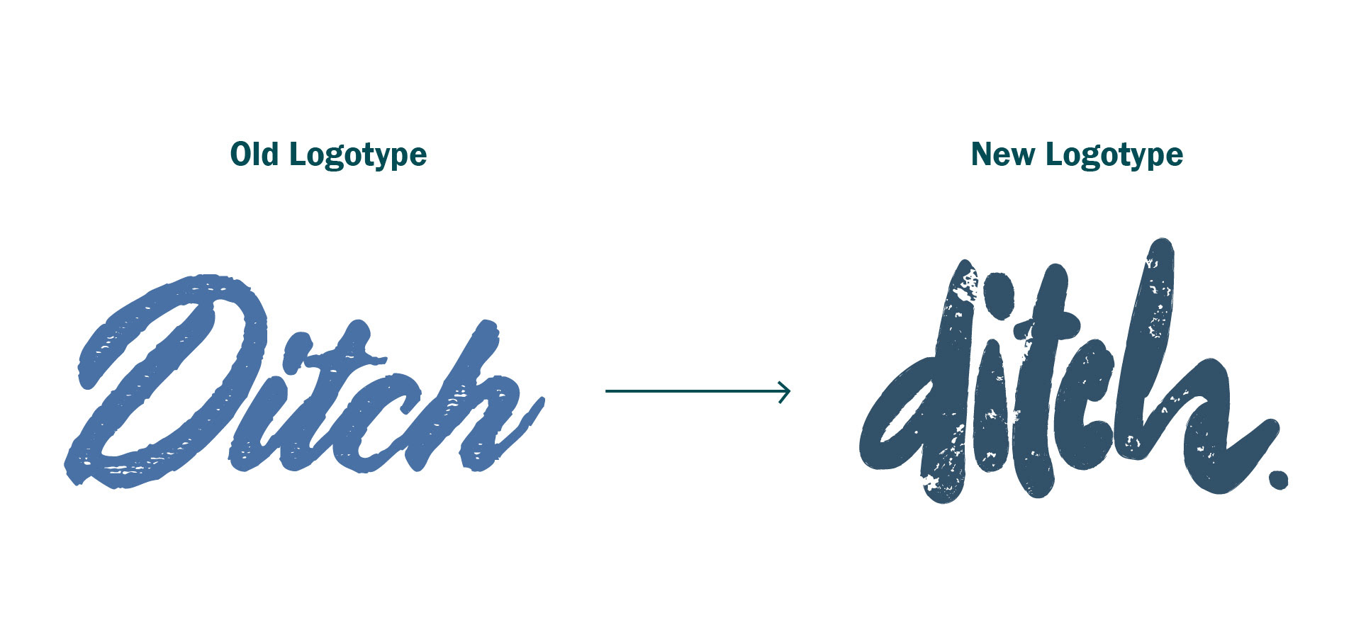
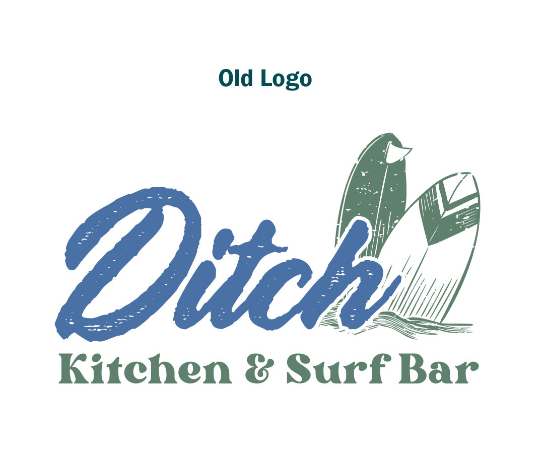
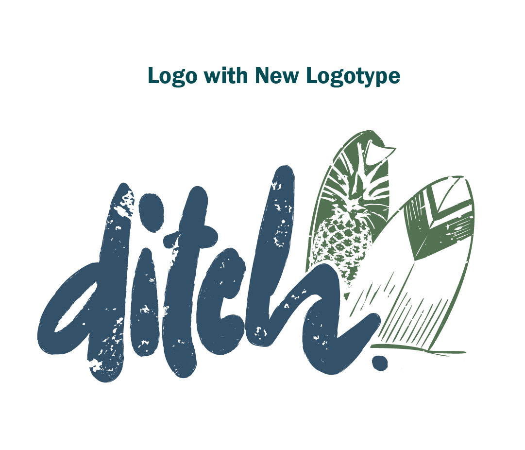
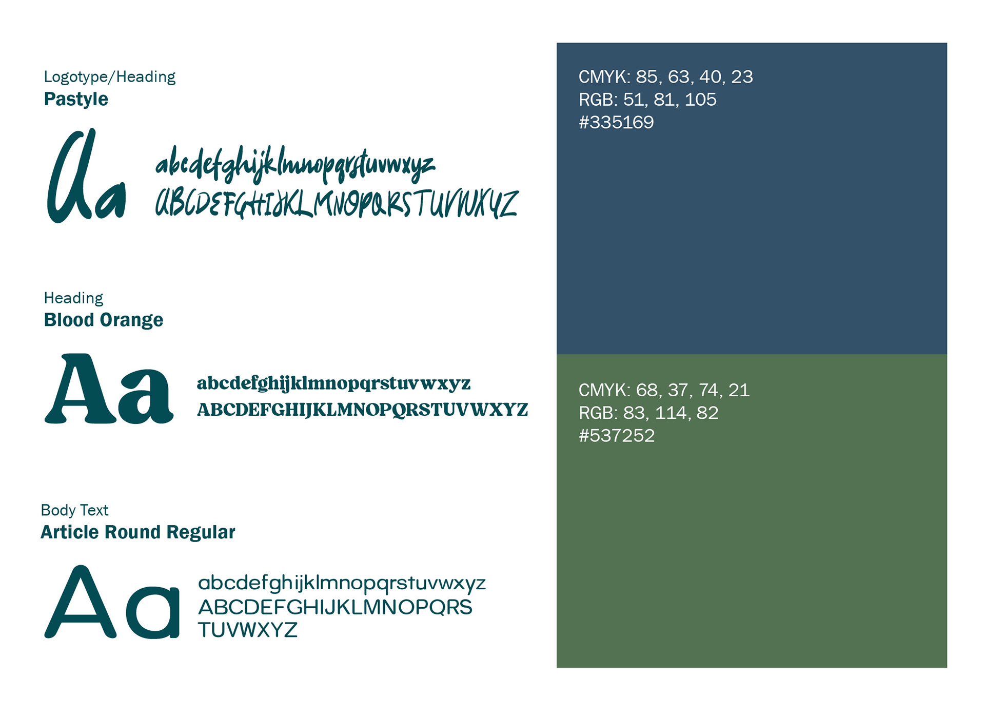
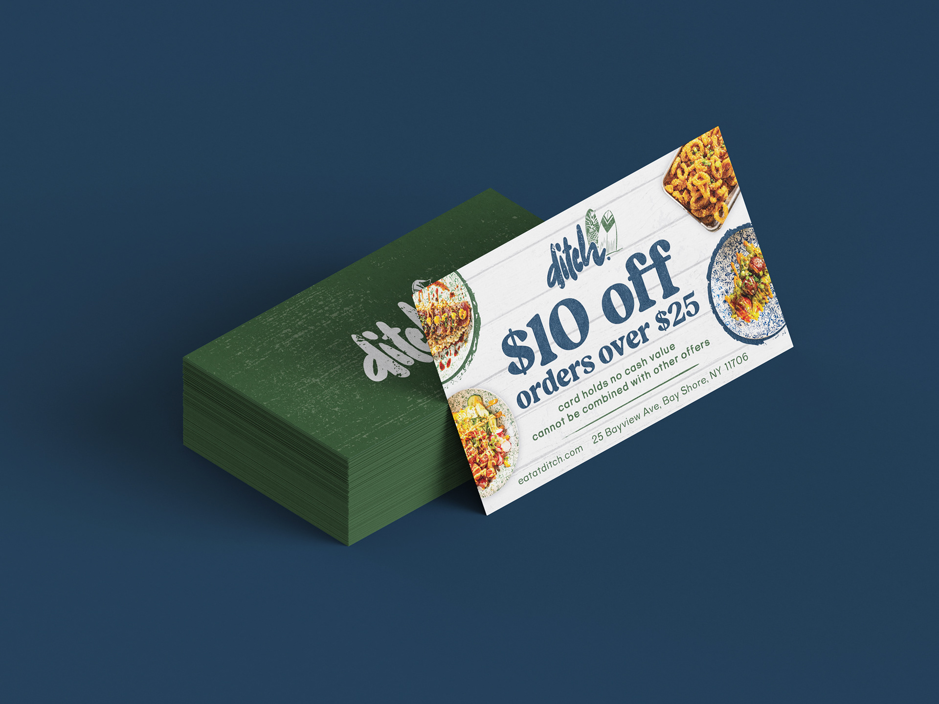
The final logotype includes a gritty look, similar to their original logotype. The client wanted lowercase type to go with a more casual vibe. A font was chosen and carefully altered so the counter of the "h" was shaped like an ocean wave. Besides the logotype, new fonts were chosen to be used in their new branding style that reflect a vintage and approachable aesthetic.
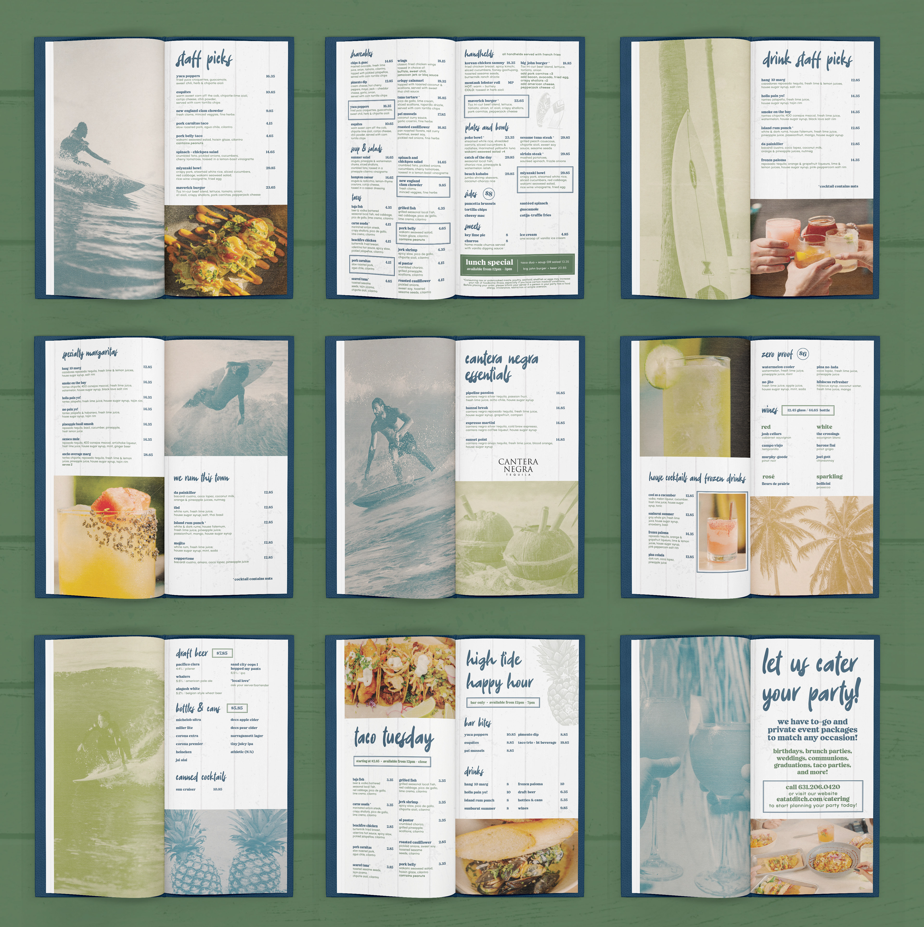
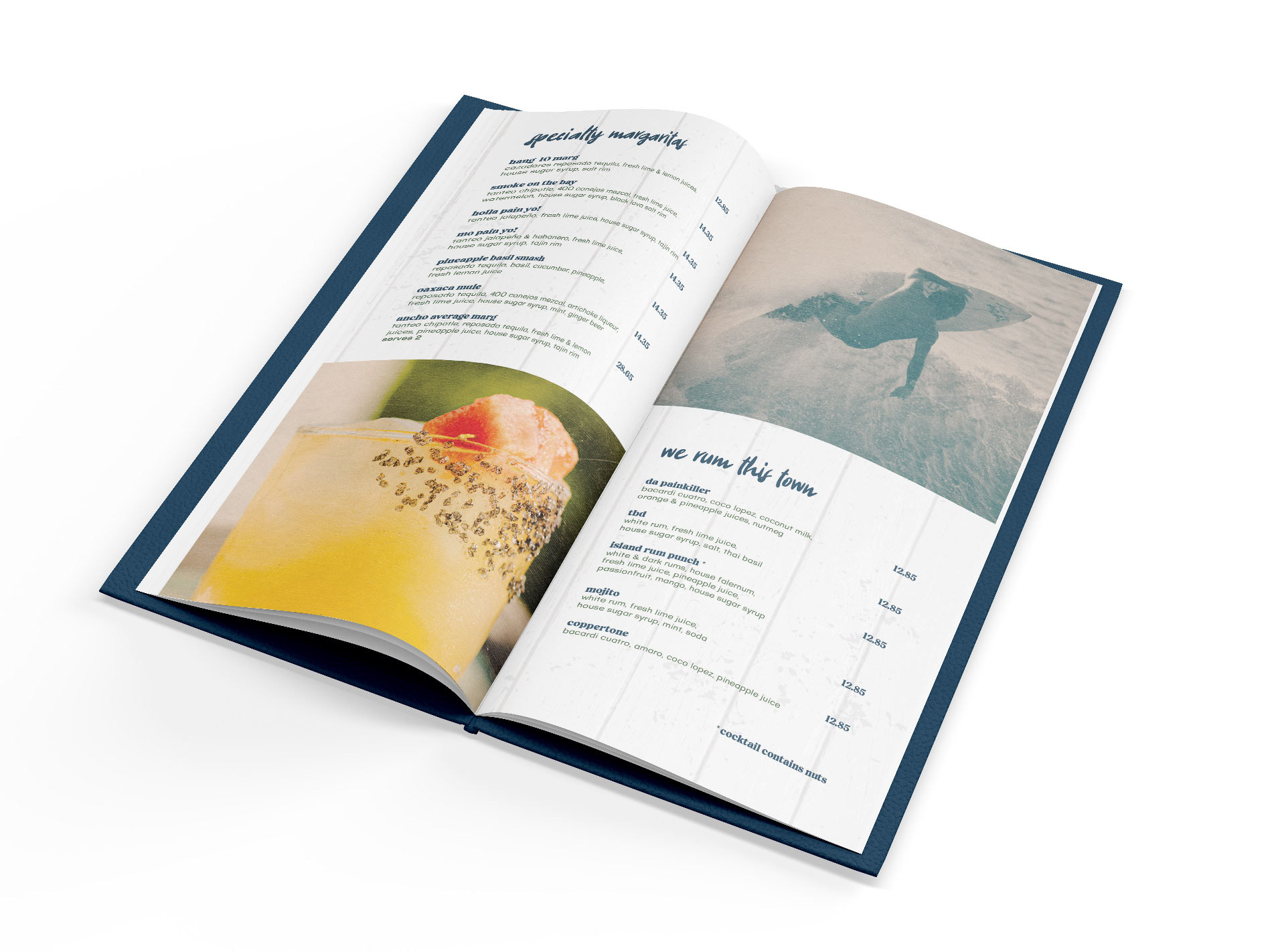
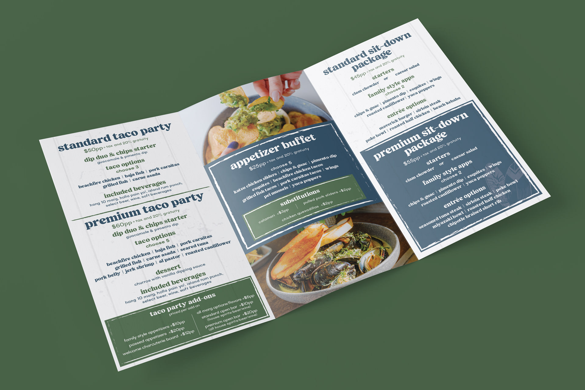
Print Collateral + Advertising
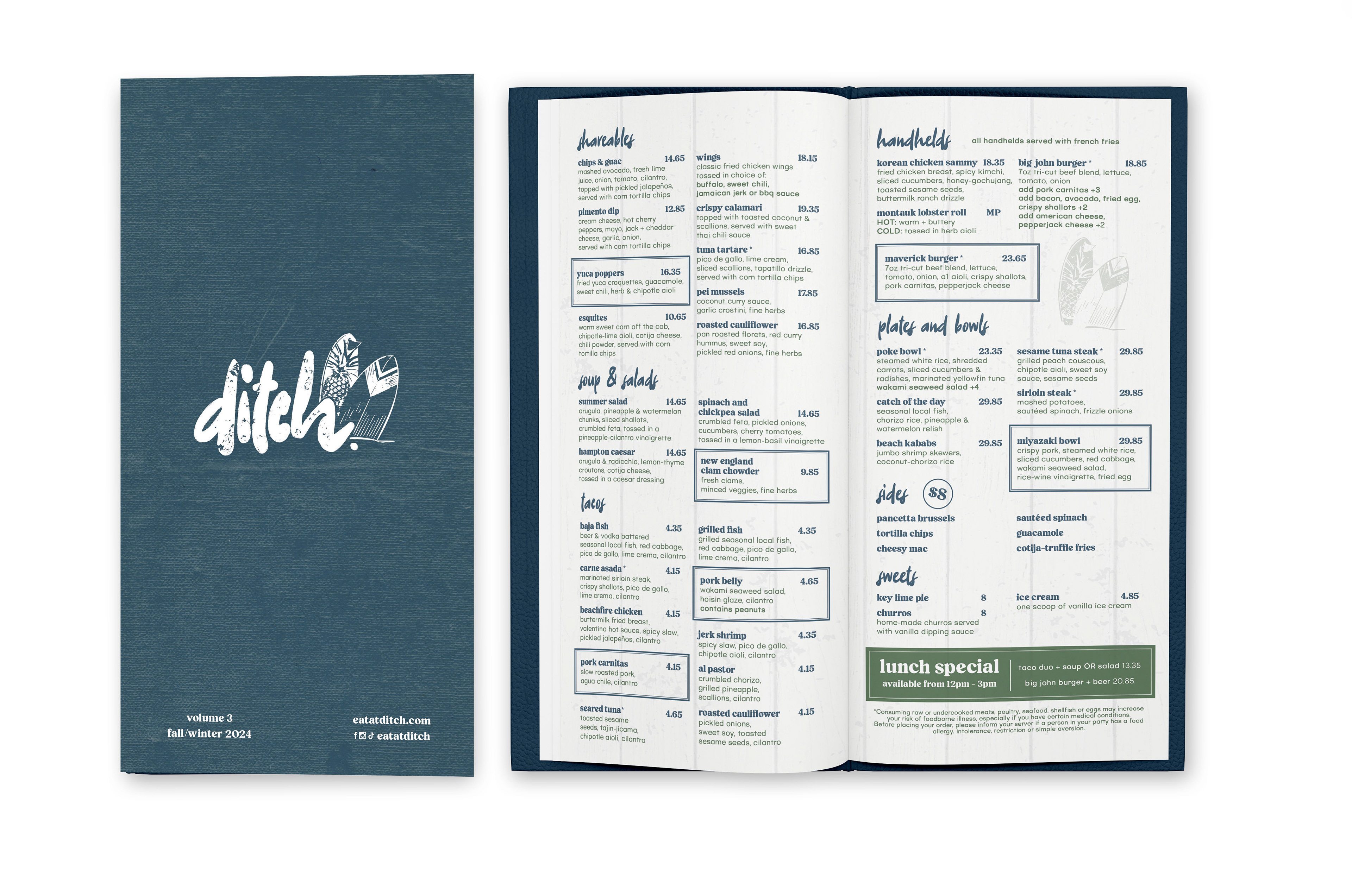
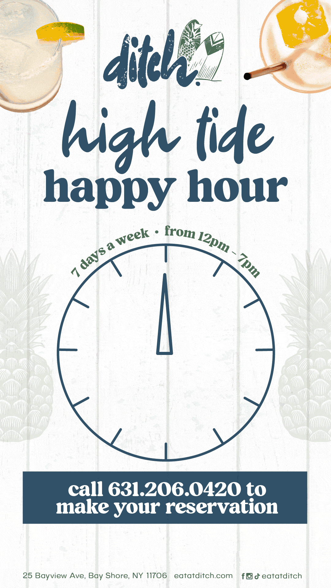
For print collateral and advertising, I selected slightly rough textures and overlayed these effects on their photography as well as relevant photos of surfers and beach themed items like pineapples and palm trees that exude the retro surfer theme the client wanted.


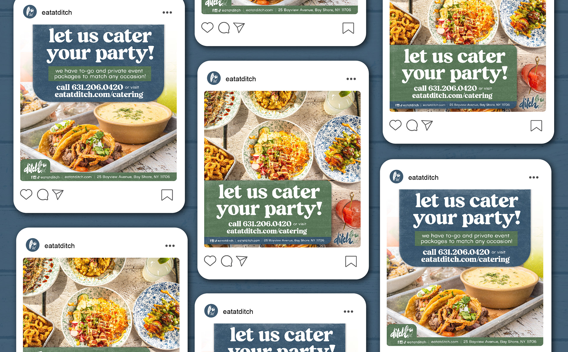
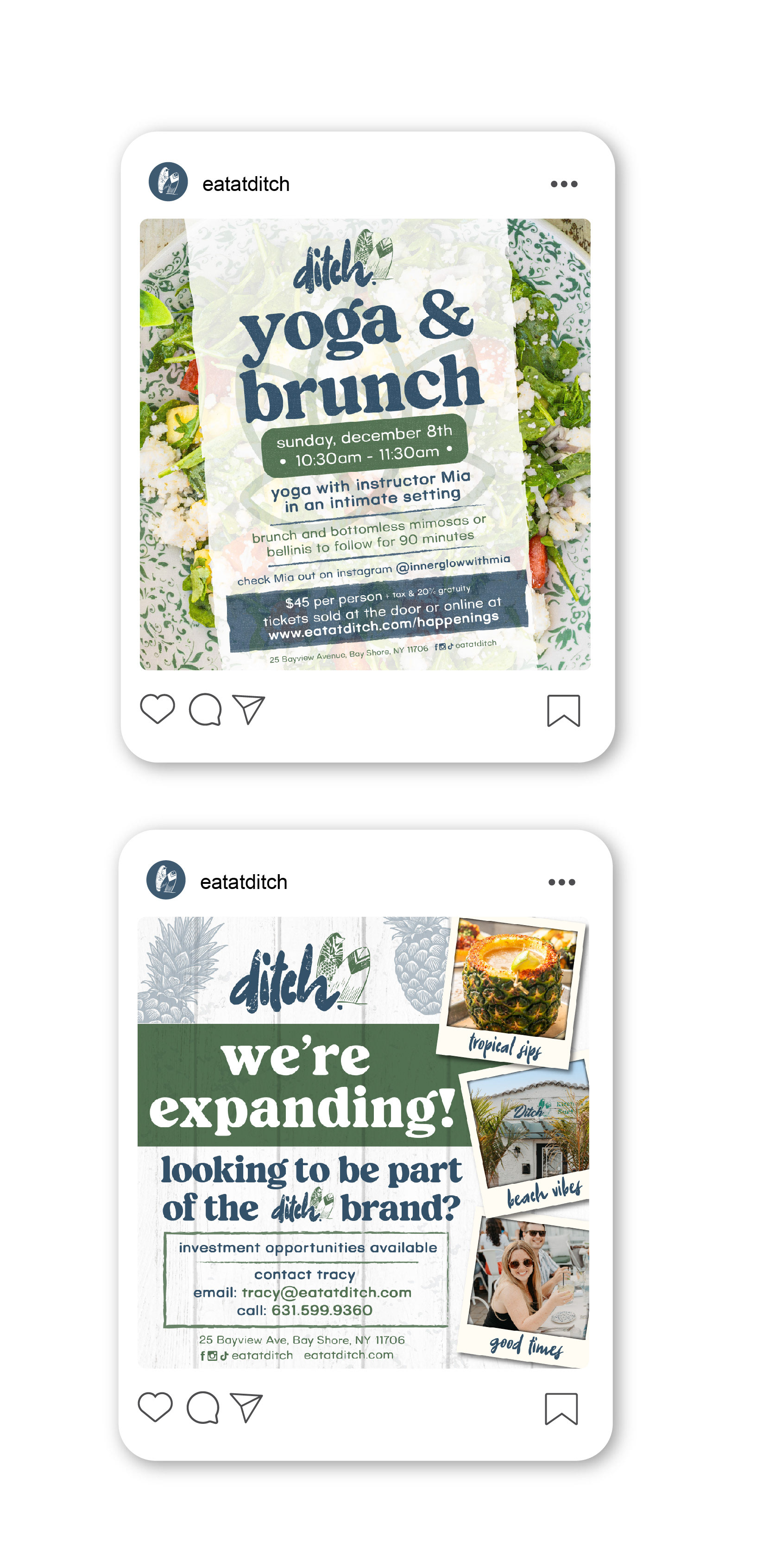
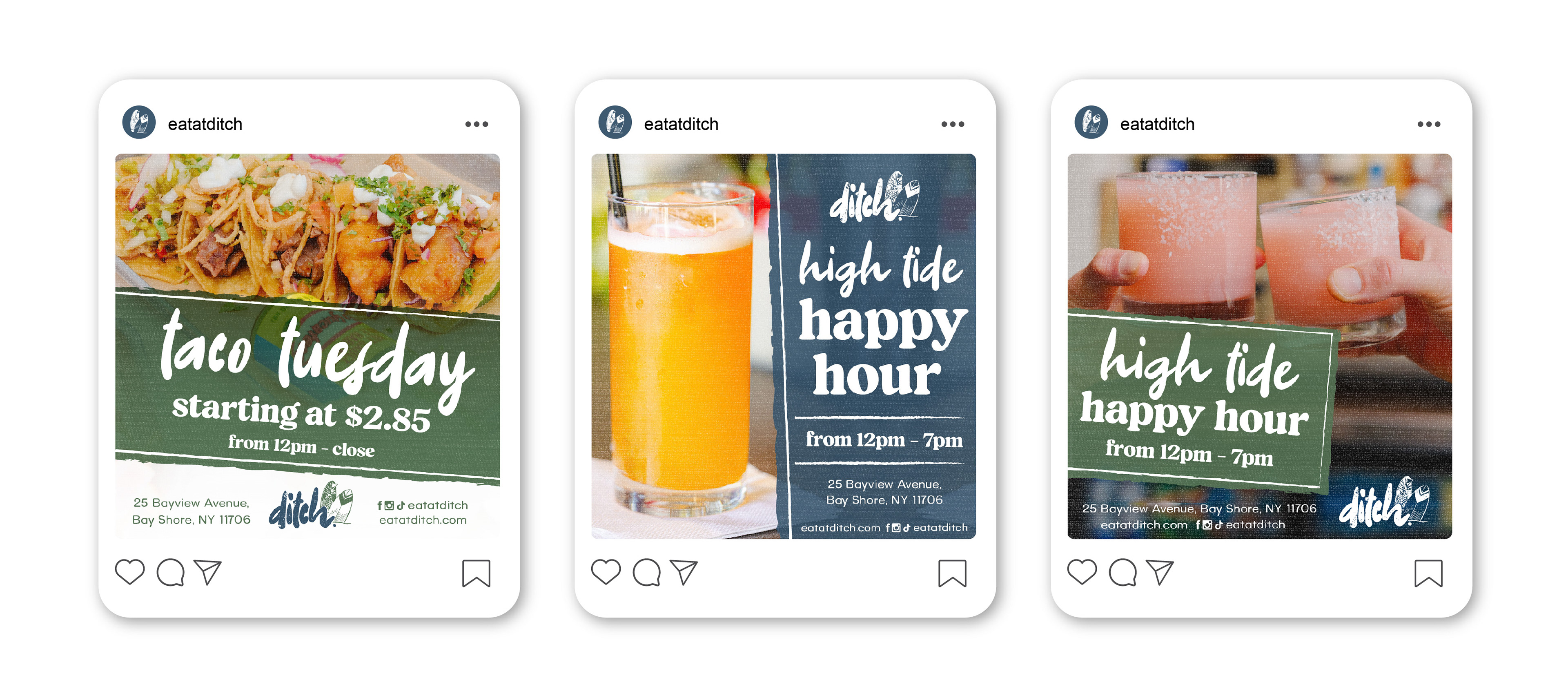
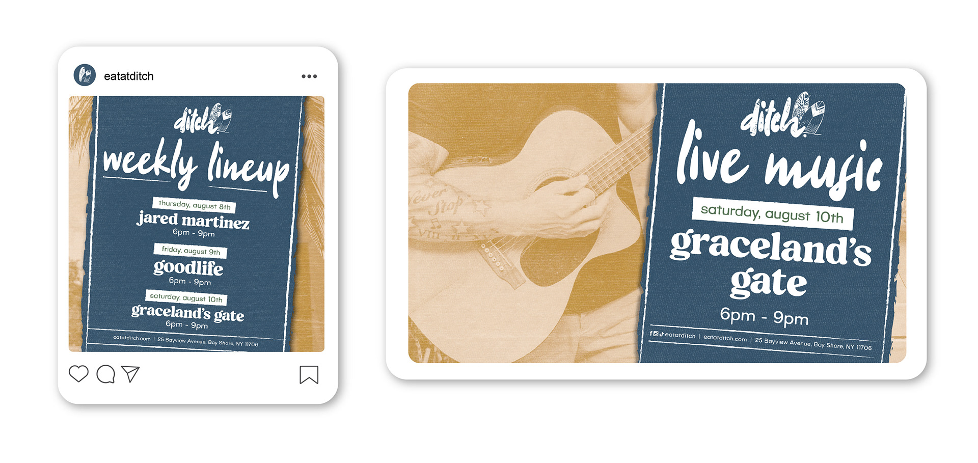
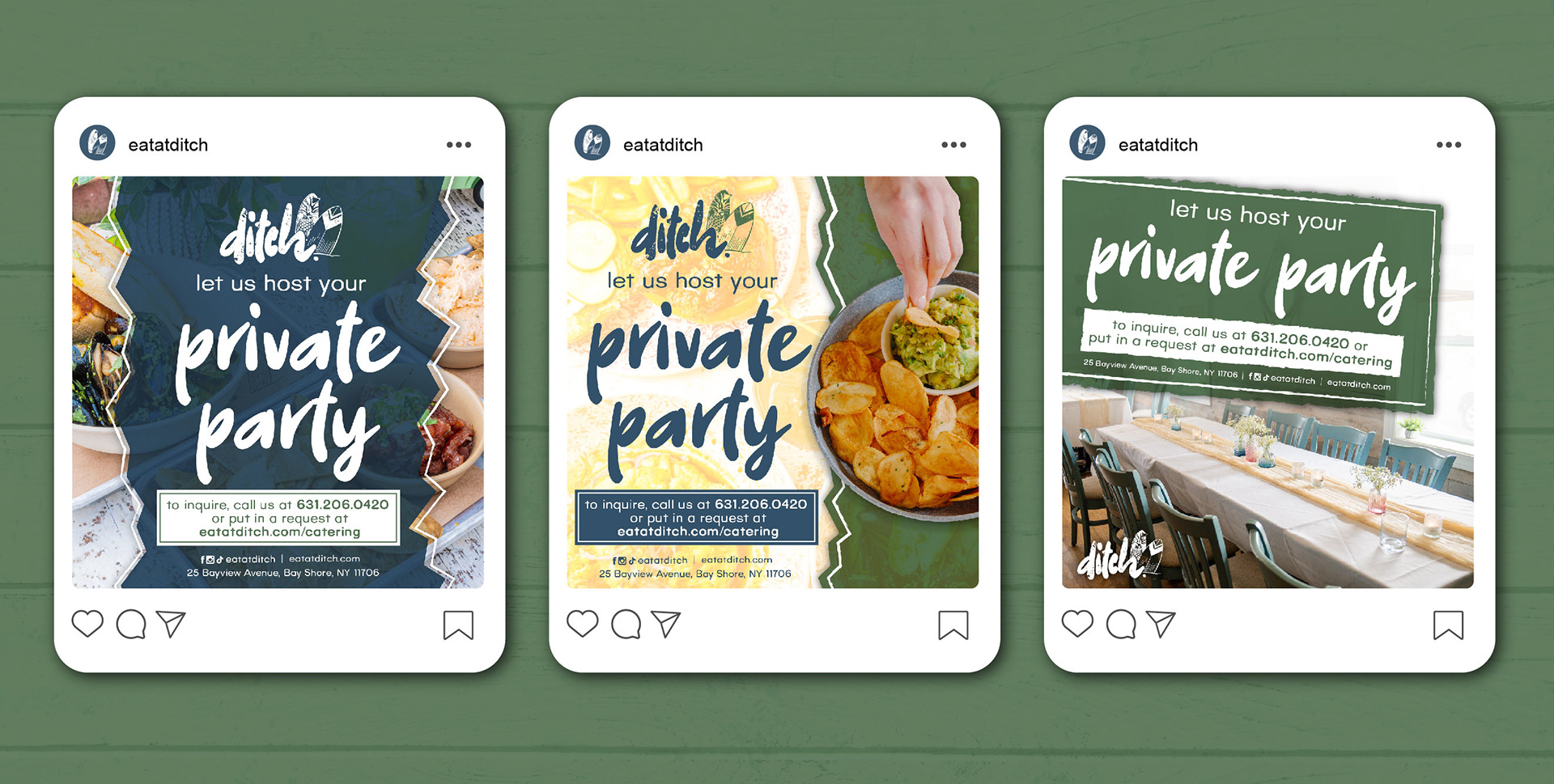
Social Media Graphics
For social media and digital advertising, we continued using the same branding elements and photography implemented in various layouts to keep the attention of consumers in attention-grabbing platforms. GIF animations were also created for SMS campaigns and social media to entice customers while maintaining the brand in motion.
Work created for Union Square Advertising
Visual assets showcased include photography provided by clients and/or by photographers at Union Square Advertising. All rights to those images remain with their respective creators.