Challenge
The luxury chocolate market is crowded. Many brands lean on common tropes: gold foil, ornate typography, predictable imagery. La Souris Noire needed a visual identity that could both evoke elegance and surprise. The challenge was to balance the artisanal hand-crafted nature with whimsical sophistication to appeal to chocolate lovers in a saturated market.
Solution
Inspired by vintage French chocolatier shops, I developed a visual identity that balanced the refined typography of the past with playful imagery that appeals to the modern consumer. Delivered packaging and design assets that evoke desire and strong visual storytelling. I created a brand that feels both indulgent and authentic, helping La Souris Noire Chocolatier stand apart in a saturated luxury chocolate market.
Logo Design
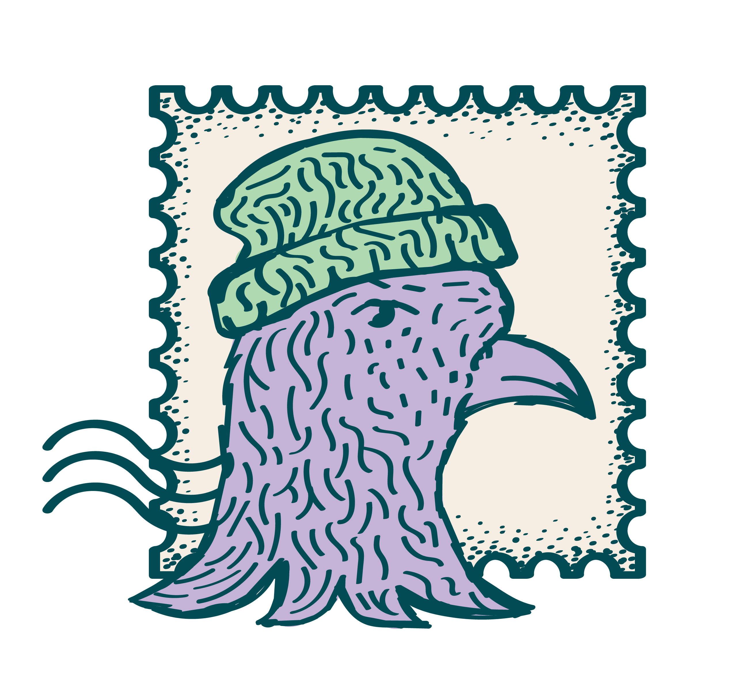
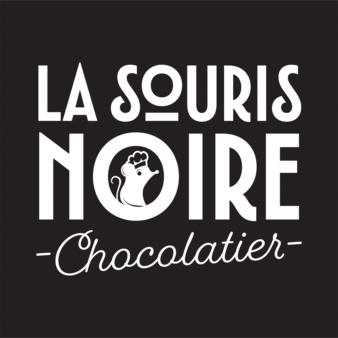
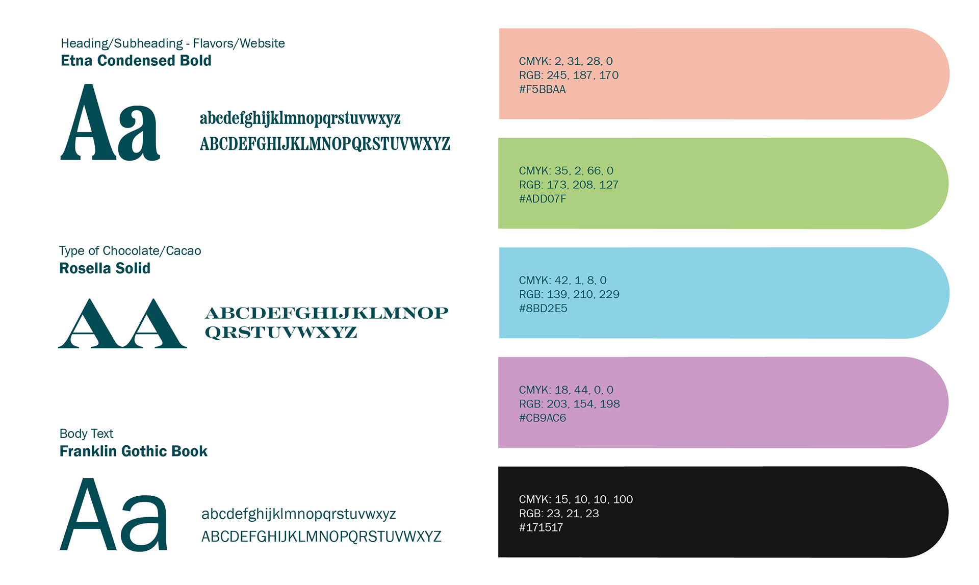
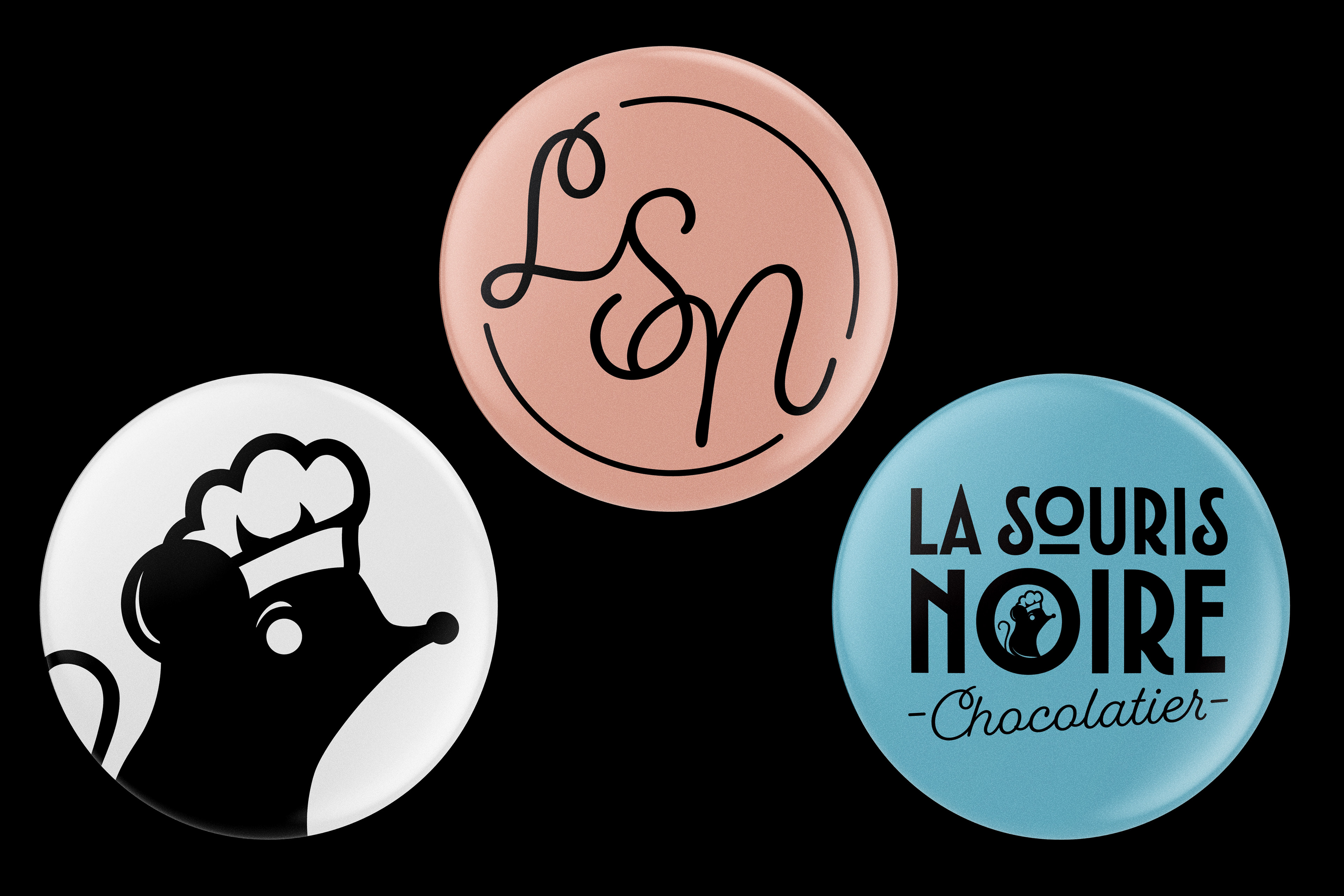
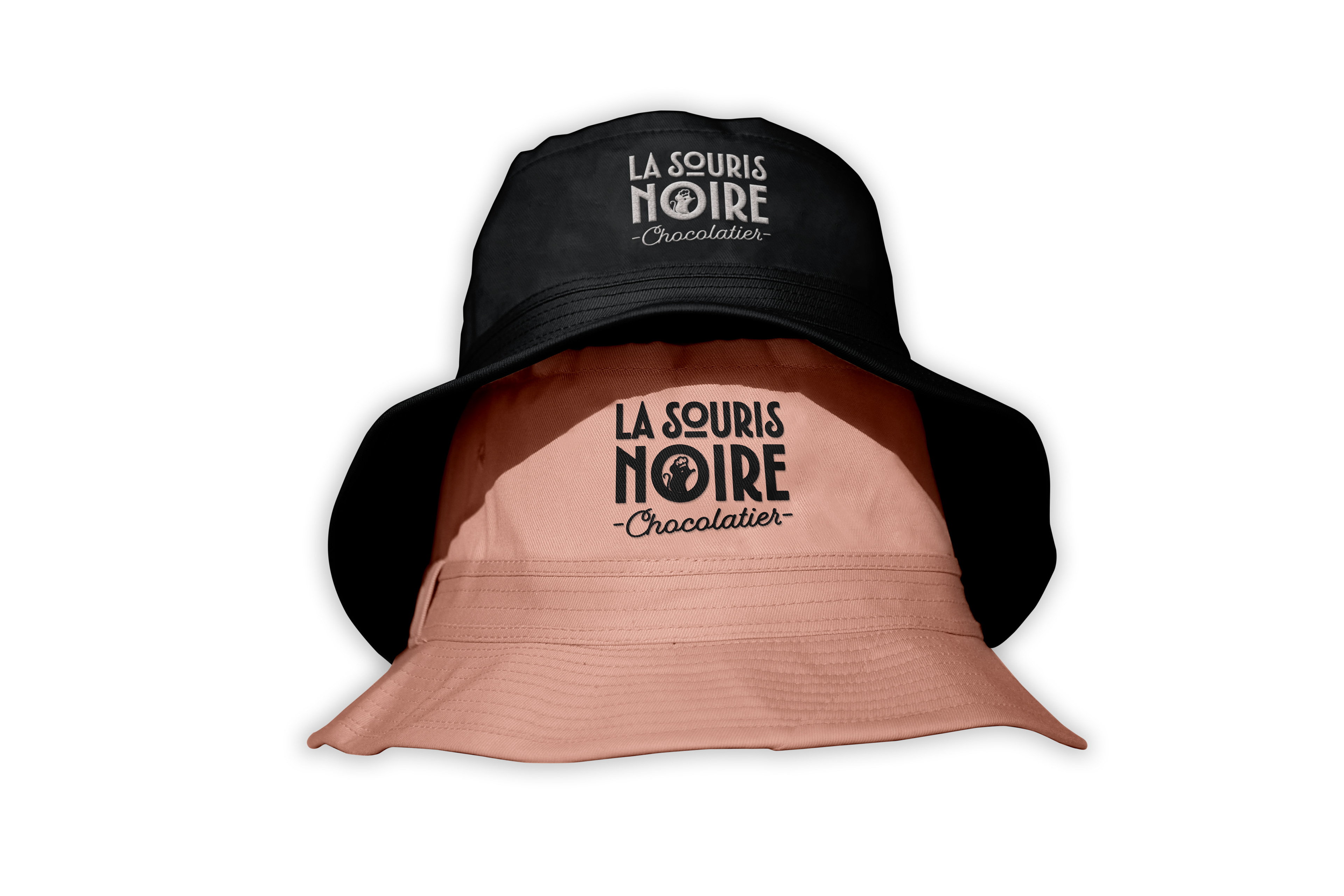
The Logo design was inspired from Art Deco typography and design. La Souris Noire is "The Black Mouse" in French. The illustration of the mouse is inside the counter of the "o" in "Noire". To finish it off I chose a monoline cursive font for the word "Chocolatier" that adds a retro touch.
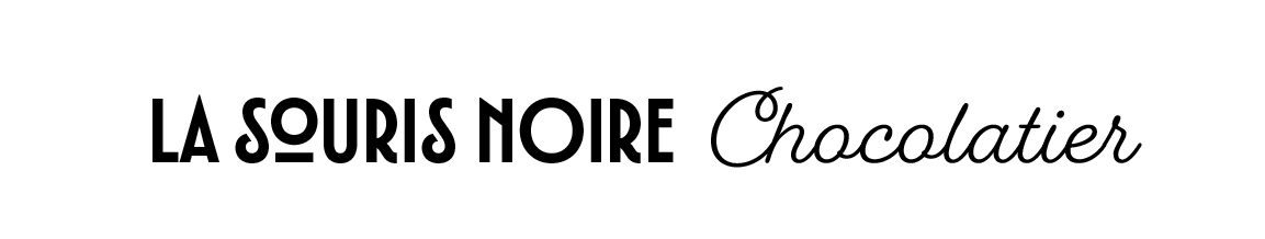
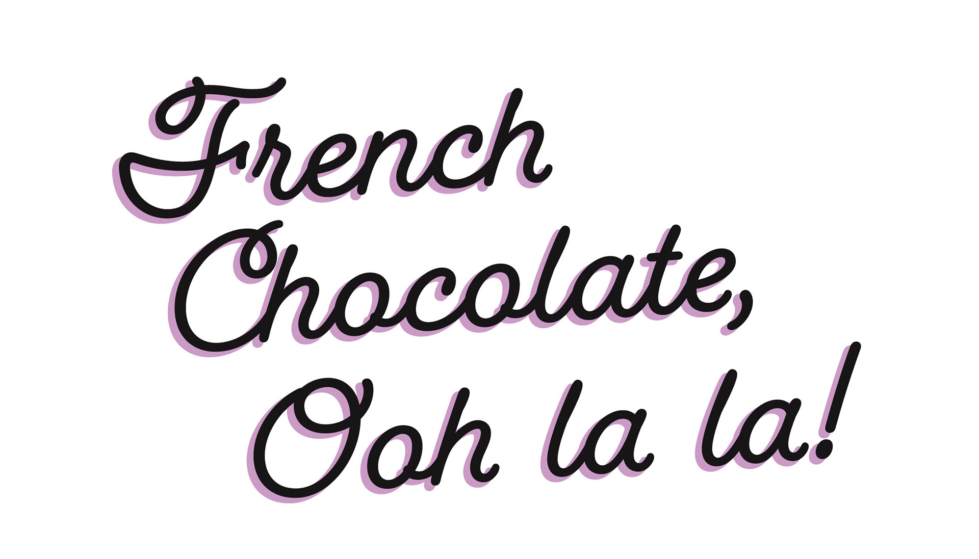
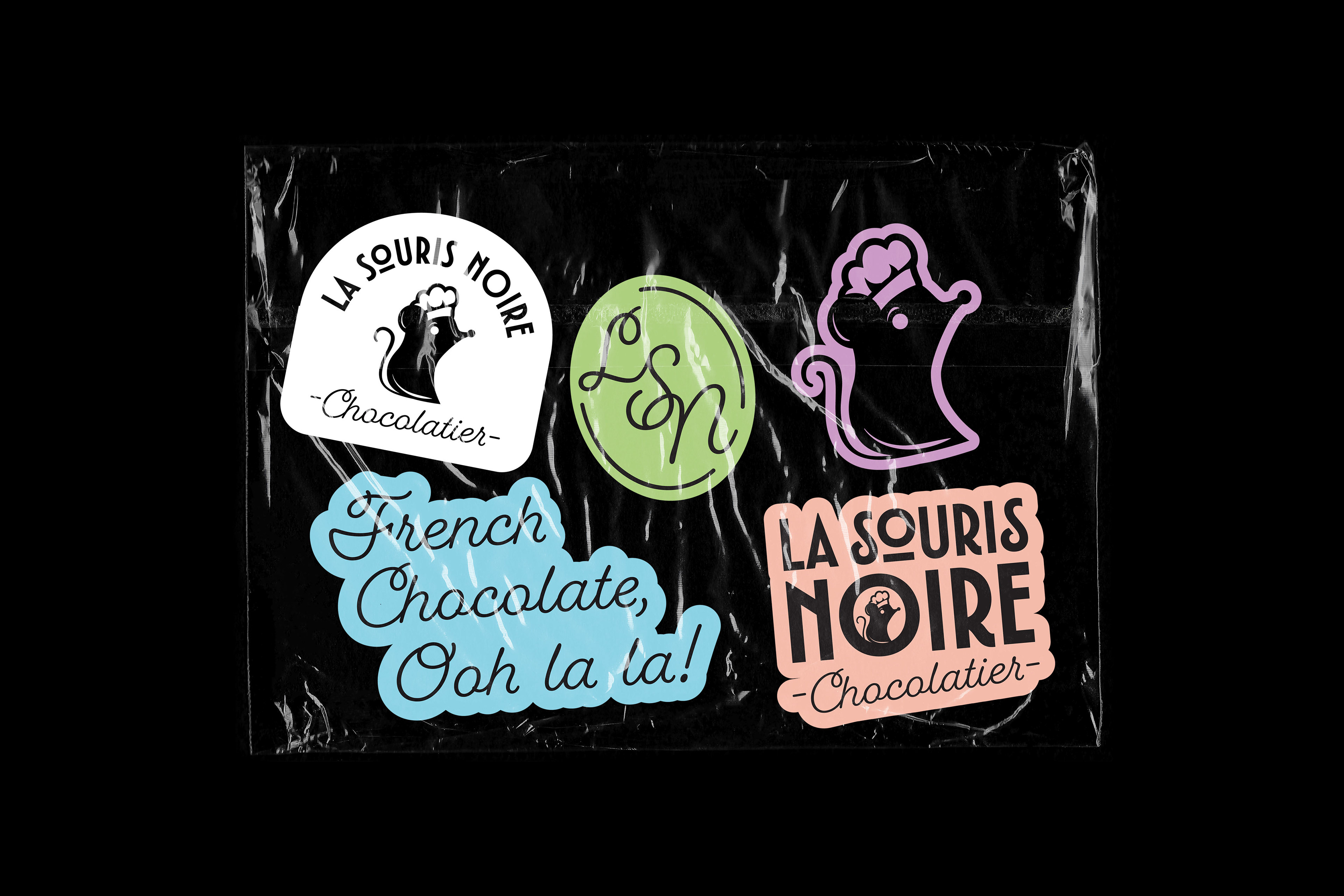
Below are the logos and the tagline typography that have been designed. When used in advertising, the tagline should always be in the same typeface as shown.
Below are the logos and the tagline typography that have been designed. When used in advertising, the tagline should always be in the same typeface as shown.
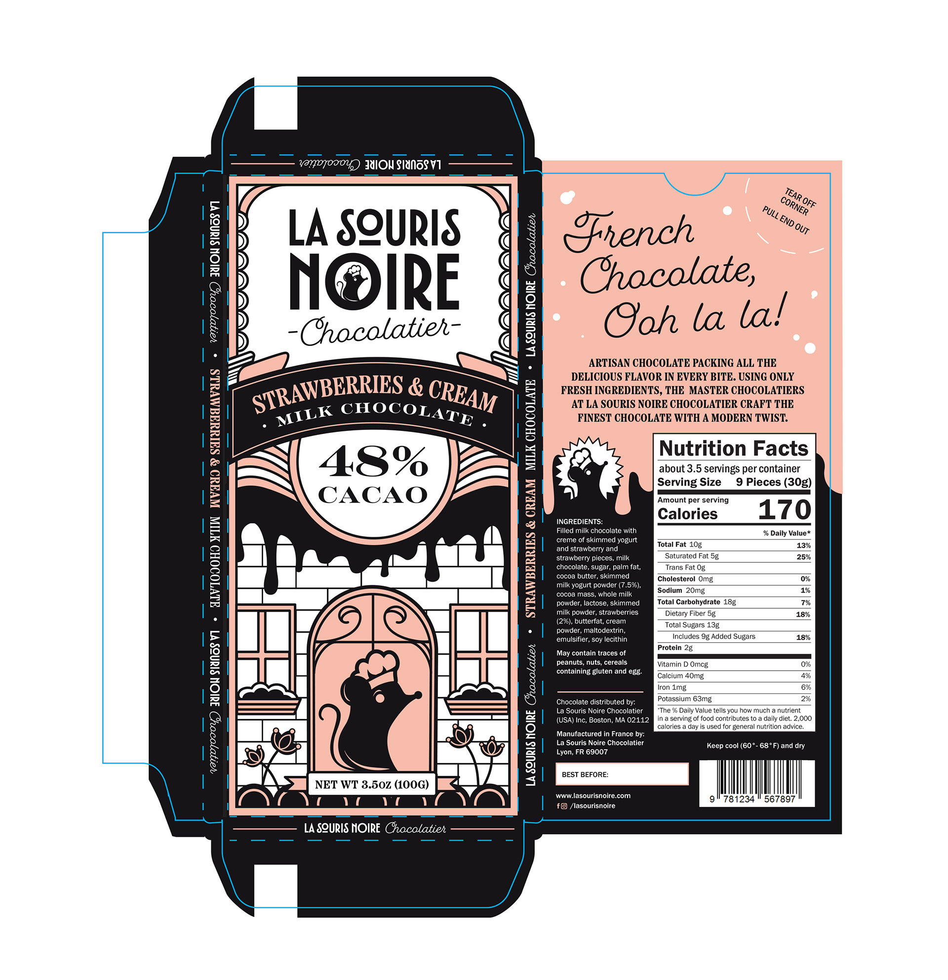
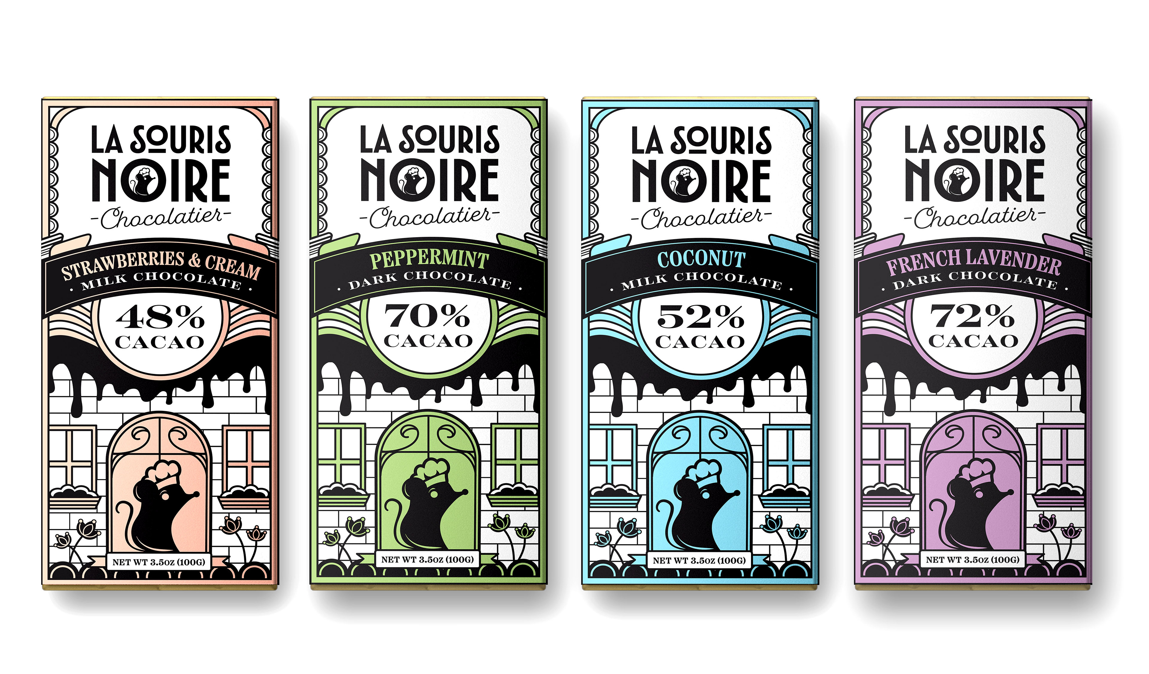
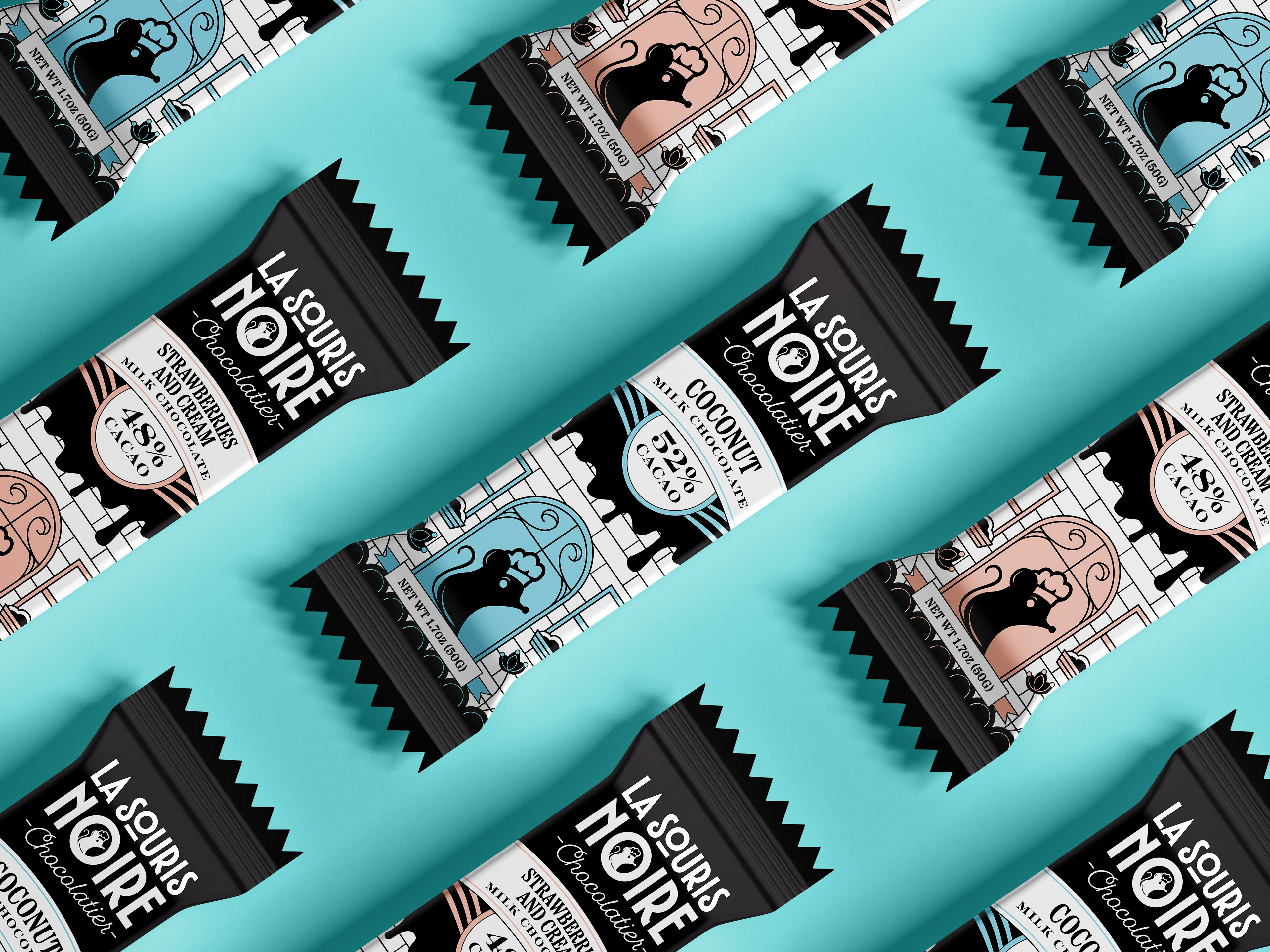
Packaging Design Concept
The objective was to create a unique packaging design that stands out from the competition and reflects the different flavors that are provided. A minimalist color palette of black and pastel colors was used, along with simple illustrations and shapes. The mixture of different typefaces echoes back to retro designs using condensed and extended typefaces. Together this makes the unique package design that will stand out to a younger audience while also bringing a nostalgic experience for the older demographic.
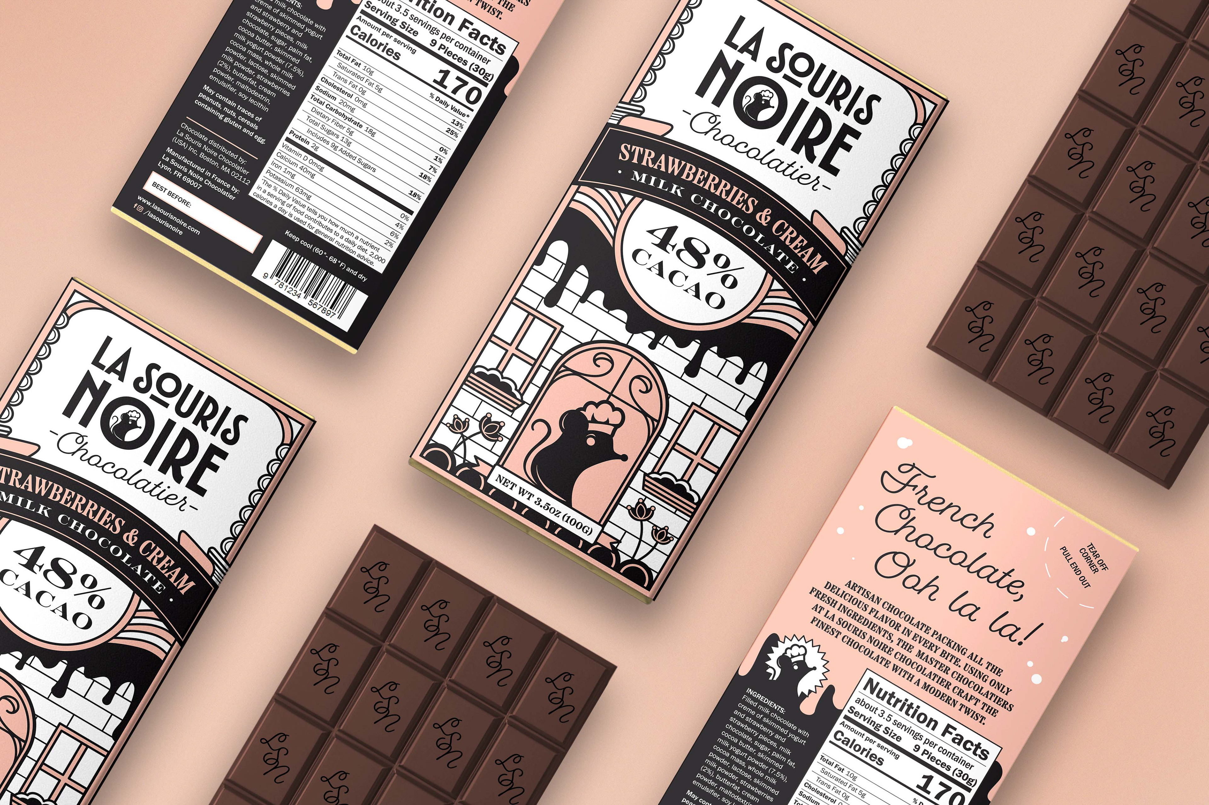
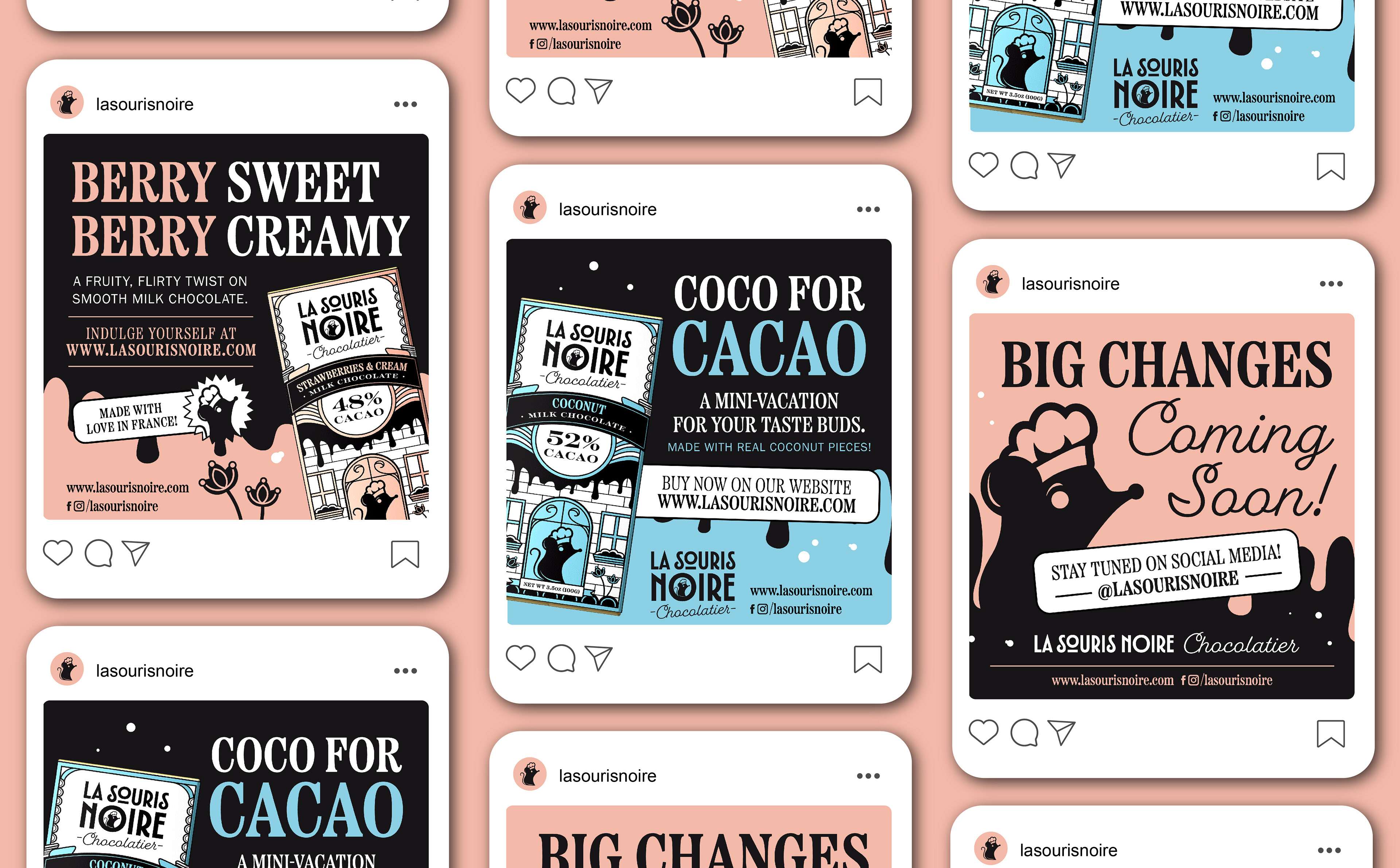
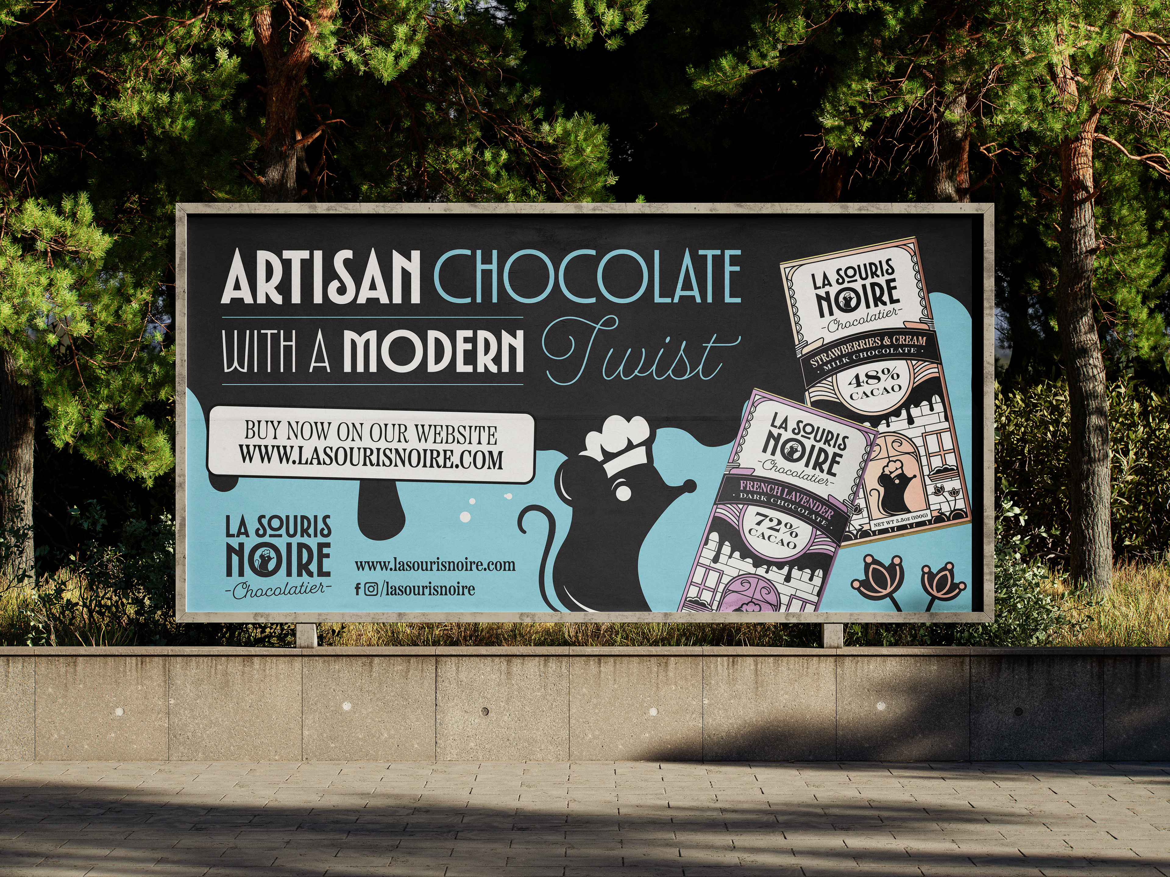

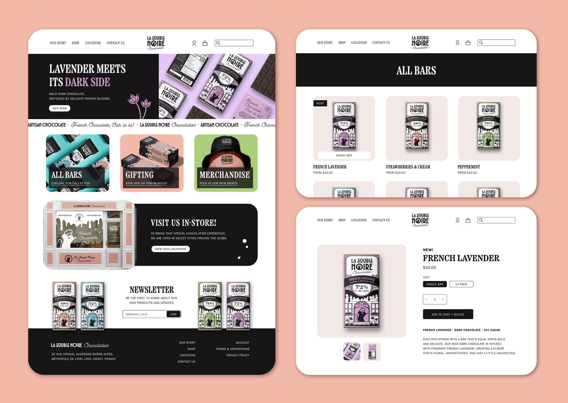
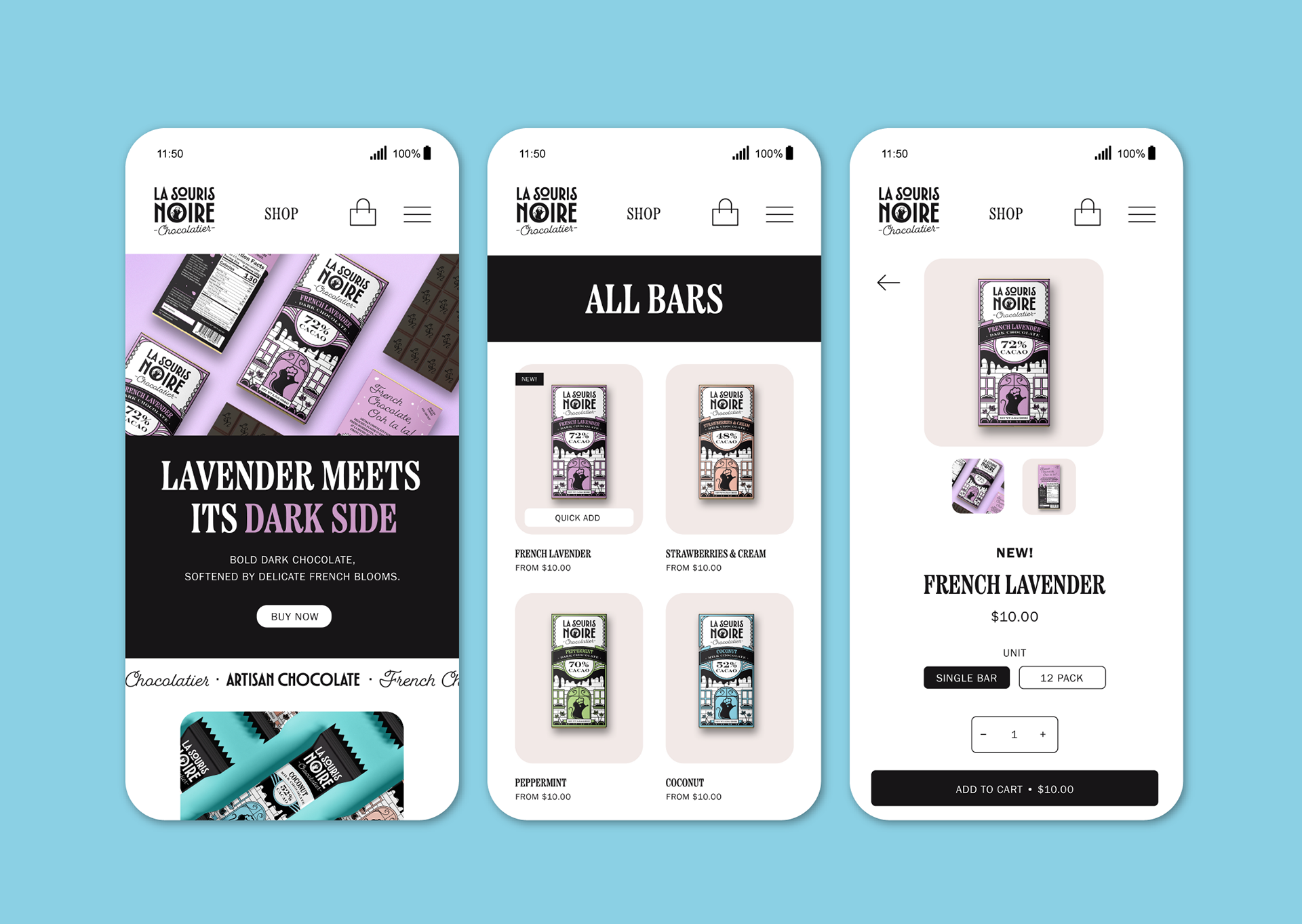

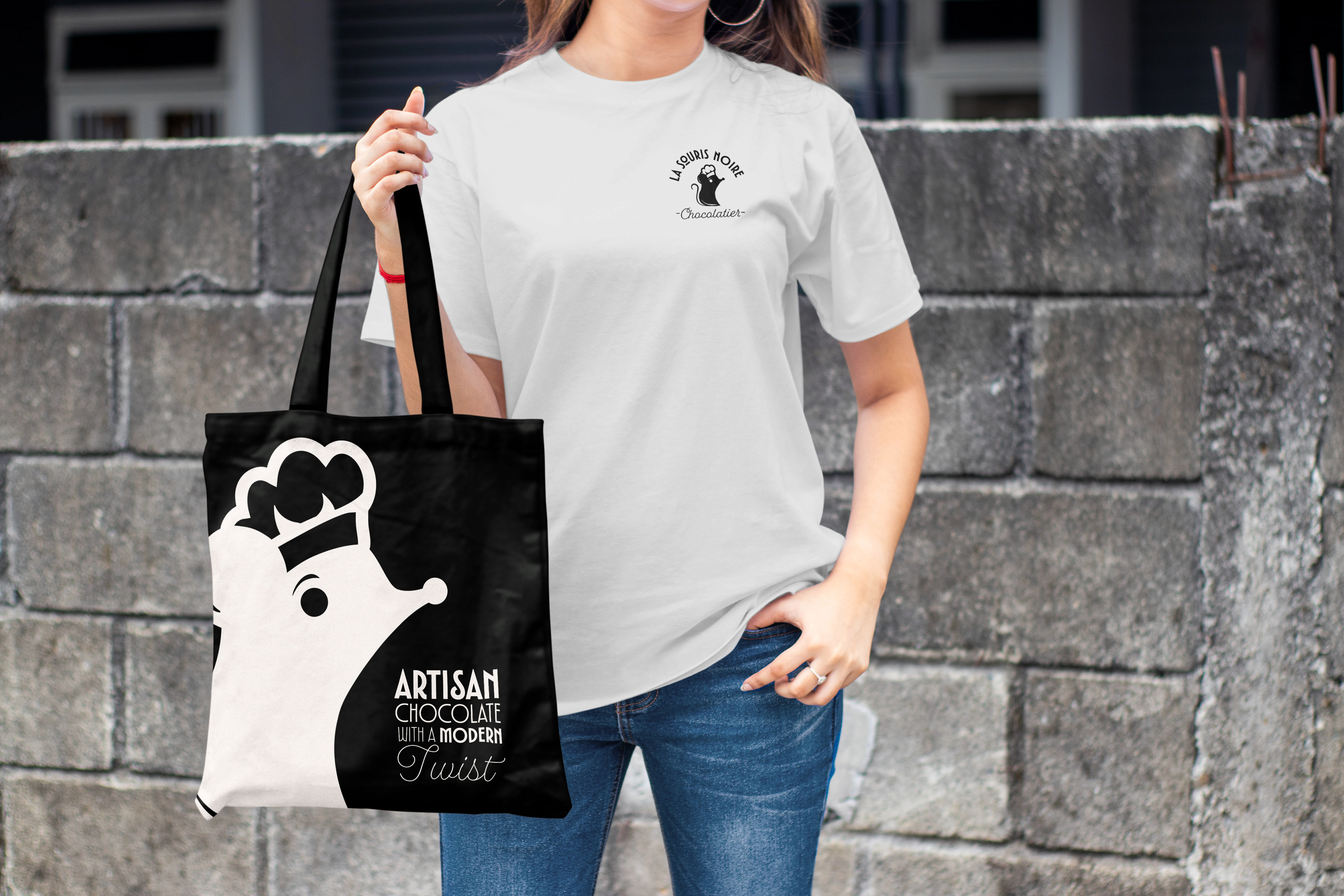

Visual assets showcased include stock mockups to enhance the visual presentation of artwork made by me.
All rights to those images remain with their respective creators.
All rights to those images remain with their respective creators.