Challenge
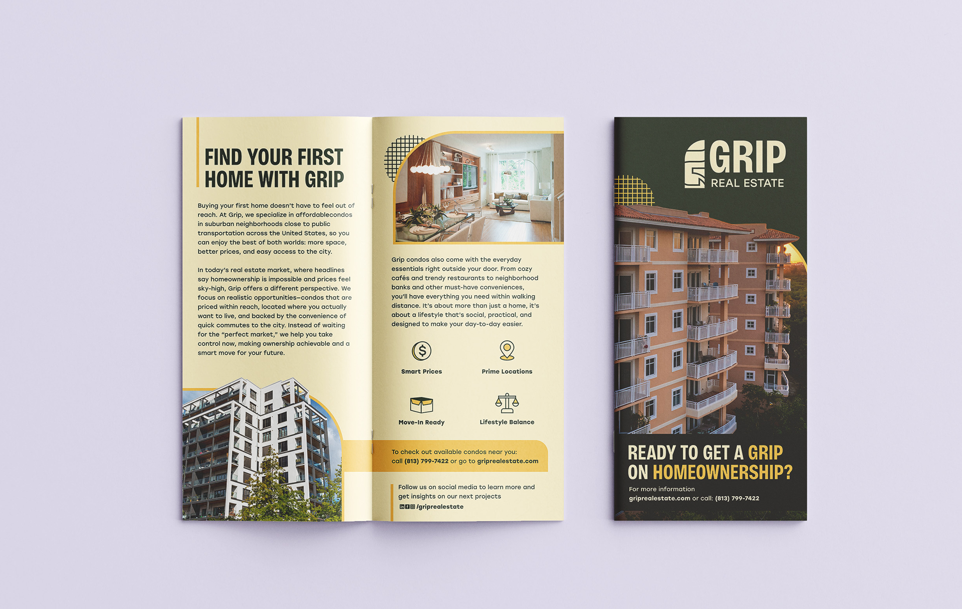
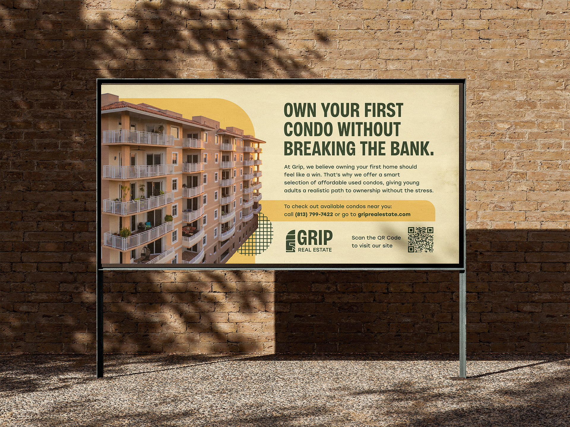
Real estate ownership is often seen as unattainable for young adults. Grip wanted to position itself as a realistic, lifestyle-driven alternative in the suburban condo market. The brand needed to feel fresh, bold, and approachable to break through the cluttered real estate space.
Solution
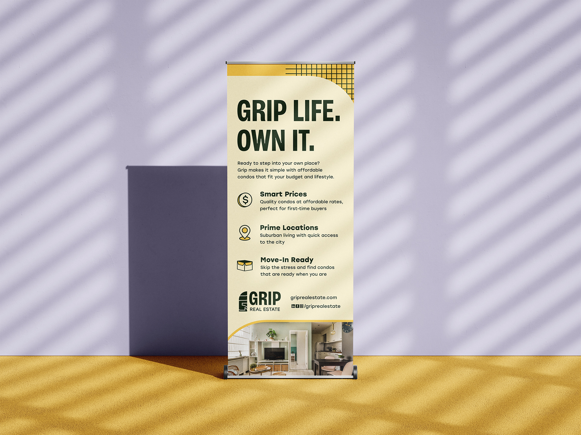
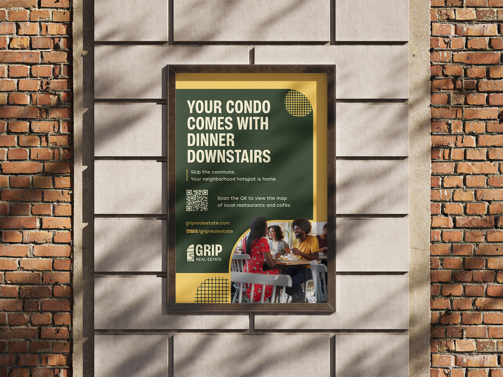
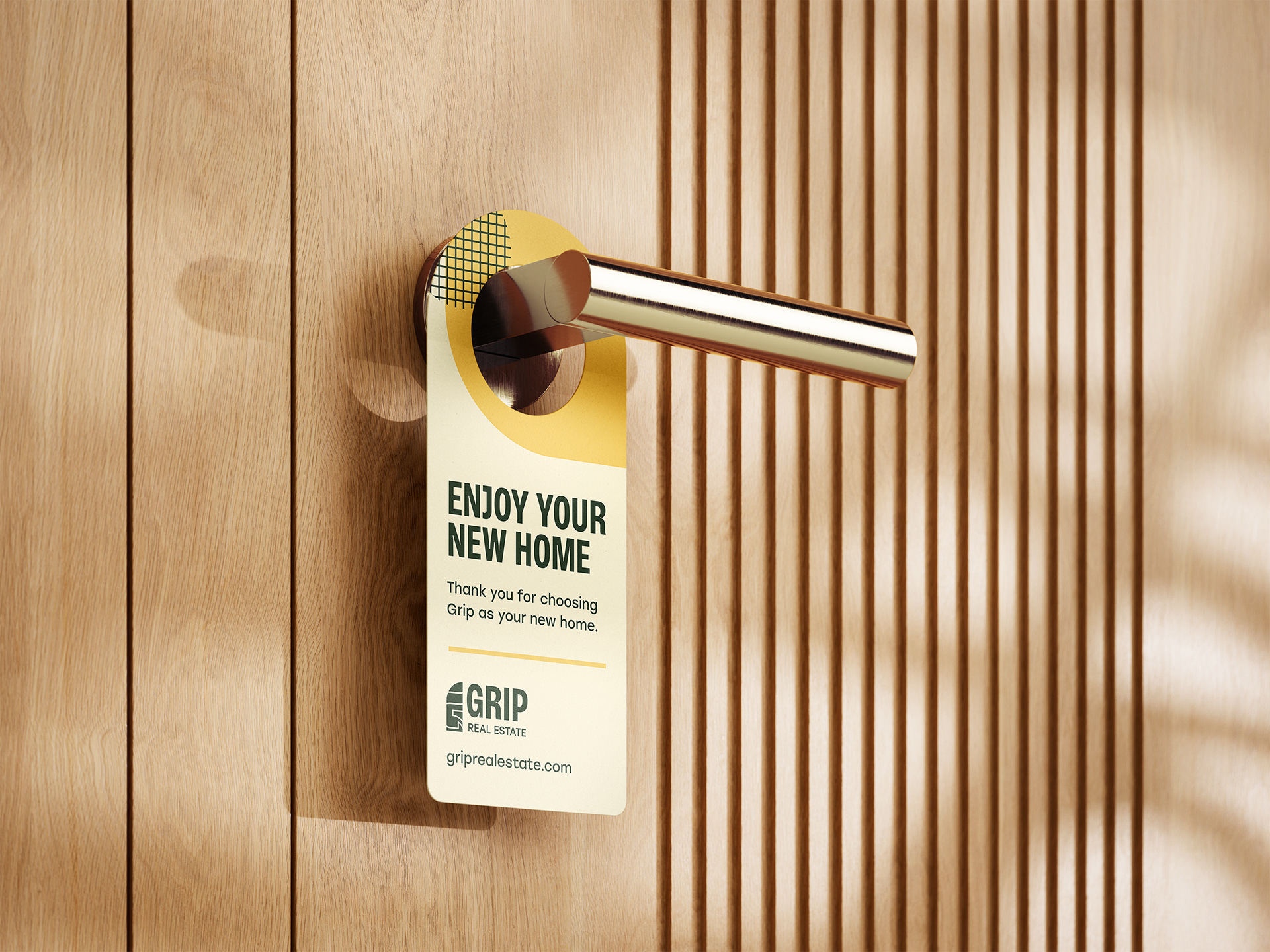
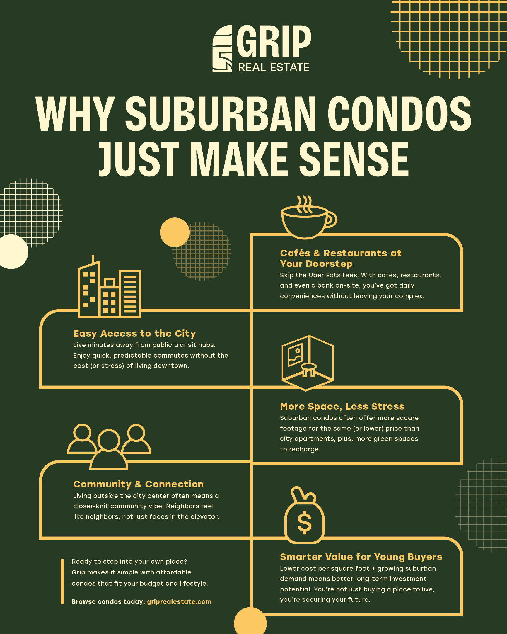
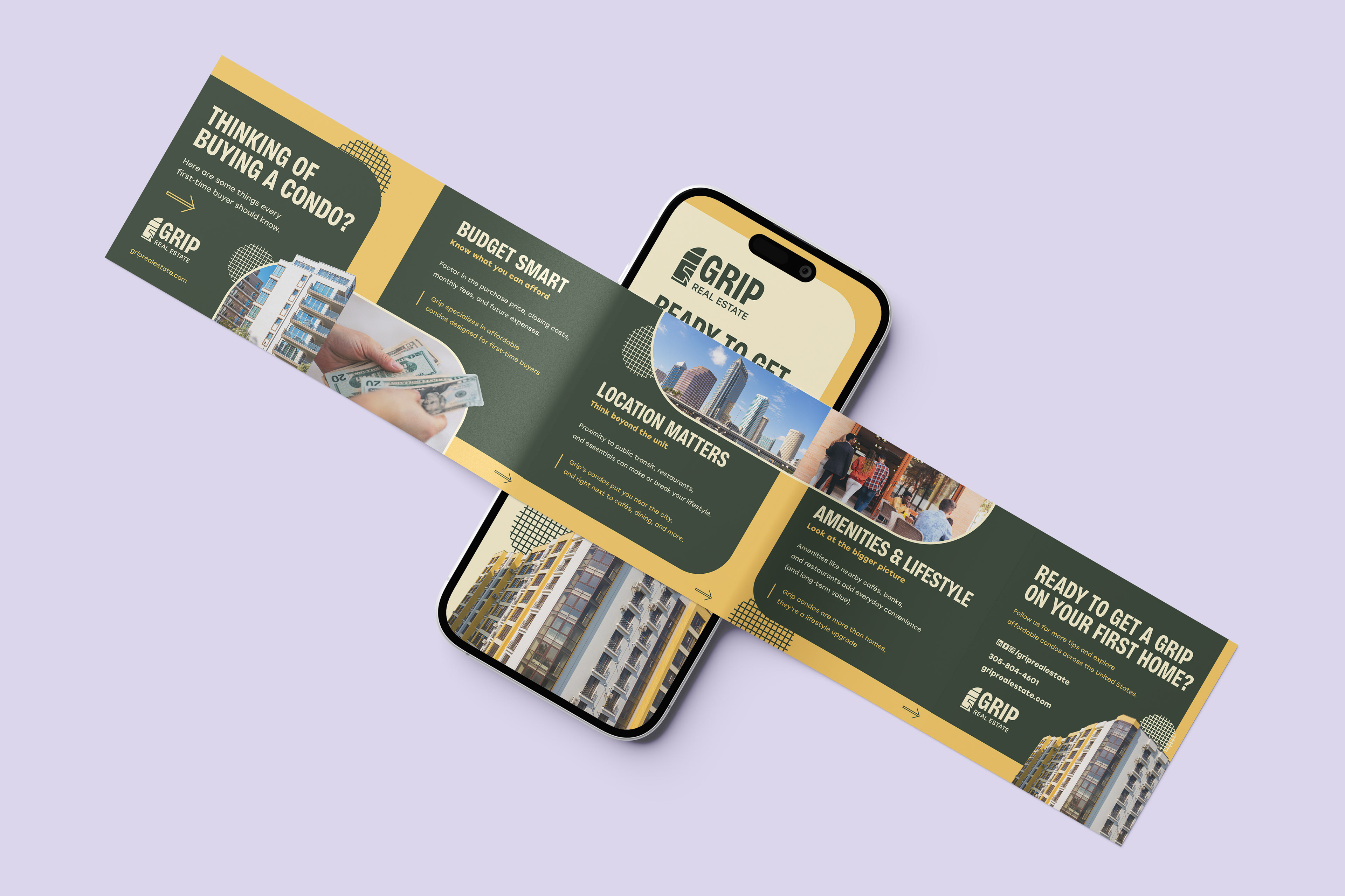
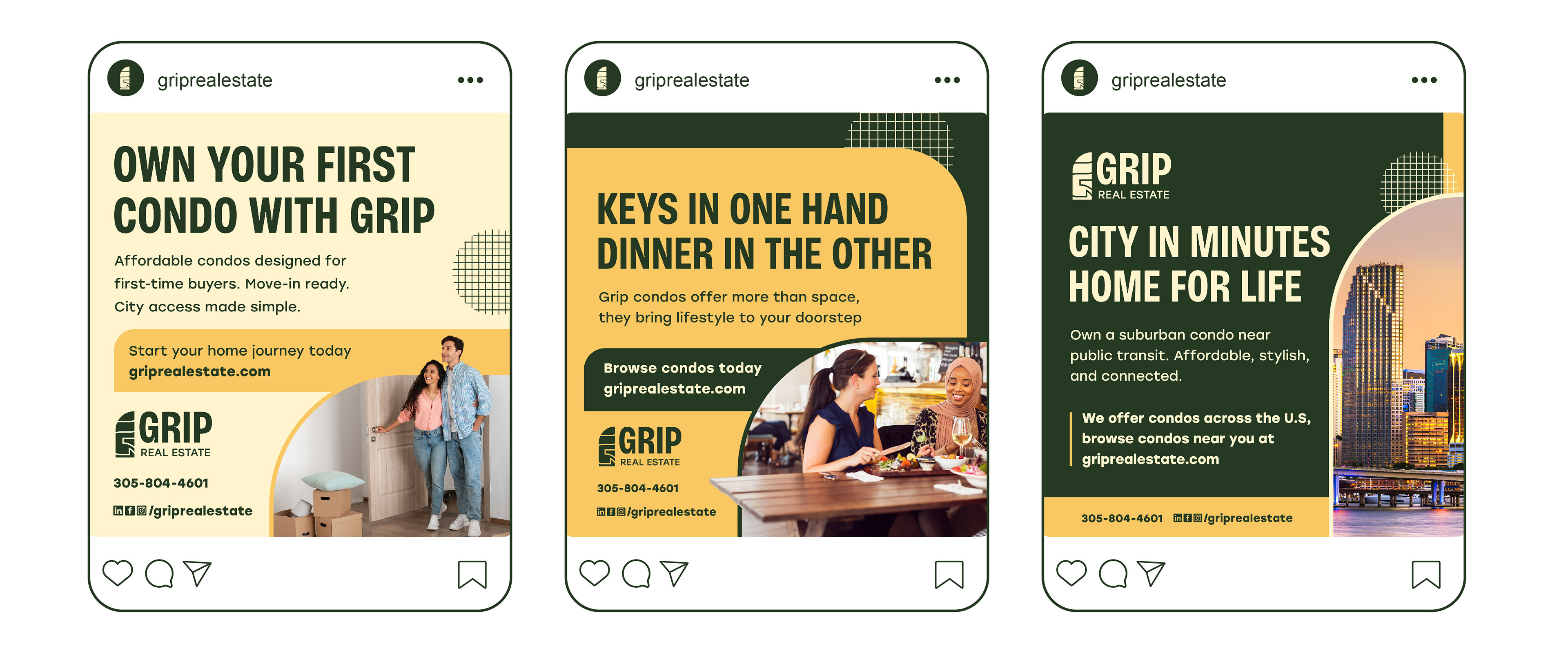
I designed a clean, modern logo and visual system that reflects stability and opportunity and designed print and digital ads highlighting affordability, transit access, and on-site amenities. Social media and display ads were created with approachable copy and eye-catching visuals for young audiences. As a result, I delivered a versatile identity system adaptable across print and digital platforms that established Grip as a youth-oriented, lifestyle-first real estate brand.
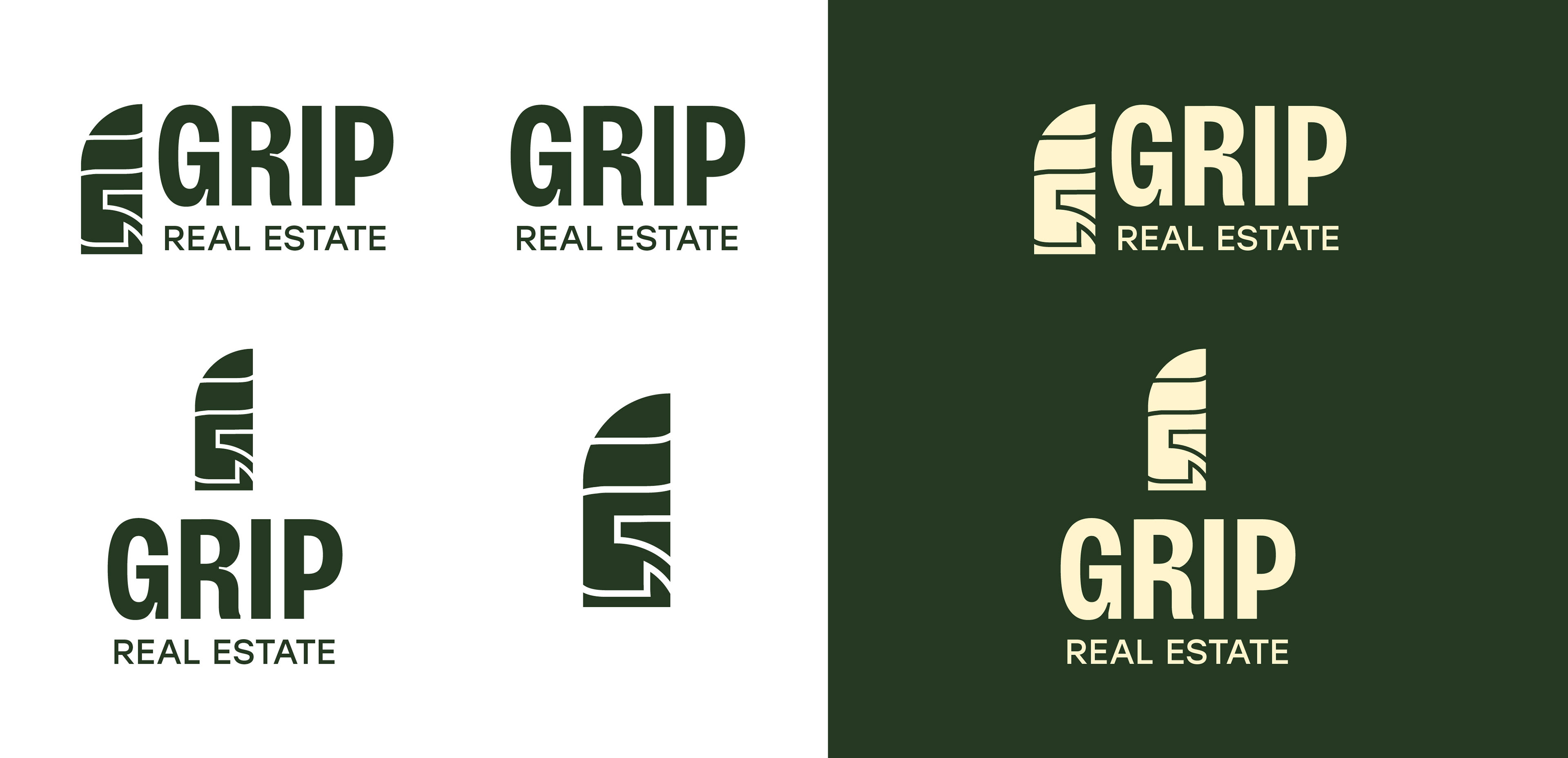
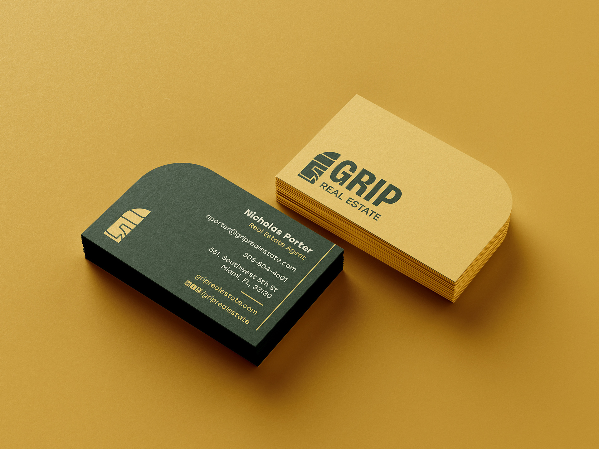
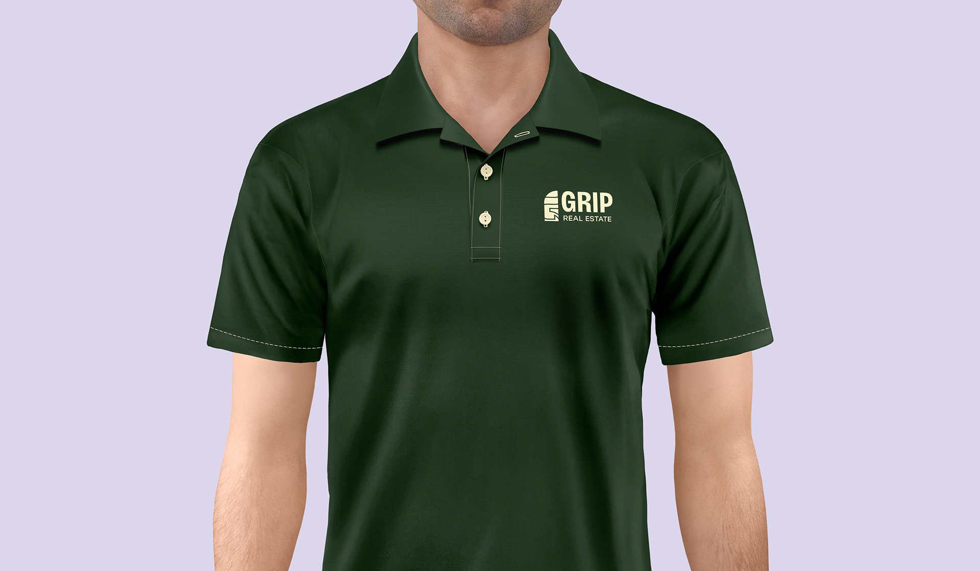
Logo Design
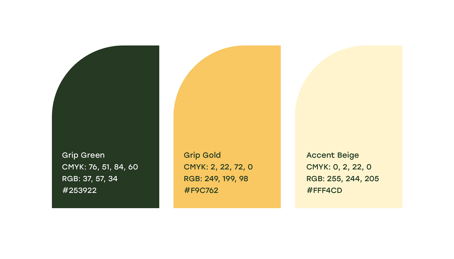
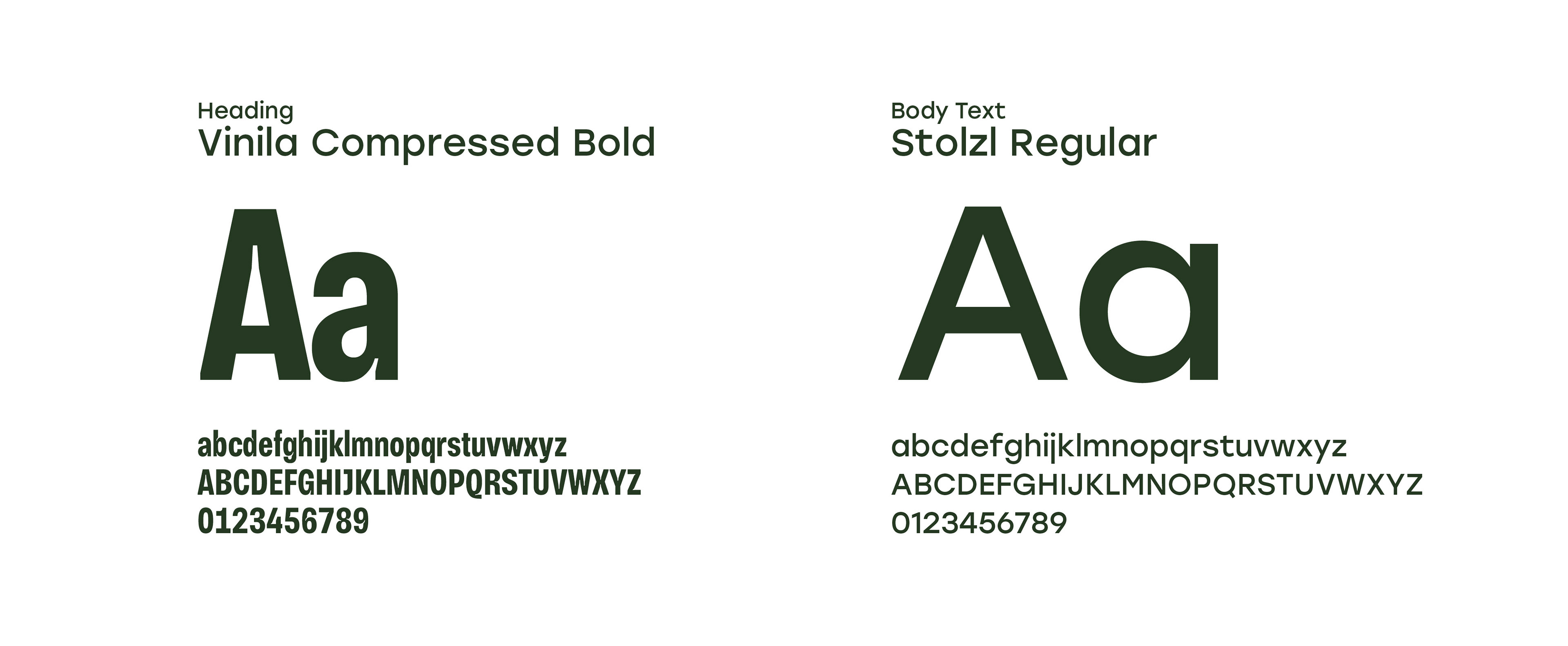
The logo needed to be powerful but scalable. To reflect the properties they build and sell, the logomark mimics a skyscraper with a hidden capital "G" inside of it. The typefaces chosen are readable and strong. The color palette needed to set itself apart from the competitors, choosing a dark green that represents stability along with a contrasting yellow and beige create a flexible color palette.


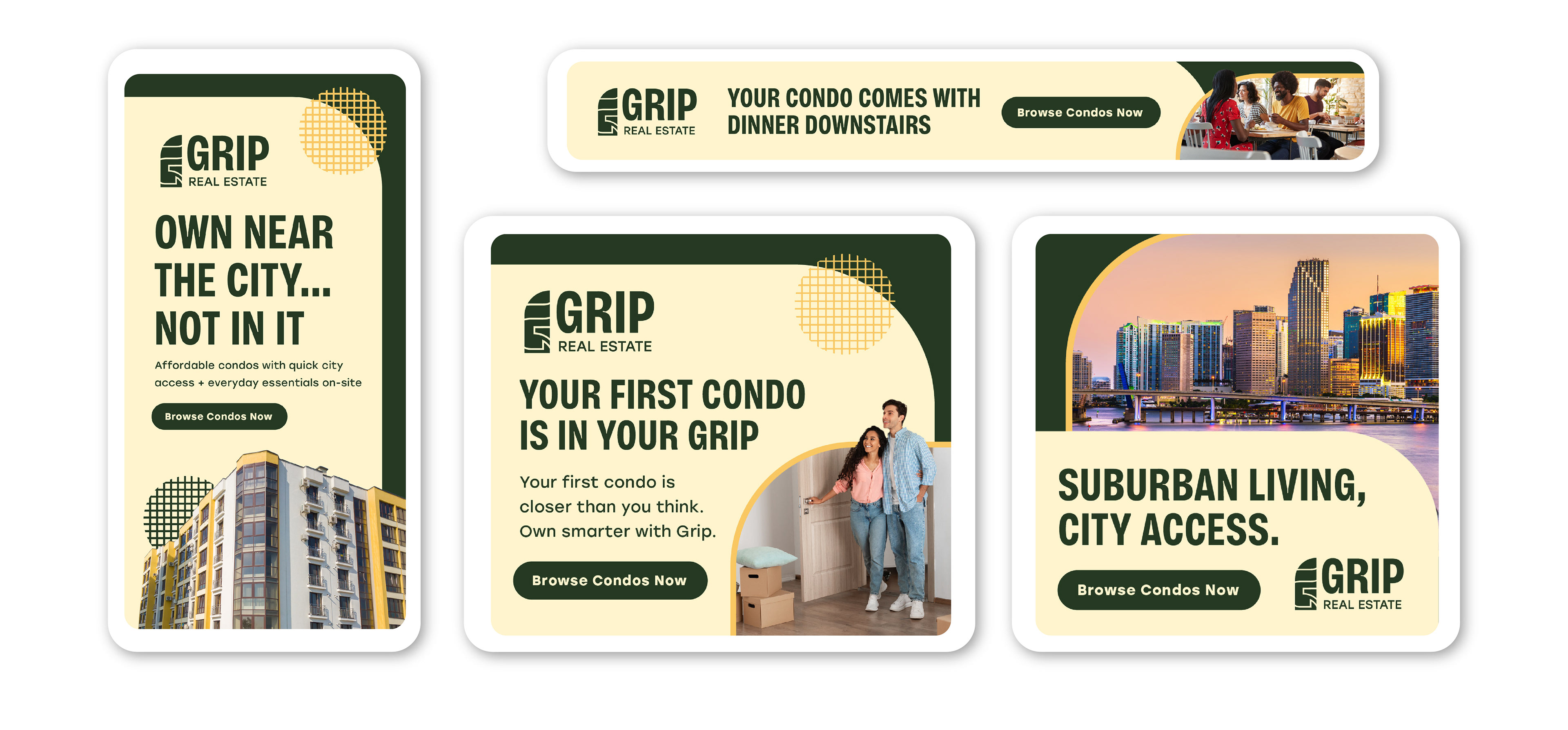
Google Display Ads
Digital ads in different sizes geared towards young, aspiring homeowners in suburban areas.
Visual assets showcased include stock mockups and photography to enhance the visual presentation of artwork made by me. All rights to those images remain with their respective creators.