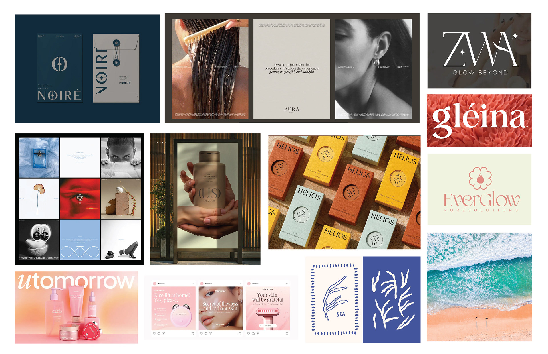
Moodboard

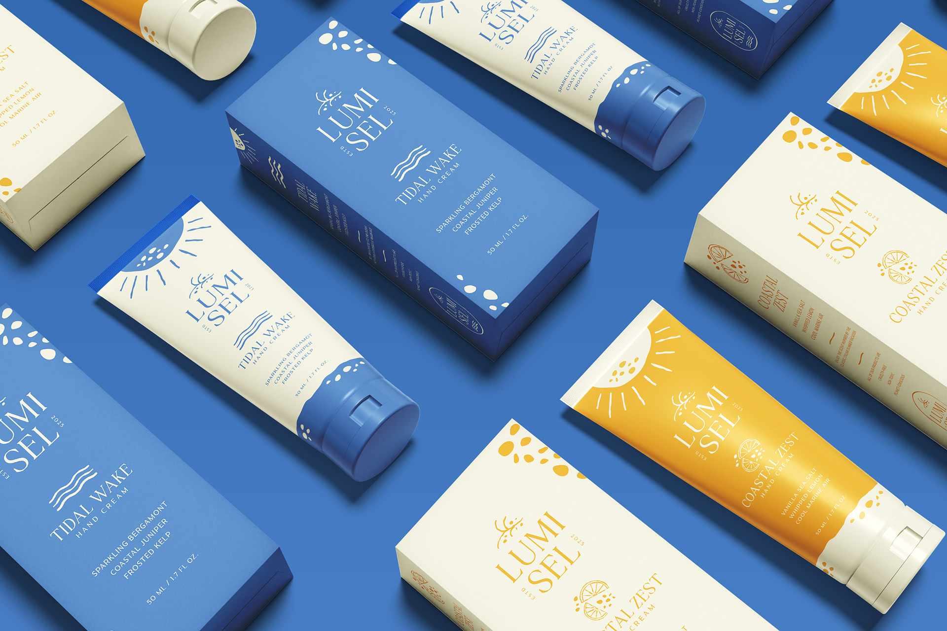
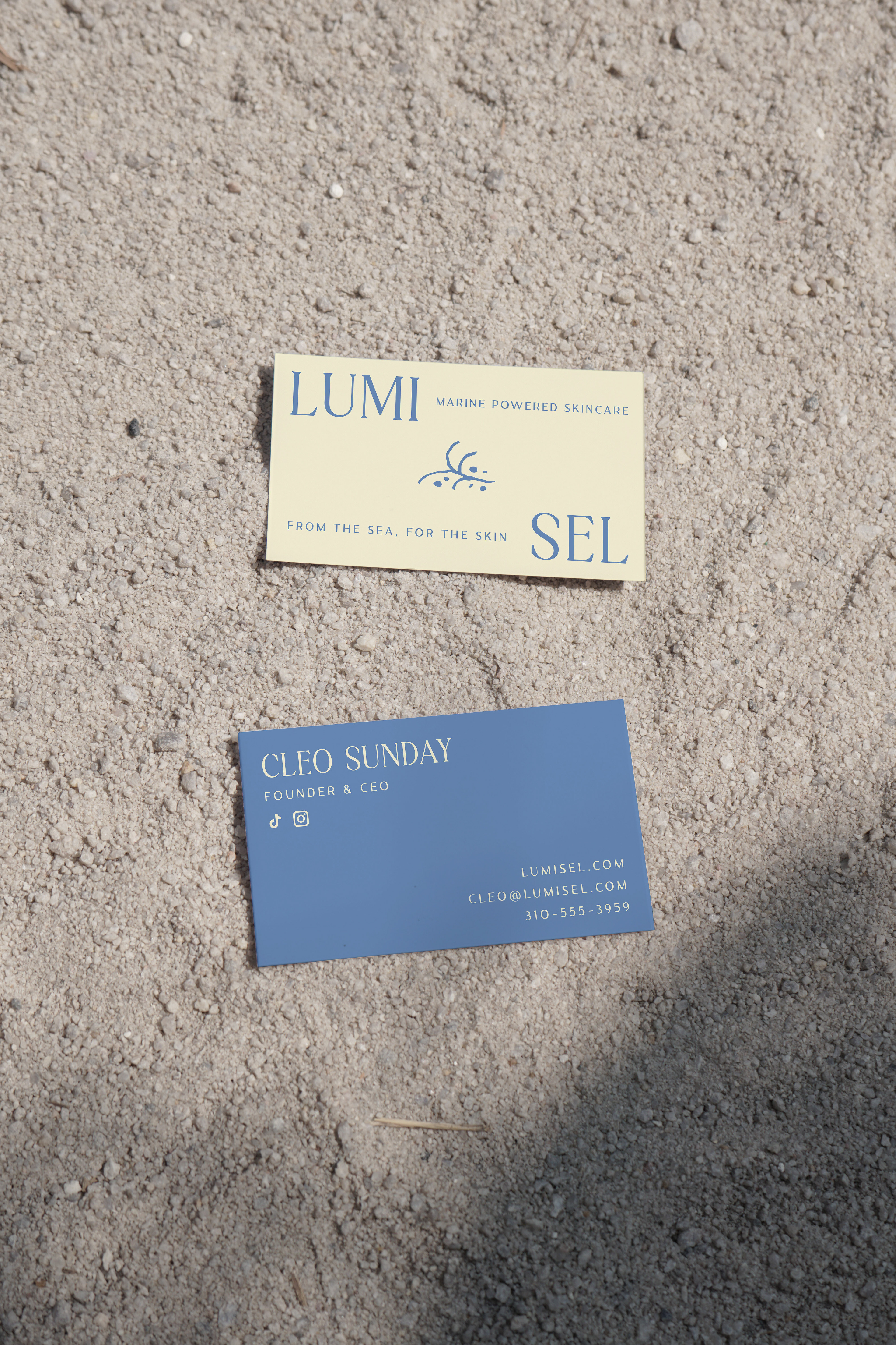
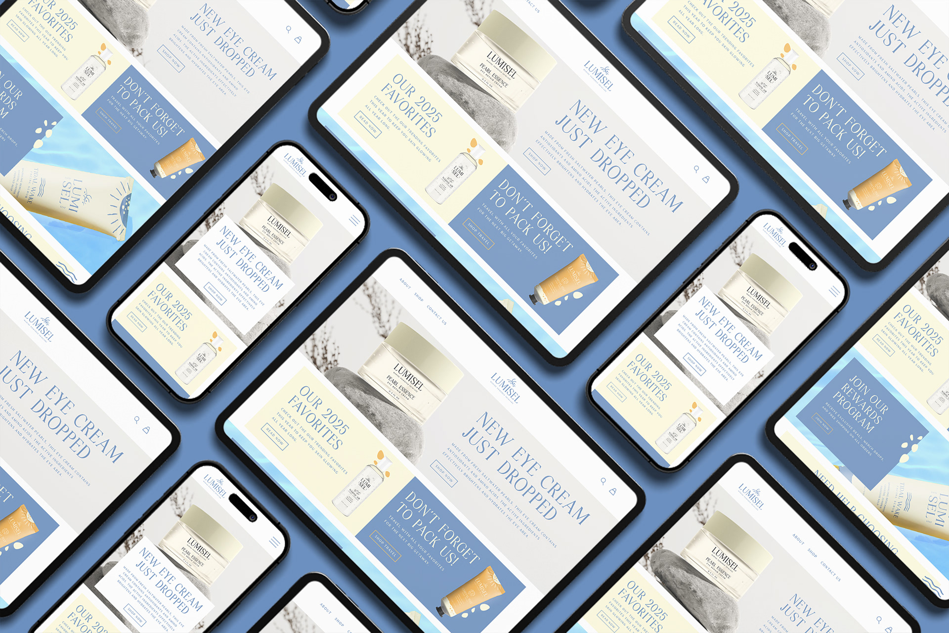
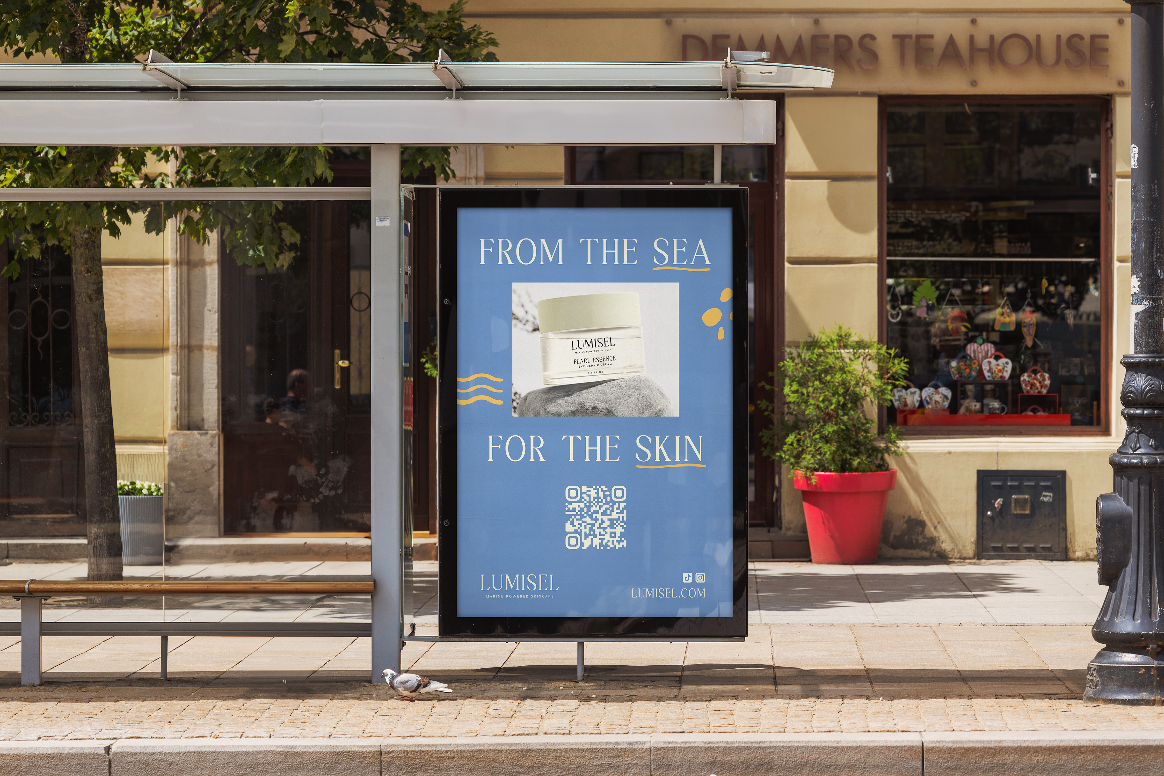
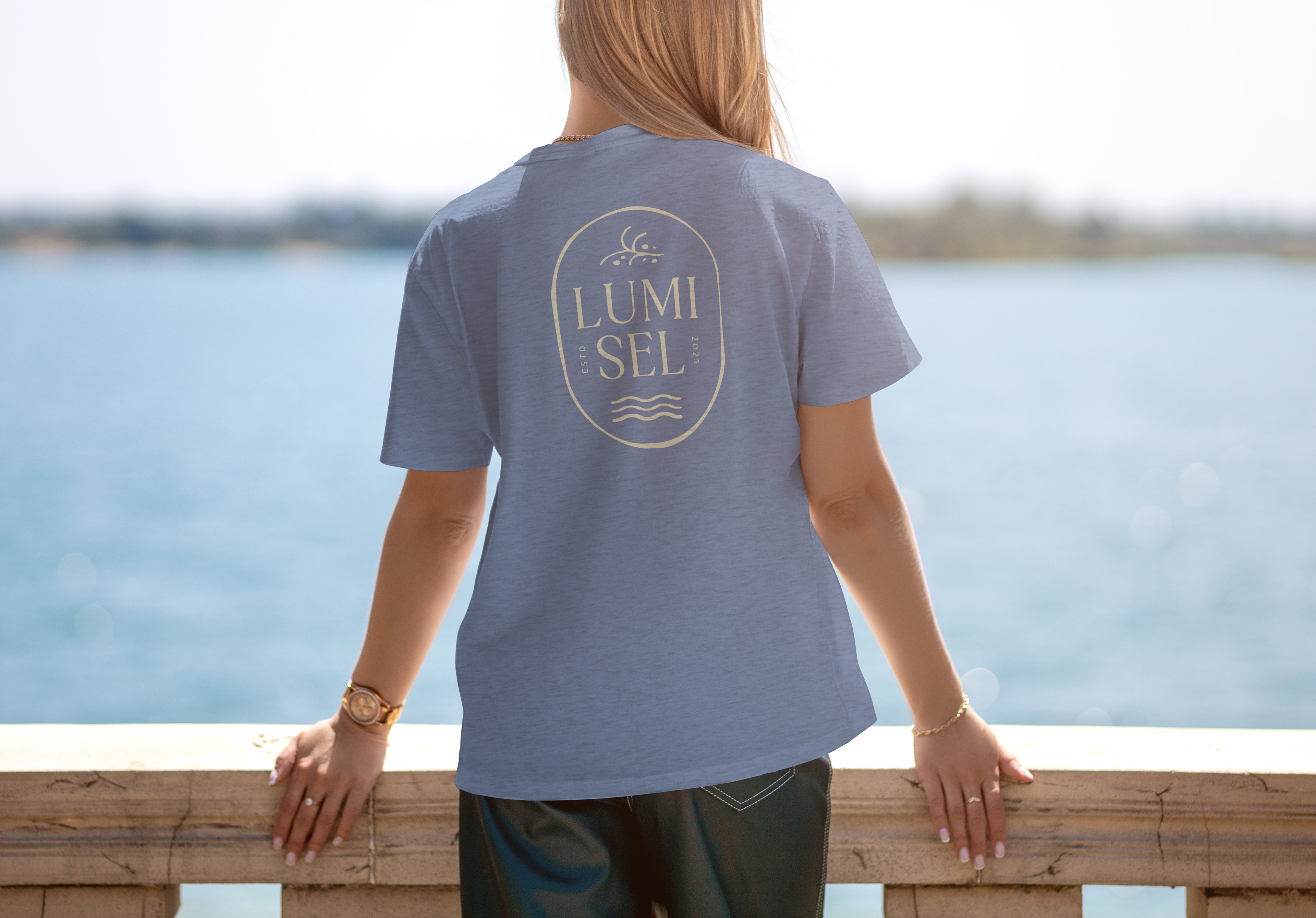
The visual branding of Lumisel evokes organic shapes inspired by the sea, while maintaining a soft and refined look. The logomark is a stripped-down image of sea kelp and pebbles/minerals found on the beach.
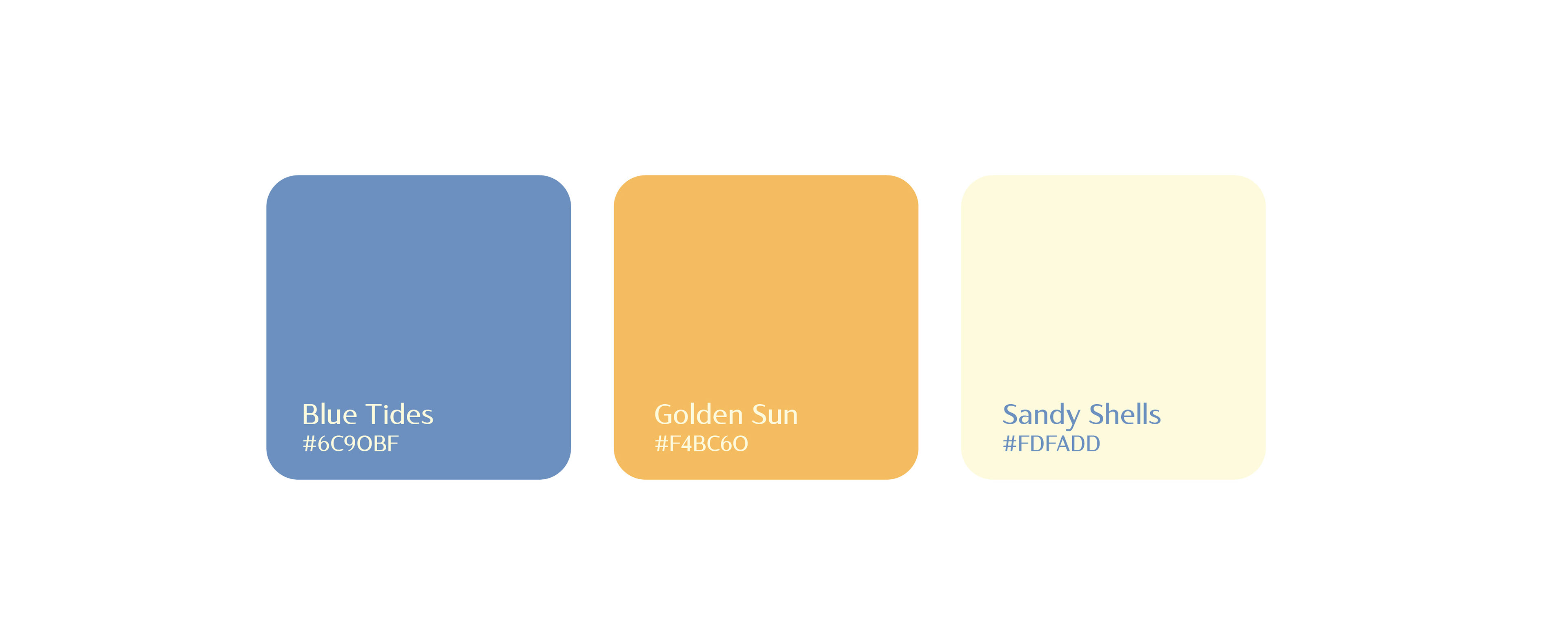
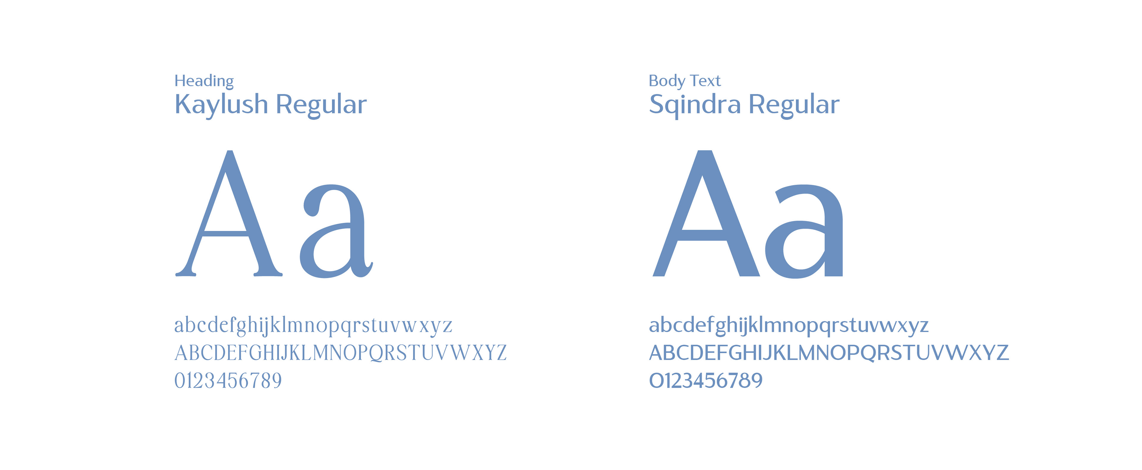
The color palette consists of the core three essentials that represent the brand: blue waves, sunset yellow, and sandy neutral. The refined look of the brand is upheld by the typography, a contrasting serif and sans-serif. The illustrations used throughout the branding include thick and thin strokes and convey the motions and organic forms of the ocean waves.


Visual assets showcased include stock mockups and photography to enhance the visual presentation of artwork made by me. All rights to those images remain with their respective creators.