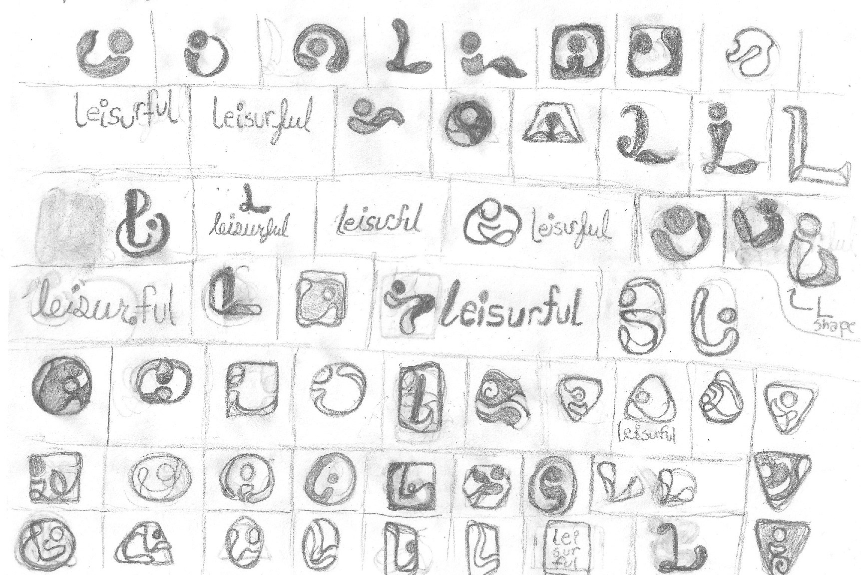
Logo Sketches
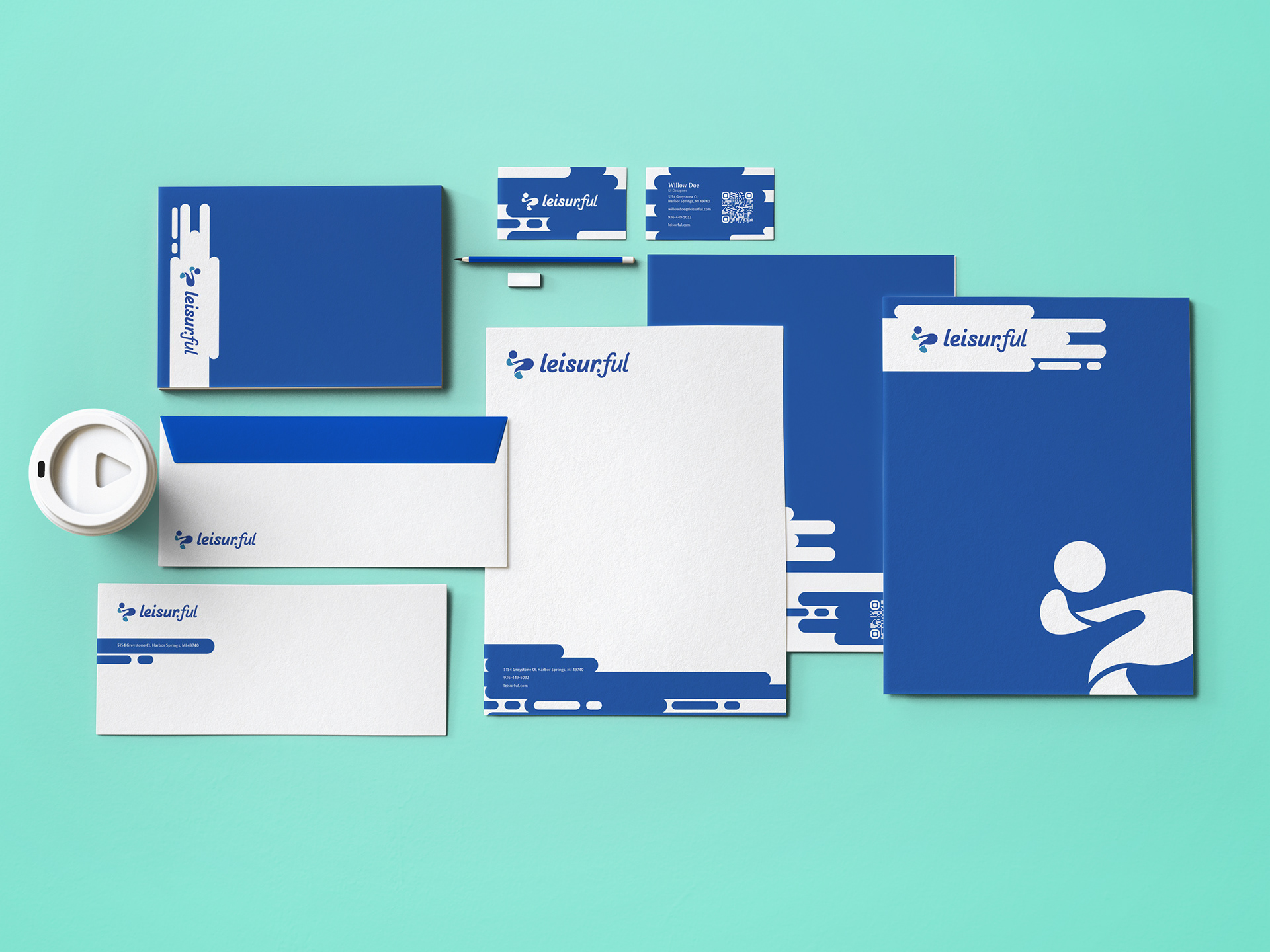
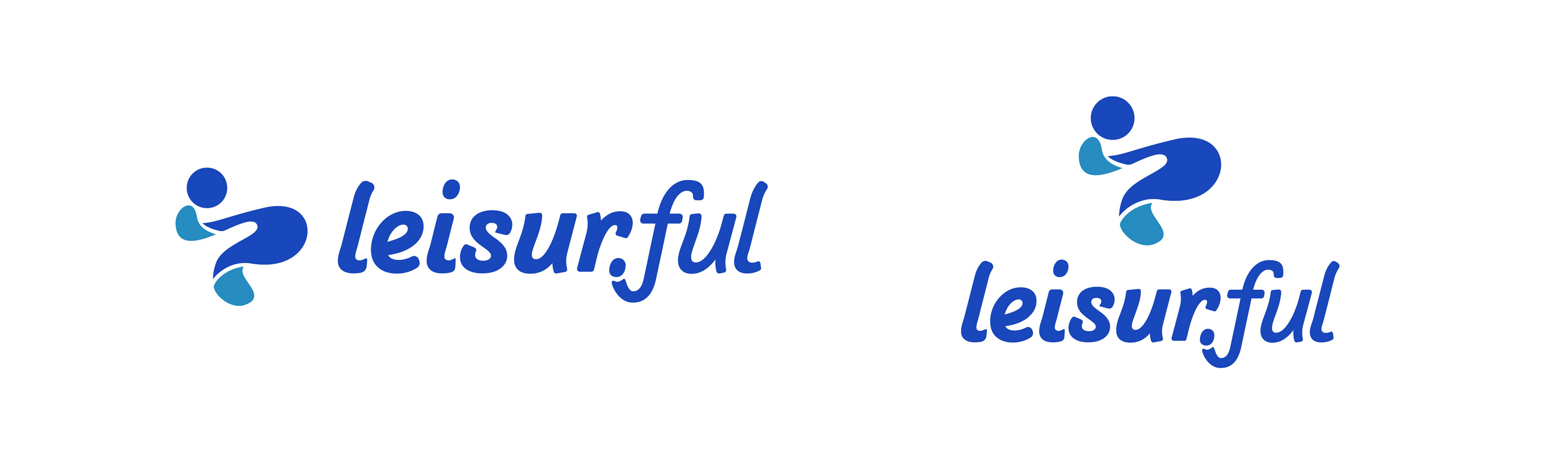
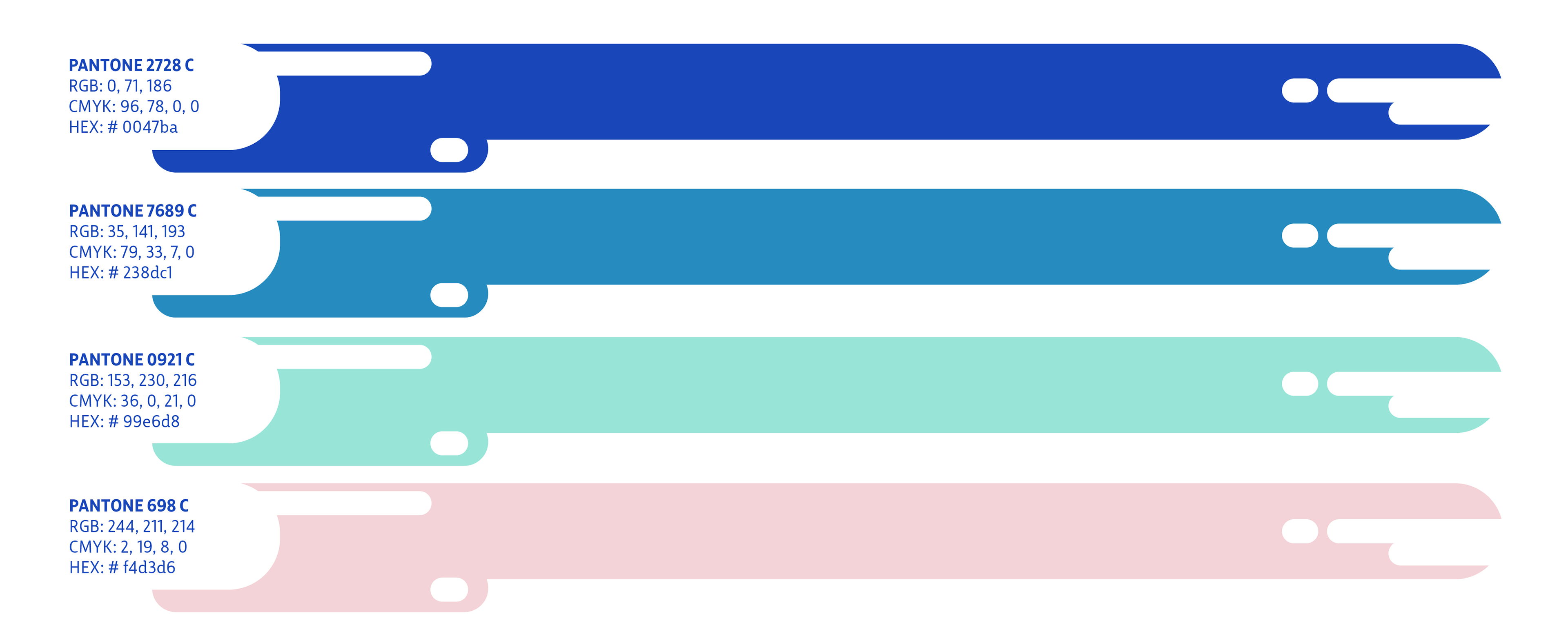
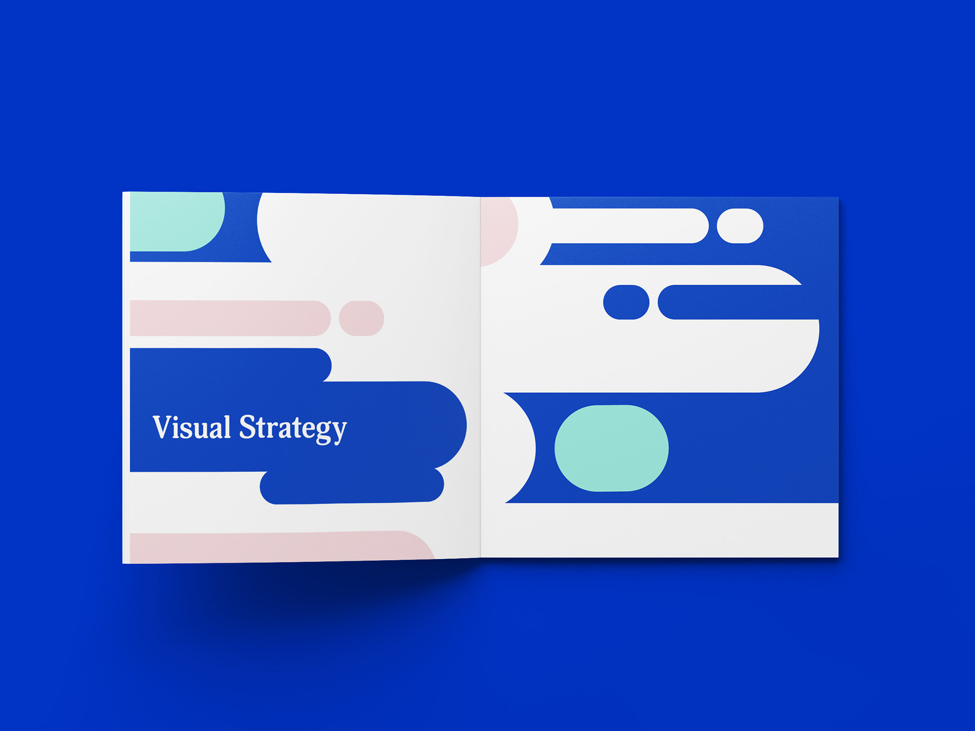
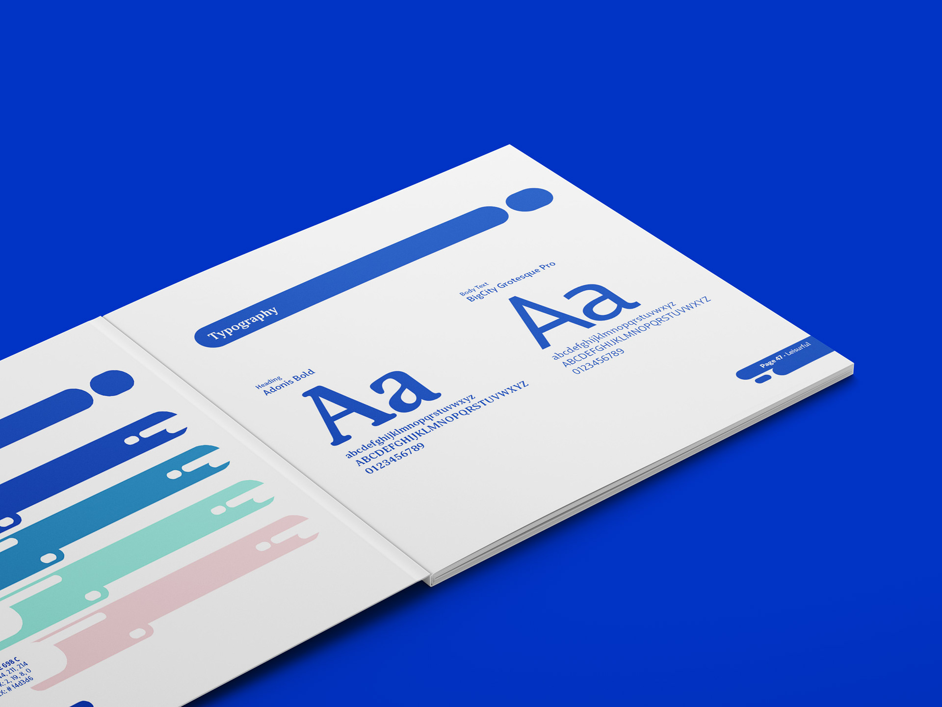
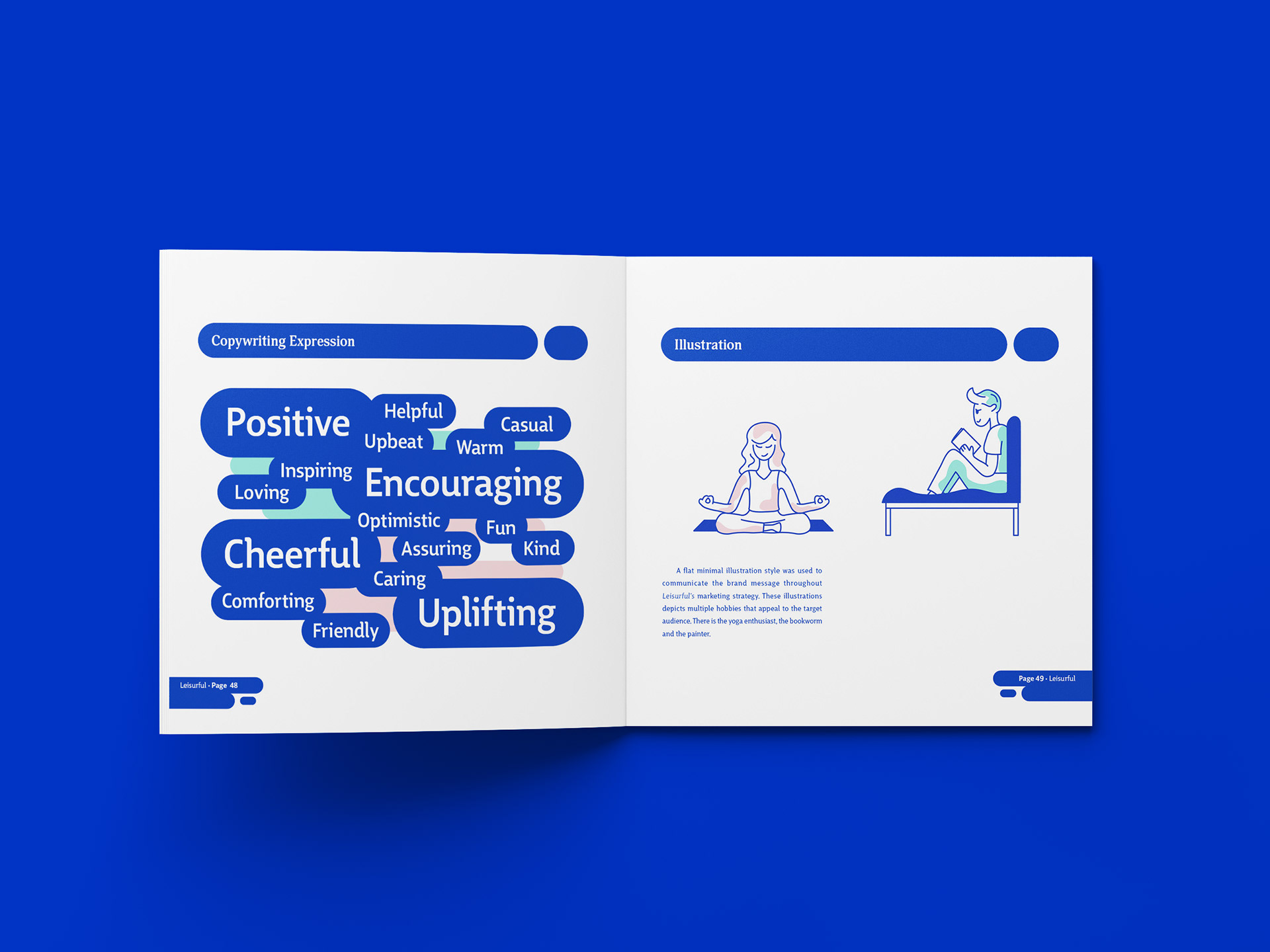
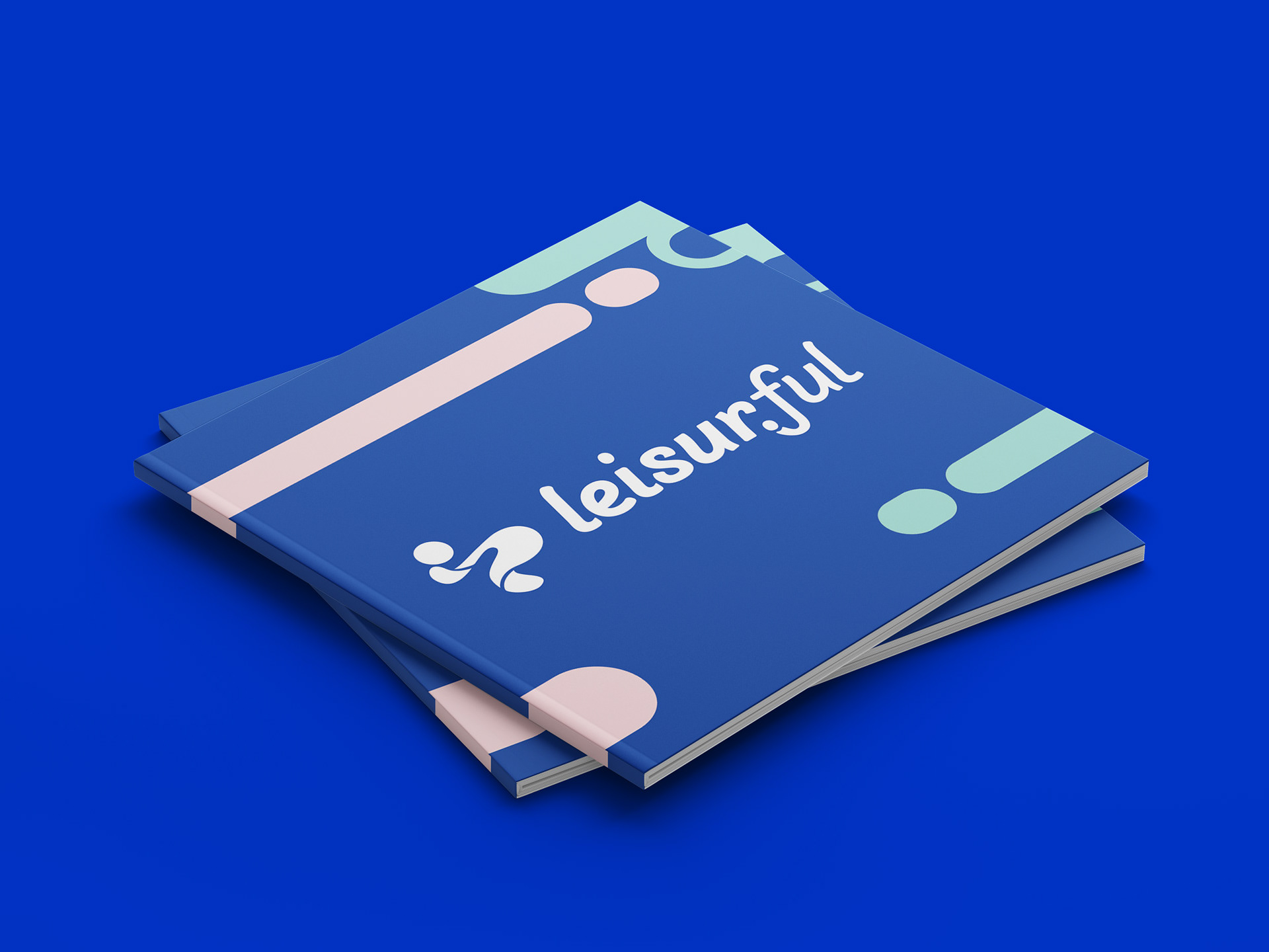
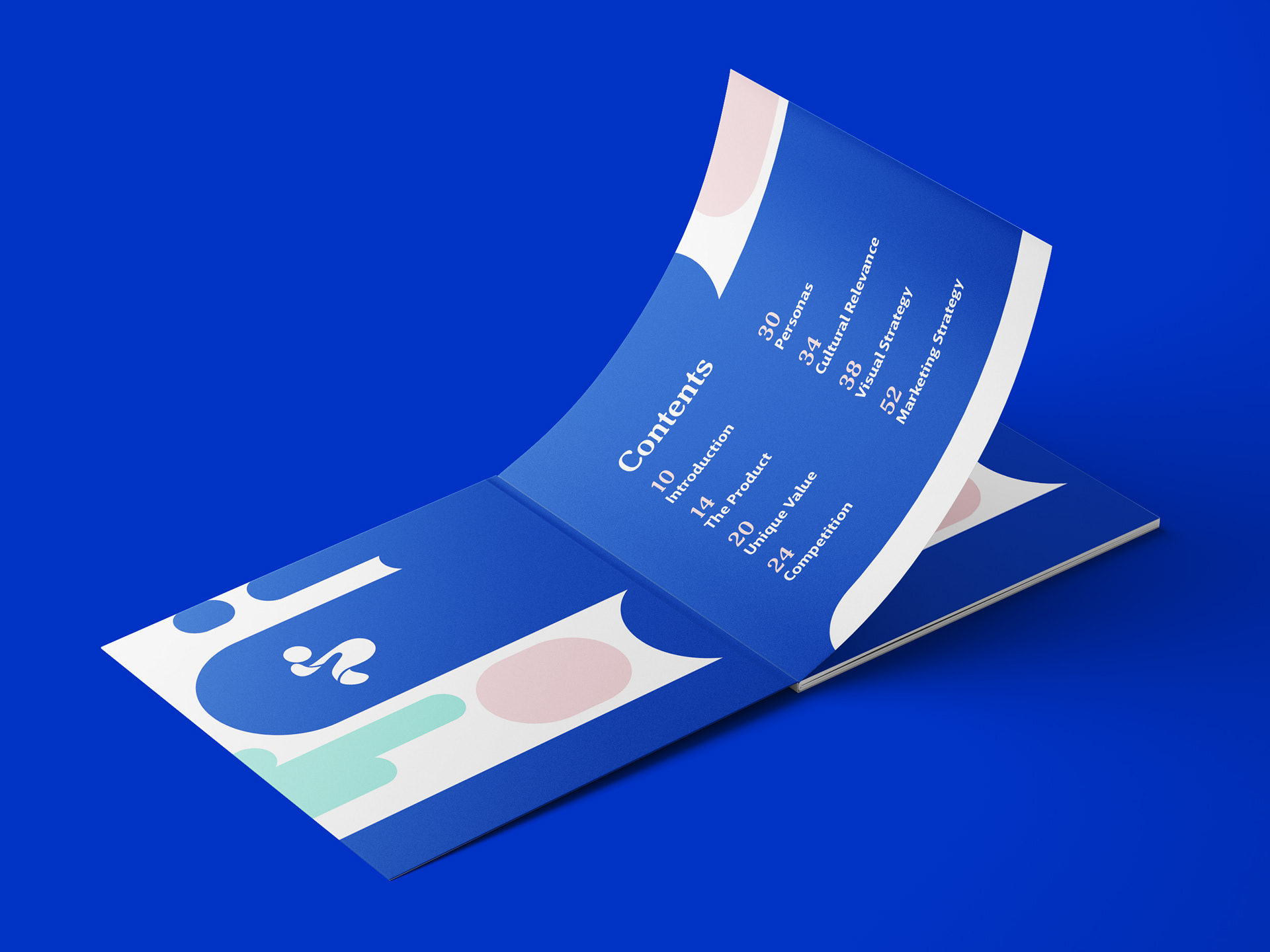
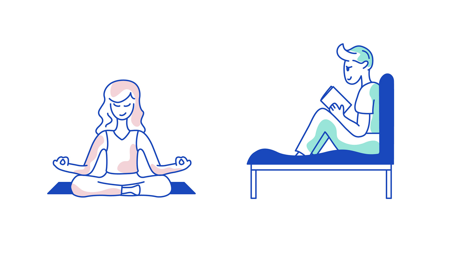
The visual strategy of Leisurful is fun, vibrant, and playful. The fluid motion of the logomark illustrates the freedom people experience from hobbies. The logomark is complemented with the wordmark that maintains the same fluidity that the logomark exudes. The brand uses a color palette of blues with complemented with green and pink. The supporting green and pink add contrast against the dark blue. The blues represent calmer emotions that are associated with relaxing hobbies and leisure time while the pink represents the fun and creative aspects related to hobbies.
Research was conducted that influenced the development of the brand and mobile application.
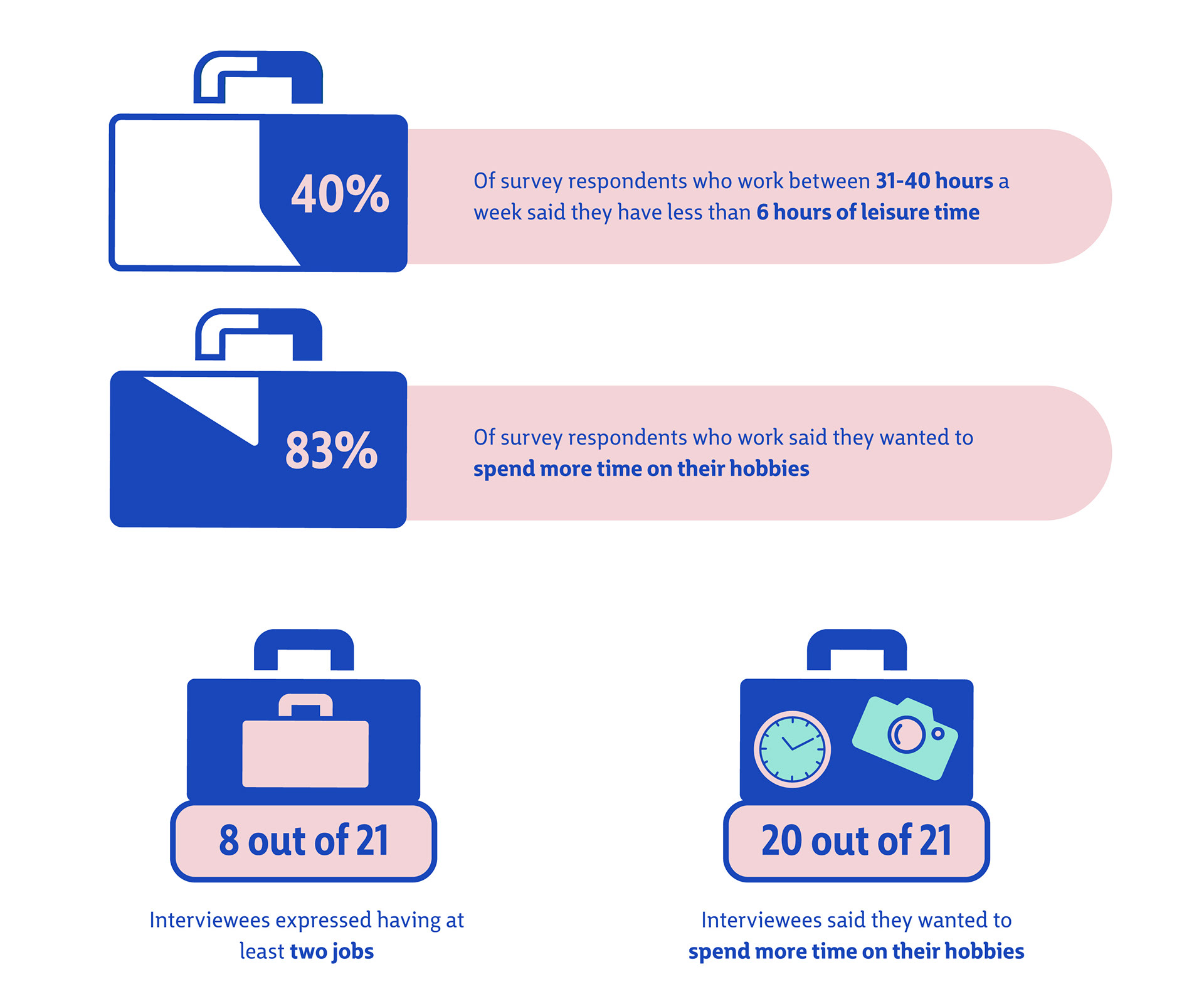
Two outlets of research included an online survey and in-person interviews of employed individuals. Fifty-four surveys and twenty-one interviews were conducted. By conducting this research, the development of the target audience and application became tailored to the common factors that prevent people from spending time on their hobbies including work, school, family and health.
Two outlets of research included an online survey and in-person interviews of employed individuals. Fifty-four surveys and twenty-one interviews were conducted. By conducting this research, the development of the target audience and application became tailored to the common factors that prevent people from spending time on their hobbies including work, school, family and health.
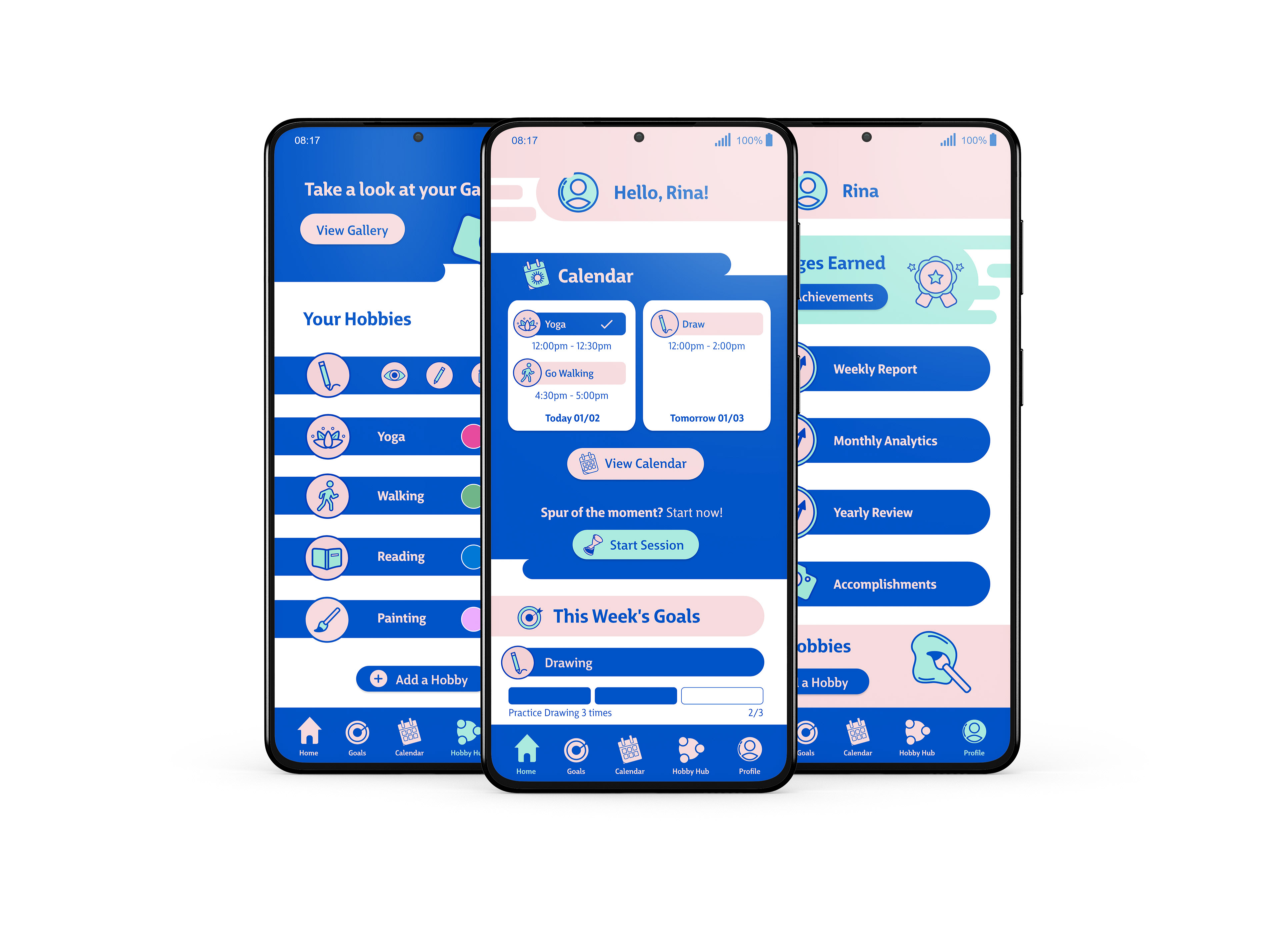
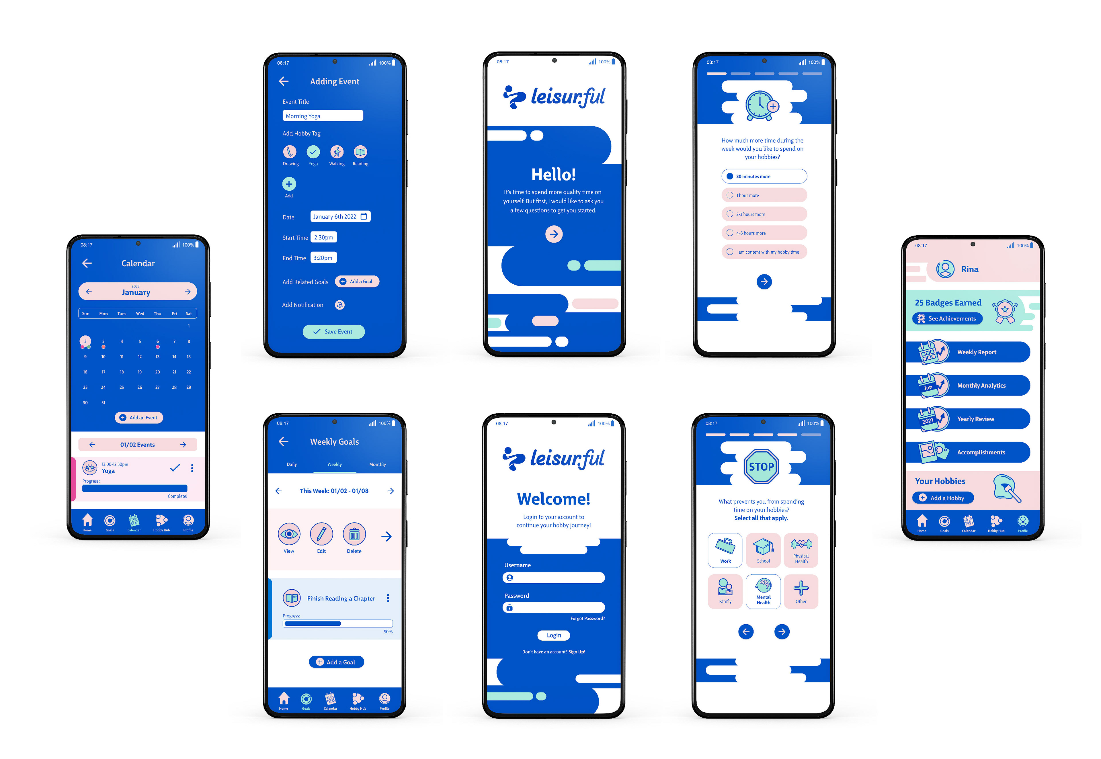
Mobile App UI
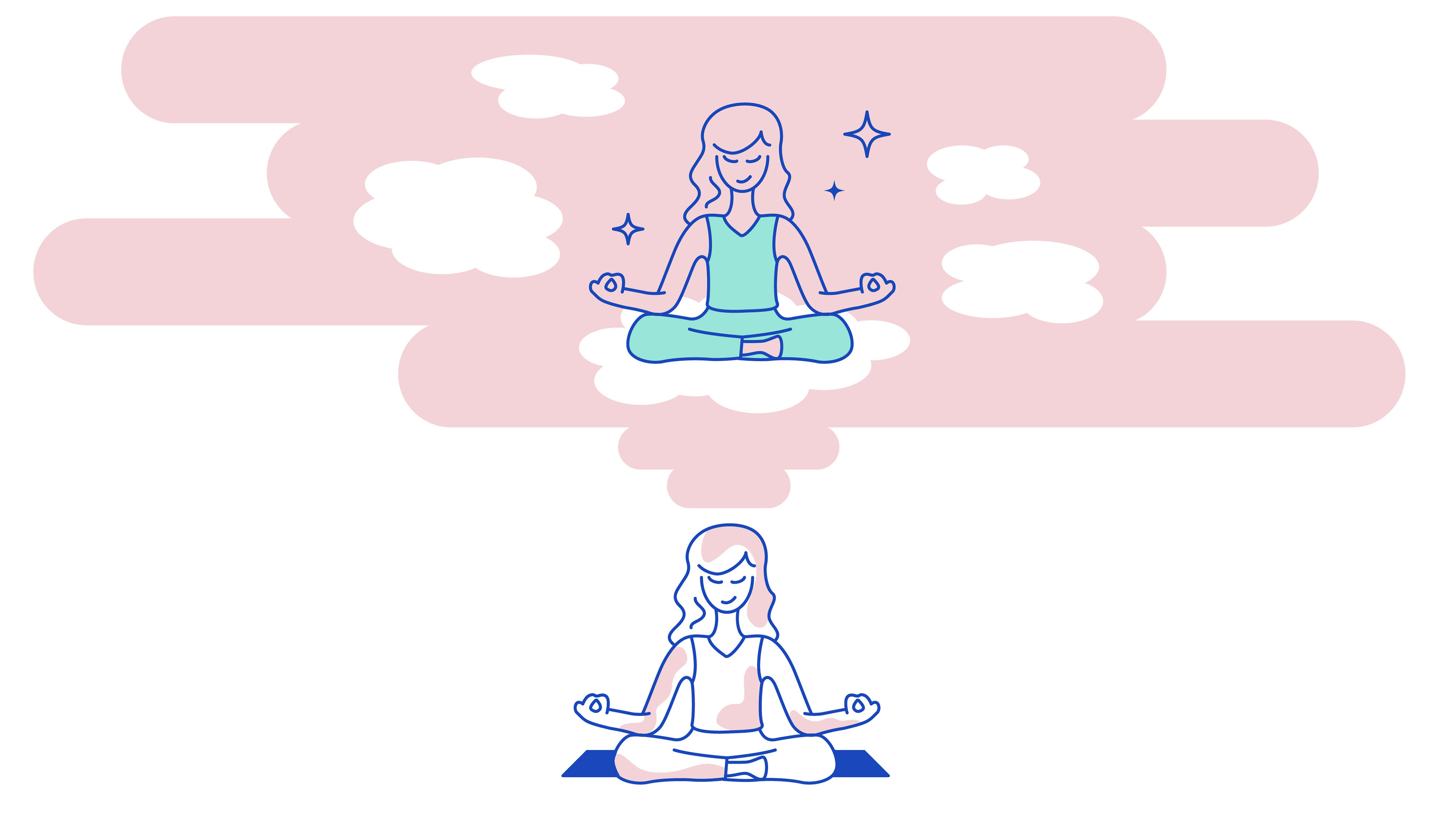
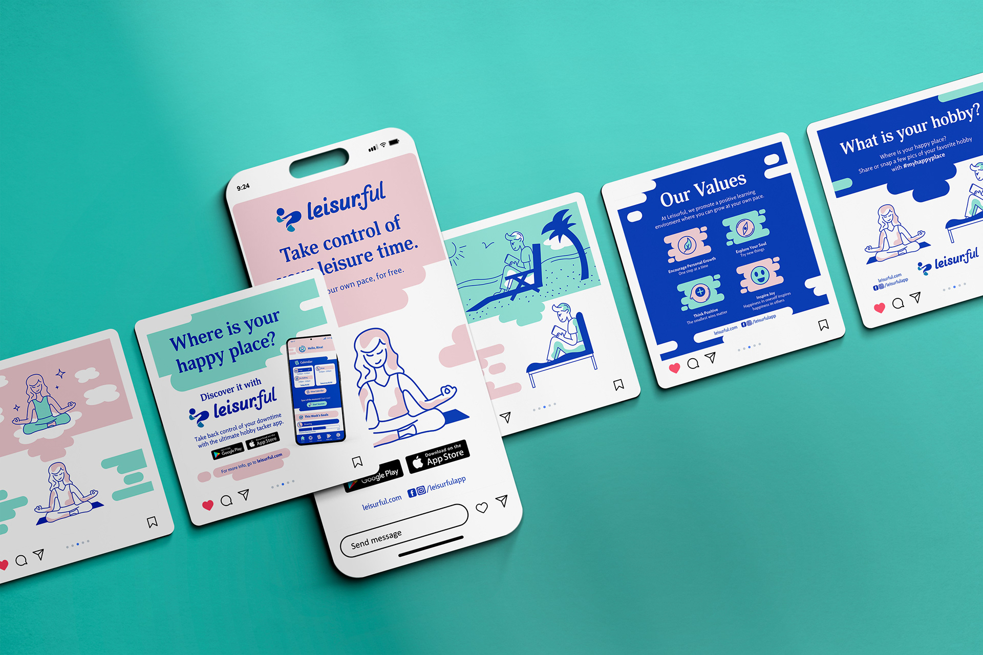
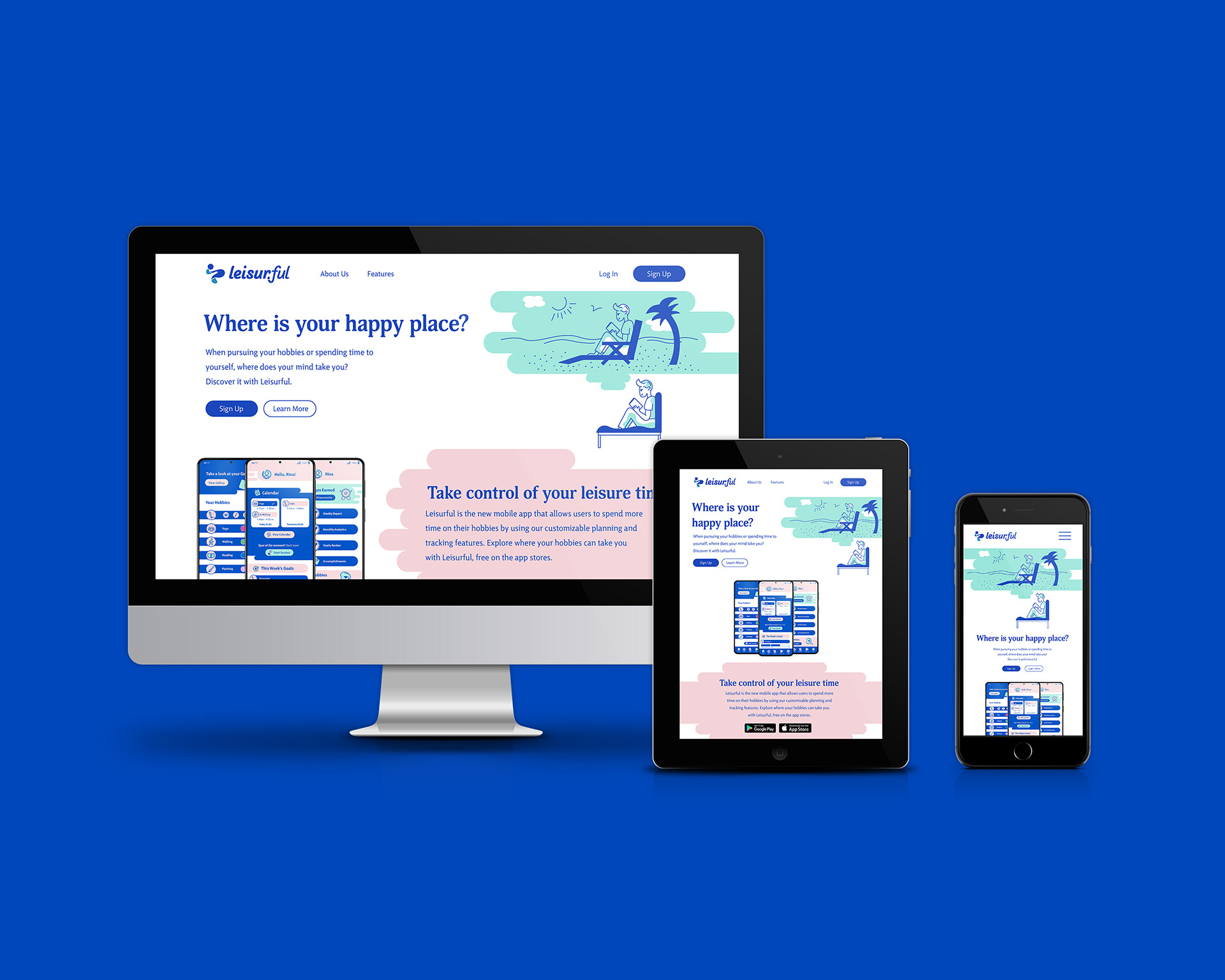
Leisurful is a free mobile app that provides users full control of what hobbies they would like to track and what goals they want to pursue related to their hobbies. The main goal of the app is to provide working adults more control over how they spend time on their hobbies. The UI reflects the visual brand identity, with fun custom icons and illustrations created to make an engaging experience for the user.
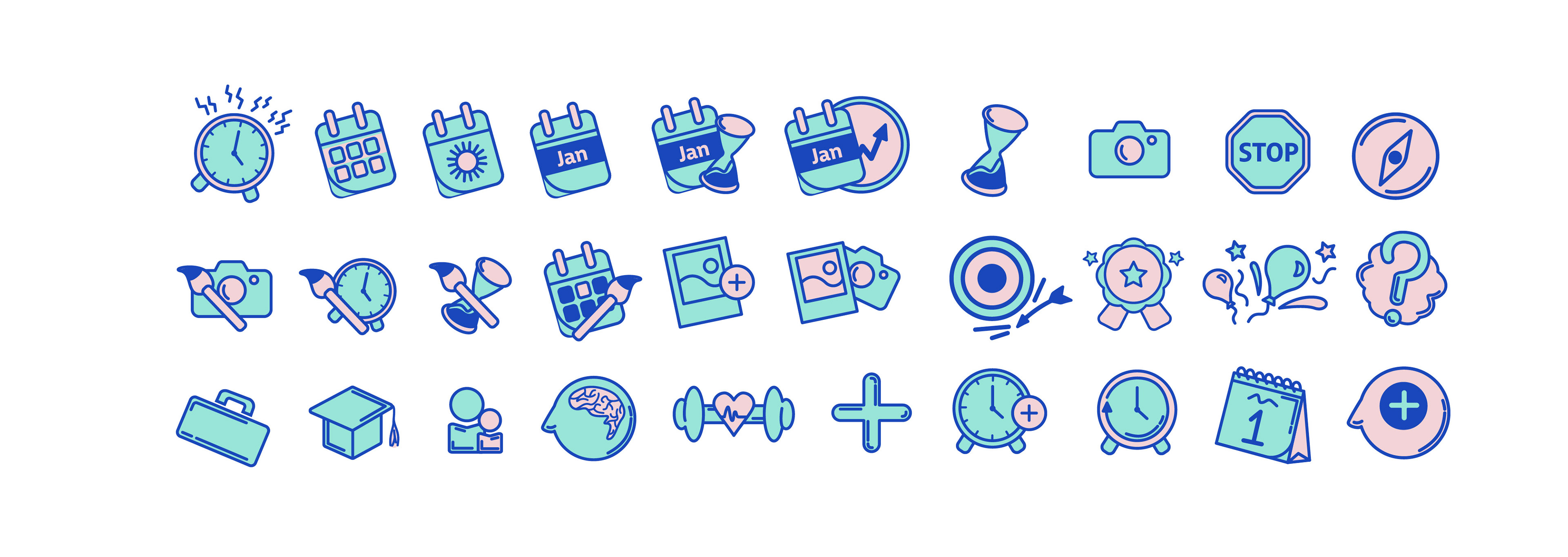
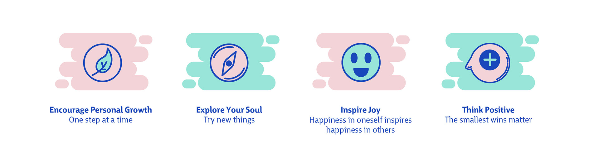
Icon Design
Maintaining a consistent iconography style is very important for easily recognizable imagery that users can identify with for different sections or aspects of the app. A moderate stroke weight gives contrast, and the use of rounded strokes evokes the friendly presence that is associated with our brand.
Brand Values
Marketing Concept
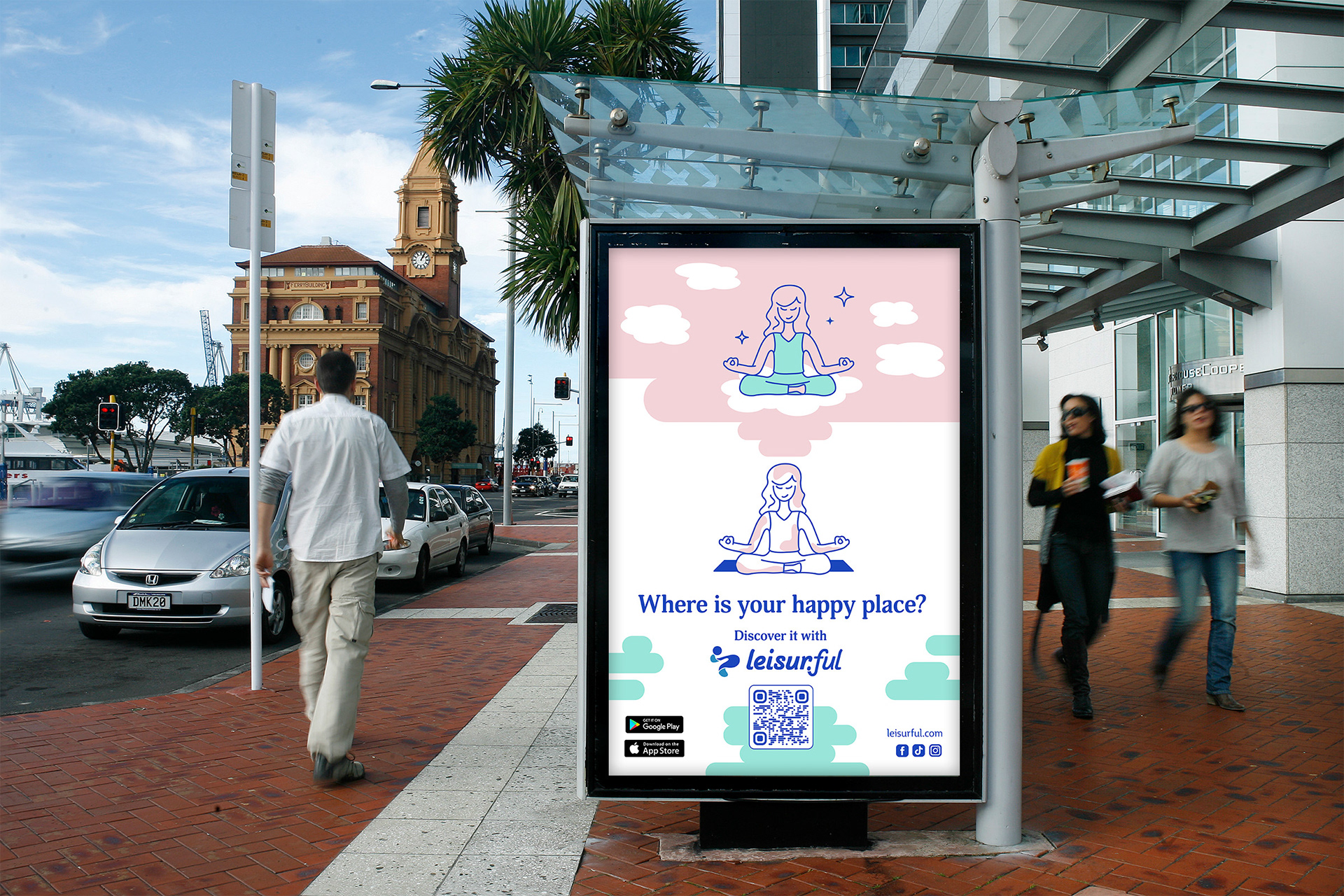
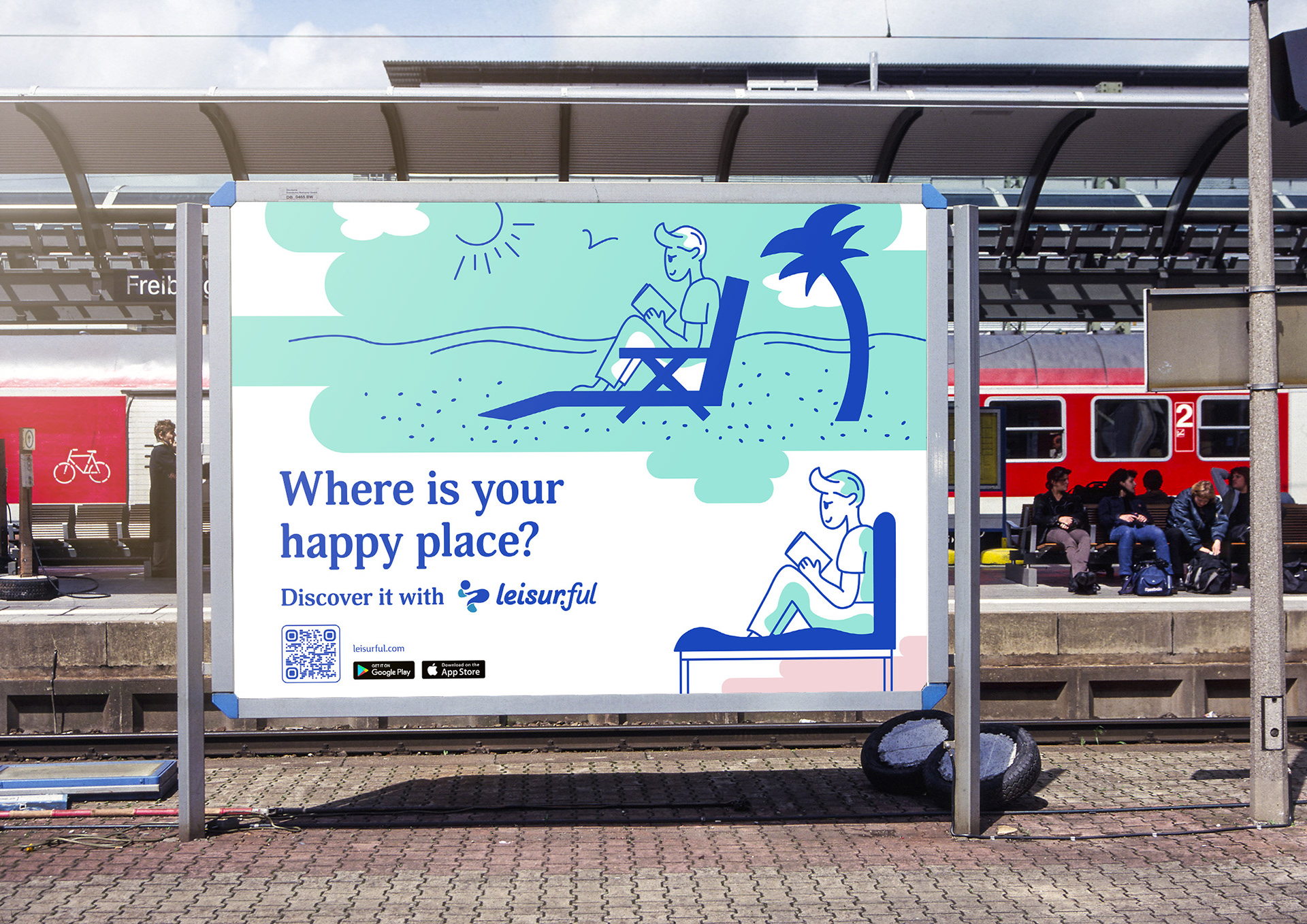
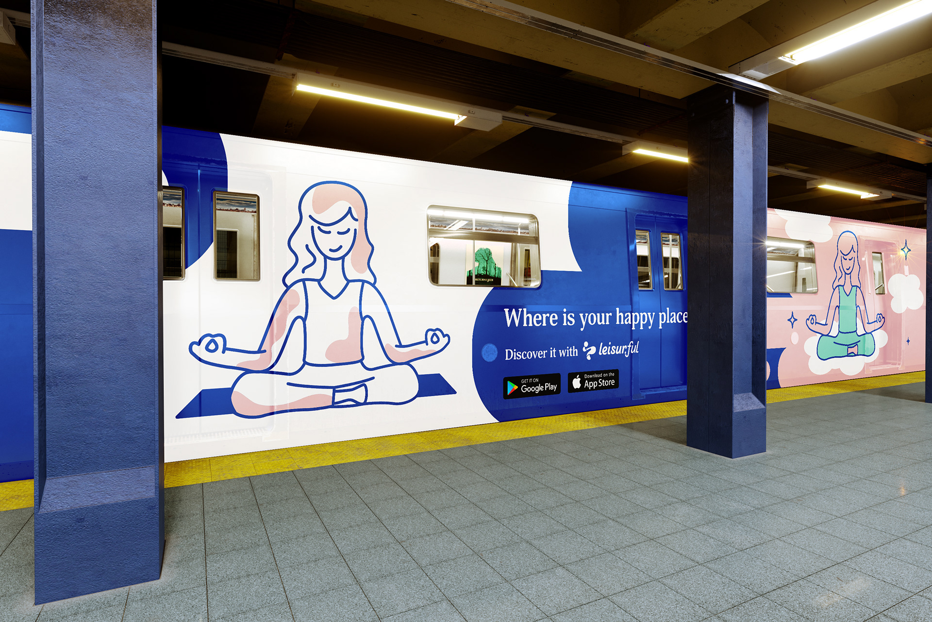
The marketing concept was inspired by the research. Hobbies often bring joy to people in different ways and consumers have different interests. I decided to express this concept in our marketing. The tagline throughout the campaign is “Where is your happy place?” which poses the question to the consumer where their potential happy place is while they pursue hobbies during their leisure time. The advertisements prompt consumers to find their happy place by using the application.
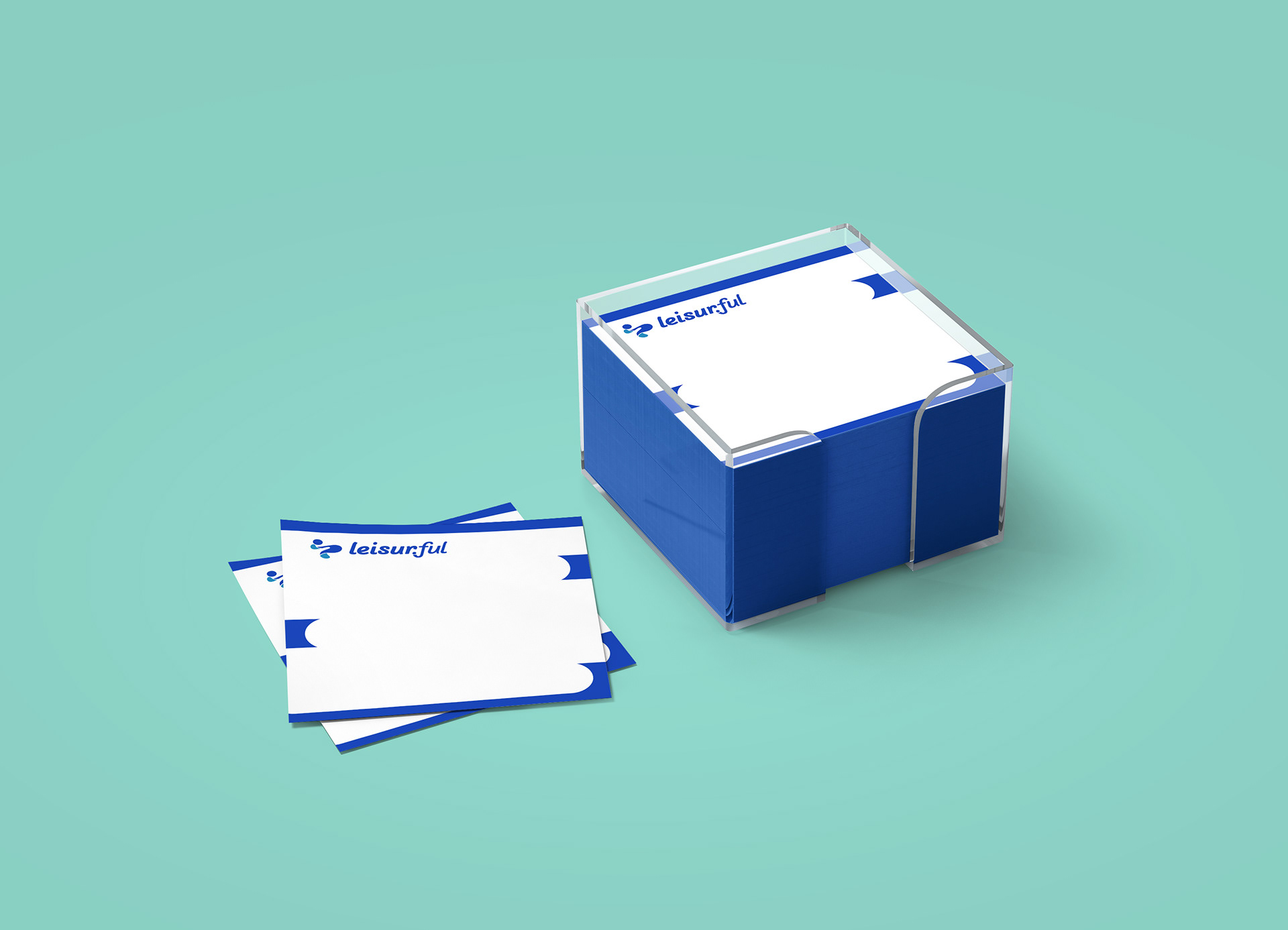
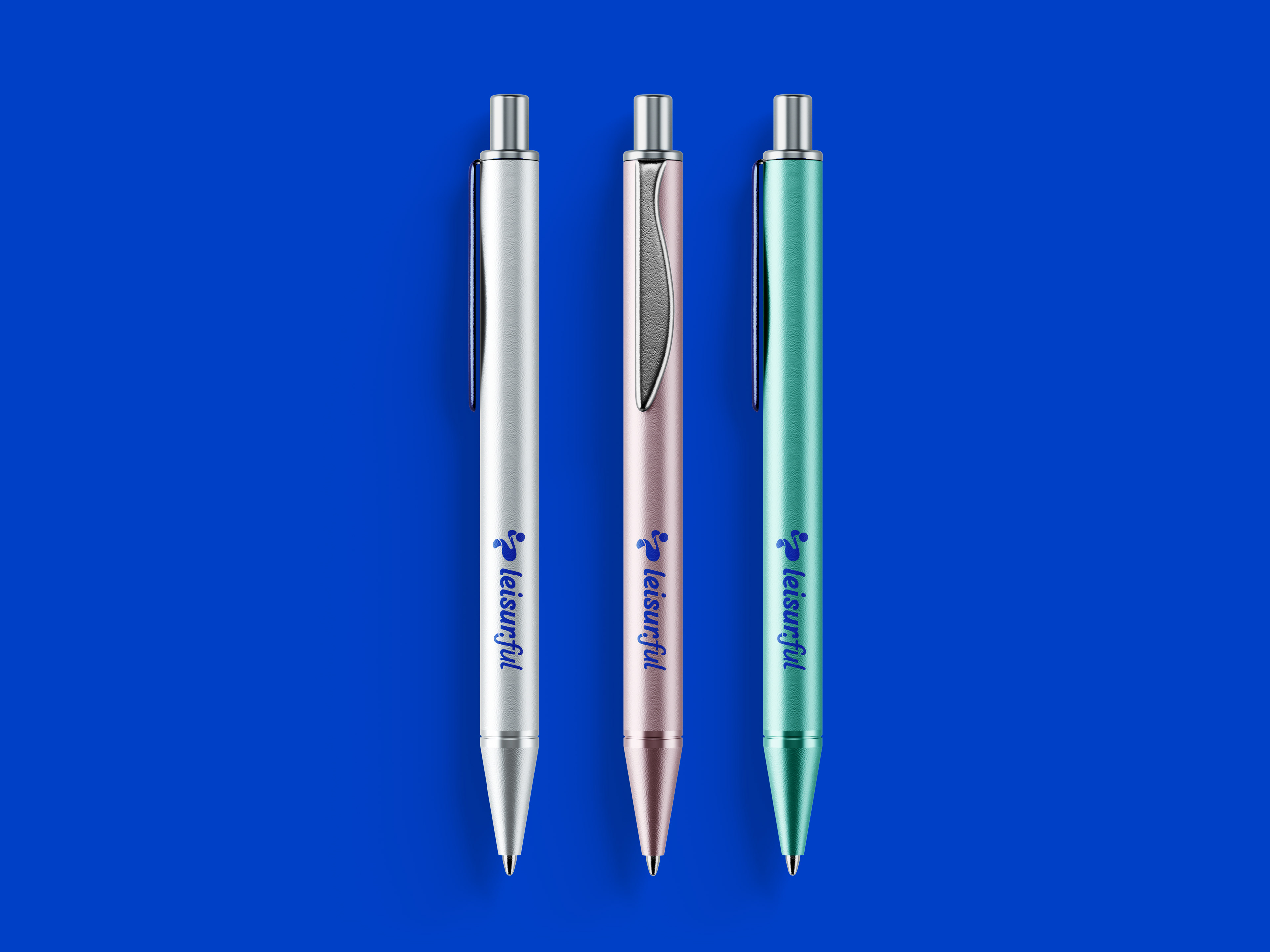
Branded Stationery + Merchandise